

Inventive Constellations and Animals Packaging. Yoga Perdana. Behance. Behance. Design Terminal identity and signage / 2012-2014 on Behance. Behance. RÅ Organic Skincare on Behance. New Logo for Royal Albert Hall by BrandPie. About “The Royal Albert Hall was built to fulfill the vision of Prince Albert (Queen Victoria’s consort) of a ‘Central Hall’ that would be used to promote understanding and appreciation of the Arts and Sciences and would stand at the heart of the South Kensington estate, surrounded by museums and places of learning.
The Hall is a Grade I Listed building; it has been in continuous use since it was opened in March 1871. It was always conceived as a multipurpose building to host not only concerts but exhibitions, public meetings, scientific conversations and award ceremonies. It is a registered charity held in trust for the nation but is financially self-sufficient: it receives no funding from central or local government.” design by BrandPie (London) related links BrandPie project page BrandPie project page opinion/notes The previous logo was fine, with a very literal depiction of the building. Thanks to Marc Nijborg for the tip. Animal Logos by Ivan Bobrov. J A Z Z on Behance. AirPano Travel Book on Behance. 12 packs gratuits pour décliner votre identité graphique en PSD. JetBlue on Behance. New Identity for Sonos by Bruce Mau Design.
About “Founded in 2002, Sonos is the leading manufacturer of wireless music systems.
The Sonos Wireless HiFi System lets you stream all the music on earth wirelessly in every room of your home with control from your Android smartphone, iPhone, or iPad. In addition to playing your personal digital music collection, Sonos gives you access to millions of songs and thousands of radio stations by partnering with AUPEO, Deezer, iheartradio, JUKE, Last.fm, MOG, Napster, Pandora, Rdio, Rhapsody, SiriusXM Internet Radio, Slacker Radio, Spotify, Stitcher SmartRadio™, TuneIn, Wolfgang’s Vault, and more. The award-winning Sonos Wireless HiFi System is available at more than ten thousand retailers in over 65 countries worldwide; or direct from Sonos at www.sonos.com.
Sanrun Mining Co. on Behance. The Vanishing Game on Behance. Lugard Brand Identity & Packaging Design on Behance. Lugard is a new gourmet shop that mainly offers consumers with premium chocolates, cookies, candies and other food products made with high qualit… Read More Lugard is a new gourmet shop that mainly offers consumers with premium chocolates, cookies, candies and other food products made with high quality, natural and organic ingredients.
It also sources different hand crafted products from African villages for fair trade. Le Point Éphémère, 10 années à la croisée des cultures. Éire Stamps on Behance. Éire Stamps (Irish: Sraith Stampa hÉireann) Since emigrating from Ireland (to Austria), I have become wiser to the world and a little more patriotic, maybe nostalgic.
It is the place I made my first forays into the world of design so this small series acknowledges my heritage and my roots not only in my life, but also my professional career. Ós rud é ar imirce as Éirinn (an Ostair), tá mé a bheith wiser ar an domhan agus beagán níos tírghrá, b'fhéidir nostalgic. L’identité visuelle du British Rail en PDF. Hello !
J’essaye de reprendre le fil du design malgré l’actualité qui me perturbe pas mal en ce moment. Chris Creamer's SportsLogos.Net News and Blog : New Logos and New Uniforms news, photos, and rumours. As we get set to enter the year of hover boards, self-lacing sneakers, and a Chicago Cubs World Series Championship we must first look back on the current year… 2014, which was my 18th running SportsLogos.Net.
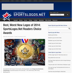
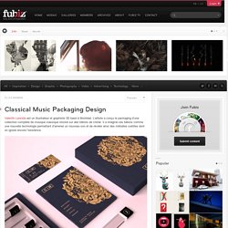
Overall 2014 was a rather uneventful year when it came to major re-brandings in the big four. The Cleveland Indians and Pittsburgh Pirates “re-designated” their primary logos (one of those resulted in significantly more uproar than the other) but left the uniforms untouched while in the National Hockey League, the Anaheim Ducks and St. Louis Blues did the complete opposite – new uniforms, logos in tact. The good: The Charlotte Hornets returned to life in the NBA, bringing teal and purple back. Classical Music Packaging Design. Valentin Leonida est un illustrateur et graphiste 3D basé à Montréal.
L’artiste a conçu le packaging d’une collection complète de musique classique stocké sur des bâtons de cristal. Le Portland'5 Centers for the Arts adopte l'art géométrique. Fondé en 1980, le Portland’5 Centers for the Arts, le 5e plus grand organisme de gestion des sites artistiques aux États-Unis dévoile sa nouvelle identité visuelle.
L’organisme change de nom et de logo afin de mettre en avant les sites qu’il gère tout en s’octroyant une vague de modernité grâce à un design plus géométrique. Branding 2013-2014 on Behance. Telgo on Behance. The Soufan Group Identity Materials. Project Description The Soufan Group is a well known security intelligence agency based in New York City.
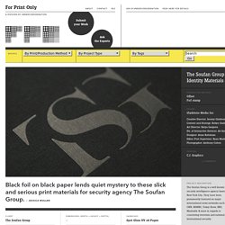
They have been prominently featured on major international news networks such as CNN, MSNBC, Today Show, BBC, Mashable & more in regards to countering terrorism and national / international security. The challenge was to articulate TSG's unique business model, while leveraging the acumen and expertise of its leadership team, developing concise and consistent messaging, and building brand awareness. Logo Design: The Work of Vladimirs Jeberza. New Logo and Identity for Help Net by Brandient. About “Established in 1998, Pharmacies Help Net is today one of the most important national chains of pharmacies.
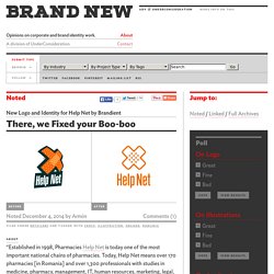
Today, Help Net means over 170 pharmacies [in Romania] and over 1,300 professionals with studies in medicine, pharmacy, management, IT, human resources, marketing, legal, communications, logistics or supply.” (Google translated) design by Brandient (Bucharest, Romania) related links Brandient project pageBrief background of Help Net as a "super brand" in Romania. Buzz Launcher Branding on Behance. Enhanced Drilling, Branding/Corporate Identity on Behance. Branding an 25' year old innovative pioneer Concept development, branding/visual identity for Enhanced Drilling. The reason for the change of visual identity was that the offshore technology supplier AGR Enhanced Drilling changed its name to Enhanced Drilling. The move followed the legal demerger from the AGR Group. Innovative, enabling technology is at the very heart of Enhanced Drilling. That has been the case for more than 25 years. Their track record in the field is enviable, with more than 500 wells now having used their RMR® and CTS™ technologies.
Enhanced Drilling supplies innovative technical solutions and services to the global offshore industry. Logos inspirants par Zdunkiewicz. Les news des logos, l'actualité des identités visuelles par l'agence Be dandy. The cloud is not invisible infographics on Behance. "The Cloud is not invisible" is a monthly double-page infographics realized for Yorokobu magazine, a Spanish publication about creativity, trends, design and communication. Our mission was to realize a sparkling and amazing composition, following our original guidelines and working on black and white outline style with a soft color palette.
The final result is a huge infographic structure with several level of information where hierarchy is the most important. Client: Nothing Is Real on Behance. Nothing Is Real: The Museum of Experiential Art & Technology, or NIR, is a branding project for an art museum that explores the idea of limitations within art. It is a contemporary space that immerses the viewer into new forms of sensory overload and/or deprivation. Using code, the logo patterning is generated to create unique forms of the logo in all capacities. Food A'Faire by Ryan Brinkerhoff. 25 Outstanding Logo Designs. Typo de Khyati Trehan pour un hommage à la science. British Council Fashion Motograph (D&AD New Blood 2014) on Behance. Oyya - ice bar on Behance. Washington's 2024 Olympic Bid Logo. Un nouveau logo pour Vistaprint. Vous connaissez probablement Vistaprint, cette société qui imprime des cartes de visite (et plein d'autres trucs, mais ils sont essentiellement connus pour leurs cartes) pour pas cher.
Tank design a retravaillé leur logo et ça donne ça. Logo Design: The Work of Samadara Ginige. Boreálica on Behance. Boreálica is a clinic that specializes in Whole Body Cryotherapy. Cryotherapy uses extremelly low temperatures to decrease inflammation, pain and muscle spasms, and increase cellular survival and muscle relaxation. Boreálica uses specialized cryogenic chambers where the patient is placed for a short duration of maximum three minutes. 25 Great Logo Designs For Your Inspiration. 50+ Minimal logos, past and present. Simple and clean designs can sometimes have an even bigger impact than a logo that has a lot going on. Good use of form and negative space can go a long way toward creating a strong visual impression. Minimal logos can be easier for your customers to remember, too. Think of the simplicity of the Pepsi logo and how recognizable that is. Or the FedEx logo with it’s hidden arrow. Both are simple and clean (the newest incarnation of the Pepsi logo arguably less so), yet are instantly recognizable just by their shape and form.
Below are more than fifty minimalist logos, both from the present and past (1950s to the early 1990s or so). New Logo and Livery for Vistara by Brand Union. 50 Logos, Vol. 4 on Behance. Design Center Website on Behance. The cloud is not invisible infographics on Behance. Domaine Lepovo - Branding. Un logo semi-tribal pour Air bnb. La start-up américaine Airbnb a déployé les grands moyens pour devenir la référence mondiale de l’hébergement entre particuliers. Silver & Green présente sa nouvelle identité. Silver & Green est une entreprise familiale indépendante qui produit des spécialités méditerranéennes à destination des professionnels de la restauration. Afin de « se différencier d’une concurrence toujours plus présente », la marque s’est offerte un nouveau logo et de nouveaux packaging.
Silver & Green explique que l‘objectif était de rendre la marque « ludique et moderne » tout en faisant ressortir « l’aspect rustique et fait maison de ses produits. » Ainsi, le nom de la marque adopte une typographie de style manuscrit à l’allure texturée qui reflète parfaitement cette idée « de tradition et d’artisanat. » Le tout s’illustre au travers d’une large palette de couleurs vives qui modernise l’identité et « sert également à préciser la gamme d’ingrédients ainsi que les cultures qui inspirent les recettes. » New Logo and Identity for Philadelphia Museum of Art by Pentagram. Established in 1876, the Philadelphia Museum of Art is one of the largest museums in the United States with a collection of more than 227,000 objects spread across more than 200 galleries that present “painting, sculpture, works on paper, photography, decorative arts, textiles, and architectural settings from Asia, Europe, Latin America, and the United States.”
If none of that sounds familiar then try this: The steps that Rocky Balboa climbs climactically during Rocky are the entryway for the museum’s main building, which is what brings us here today. (The building, not Rocky). Coinciding with the unveiling of a master plan for a major renewal and expansion by Frank Gehry, the museum introduced a new identity designed by New York, NY, Pentagram partner Paula Scher. Philadelphians colloquially refer to the Philadelphia Museum of Art as the “Art Museum,” and the new identity both brings art to the people and leads people to the art. Pentagram project page The previous logo was fine.
Float – The Water Therapy Product. Float est un produit utilisé pour vivre une expérience relaxante et unique dans l’eau. KENZO X TOILET PAPER. Recevoir étapes: Toute l'actualité du design à 16,80 € par mois. Lessalesgosses-7. Zador Identity 10. UNICEF ZEROawards Collateral. Project Description Background As Vietnam entered a "middle income" global status, UNICEF Vietnam became ineligible for some external funds. Even so, 100 children would die daily of preventable causes in the country. Awareness of UNICEF was low, though they had operated in Vietnam successfully since the mid 1950's. With a significant reduction of external funding, UNICEF needed a fundraising platform which would capture the imaginations of Vietnam's most successful individuals and corporations and inspire them to generously donate. Brief Create a strategic platform from which significant funds could be solicited from Vietnamese elite to support UNICEF Vietnam locally.
Strategy Building upon UNICEF's global platform "Believe in ZERO" (who's aim is to bring the number of preventable child deaths to zero) we created and branded a new, high profile property called the UNICEF ZEROawards. I Don’t Believe in You Either, A Bigfoot Art Show on Behance. Vector Scouts by Ryan Putnam. Tischlerei Gebrüder Falgschlunger on Behance. Northern Territory on Behance. RAWZ. Mais pourquoi est-ce donc ? Pour une chaine d'hôtels en Malaisie, The happy eight, et c'est une réalisation du studio chinois 1983 Present. J'aime beaucoup beaucoup :-) Jigsaw. Logotypes collection. Coffee House London - Brand Identity on Behance. Nike Lebron 11 on Behance. New Logo by and for Invisible Creature. Zepros: The Information Pro on Behance. Speak Up Africa on Behance.
Dimora Rurale Villino Odaldo on Behance. Questure on Behance. Exquisite Icon Design by Anna Paschenko. Pastor winery / 2013 on Behance. New Logo for Serpentine Galleries by Pentagram. New Logo and Identity for Crystal Ski Holidays by SomeOne. Reliance on Behance. Identity concept for Hungary / 2013 on Behance. PIGMENTPOL on Behance. Chocolates with attitude 2012 on Behance. F61 work room on Behance. Foodservice Brand Identity on Behance. Téléchargez dix exemples de chartes graphiques en PDF !