

Case Study: Saily. Designing Logo. Logo design process has already been presented by us in previous case studies: we told about the logo for photo editor in Ribbet case study, PassFold logo for the mobile application for tickets/passes storage and management as well as our own Tubik logo.
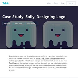
All the previous cases show how thorough and sophisticated should the work on efficient logo be. Logo is the sign with the deep symbolic meaning that is the important part of UI design, branding and therefore successful promotion of the product. This time we are going to tell about one more logo design process which was accomplished by Tubik Studio designer Arthur Avakyan for Saily app.
Arthur Avakyan creating variants of logo for Saily app Task Designing a logo of the mobile application for local user-to-user e-commerce. Tools Pencil sketching, Adobe Illustrator Process Lettering Saily is a local community app allowing neighbors to buy and sell their used stuff. Tamara working on UI design for Saily app. Design Talks #1 : Aaron Draplin on How To Defy The Odds And Build A Good Life In Graphic Design.
I Lived Like an Animal.
Q. Tell us about your creative journey. How good is your logo? Do you have a strong logo or a weak one?
While a dancer may ask herself, “I wonder what Michael Jackson would think of my dance moves?” Or a boxer may ask himself, “I wonder what Muhammad Ali would think of my right hook?” , a designer would ask, “What would Paul Rand think of my logo?” By the end of this read, you will know confidently whether Paul Rand would approve or disapprove of your logo. The Legend. Aaron Draplin Talks Design, His Process & How to Be Human. Below is an excerpt from the summer issue of HOW, which features Aaron Draplin + 9 more of the most interesting, innovative, and inspiring designers, leaders, and entrepreneurs today.
Words by Rebecca Bedrossian Surprise. Unveil the iron curtain by Patrick J. Jankun. How Google Finally Got Design. It would have been crazy to say just a few years ago.
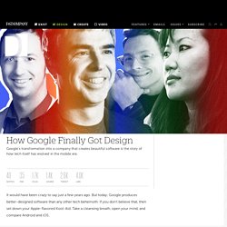
But today, Google produces better-designed software than any other tech behemoth. Patryk Hardziej: "Mam przeczucie, że Polska pod względem projektowym rośnie w oczach." Patryk Hardziej to postać zyskująca coraz większą popularność wśród grafików.

Ilustrator i projektant graficzny, autor Oldschool Logo, Polskich Znaków Graficznych, współwłaściciel ¬ Negation Studio. Cześć, dziękuję, że zgodziłeś się na rozmowę. Writing.mariusz. Warning: Due to server failure, I lost a lot of the data in here and I'm currently in the process of rebuilding the list, so it might be incomplete in places.
Check back for updates. Recently, I've been doing a lot of training, consulting and teaching people how to get better at product design. I still believe nothing beats craft and spending enough hours on projects (even side projects) and getting enough feedback from other designers, users and clients to actually get good, but I think this is a good list to expand your knowledge. Since some of these things here are classics (like Bringhurst's “Elements of Typographic Style”), some will be expanded and some are in the constant state of flux (like prototyping tools and front-end stuff), the plan is to expand and maintain this list as I go. Check the last updated date below to know if you're getting the fresh version. Last updated: 19th March 2015. 2015 LogoLounge Trend Report on LogoLounge.com.
Each year, as I browse through thousands of logos in preparation for the annual Trend Report, I can’t help but consider the societal, technological and environmental influences and how they will affect the future of our industry.
This year, three thoughts occurred to me. One. Now more than ever, perhaps because they make up a majority of the world’s early adapters and drivers of trends, we look to children and adolescents for insight into what will become the next big thing. We’ve known for some time, and I addressed in last year’s Trend Report, that the size of our digital viewing ports – I understand the layman calls them screens – continues to get smaller and smaller. And a recent Pew Research Center report indicates that 91 percent of teenagers access information online through mobile devices. IBM Design Language. Vintage Logos - an album on Flickr. Some of the best digital agencies and studios from Amsterdam. Amsterdam is well known for being one of the cities in Europe with the most agencies per inhabitant (well, this isn’t really true or verified; but, just take a look at our directory map to get an idea).
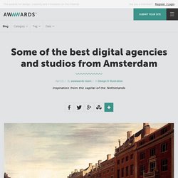
There’s also a lot of talent there – it’s not just coffee shops and red lights. This article covers the whole of production in the Netherlands, going beyond the City of Amsterdam. The fact is that this country attracts a significant percentage of the digital market from Great Britain and Central Europe – and that’s why there are so many great companies located there. Here, we present some of the most creative and interesting award-winning agencies which are established in the Venice of the North.
What’s your favourite? Superhero Cheesecake Superhero Cheesecake is an award-winning creative digital production studio. Druga Ogólnopolska Wystawa Znaków Graficznych. Facebook Visual Identity. Working With Rand on Vimeo. Understanding Design Strategy: Effective Graphic Design for Clients. In the broadest sense, “strategy” is a plan for how to achieve a goal.
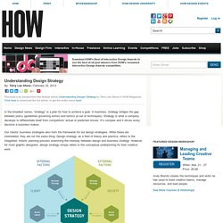
In business, strategy bridges the gap between policy (guidelines governing action) and tactics (a set of techniques). Strategy is what a company develops to differentiate itself from competitors’ actual or predicted moves. It’s complex and it drives every decision a business makes. Our clients’ business strategies also form the framework for our design strategies. While these are interrelated, they are not the same thing. Watch a Designer Who Really Knows What He's Doing Create a Logo From Scratch. If you've ever wondered how logos get made, who makes them, and where the people making them draw their inspiration—here's a great little glimpse into that world. Aaron Draplin, a freelance designer in Portland, Ore., accepted a logo design challenge from Lynda.com to create a mark for slab concrete company and made this short tutorial.
Draplin, a bearded, burly 40-year-old veteran design dude with a canon of really diverse work, makes it look easy. But his ease and demeanor are the result of years of experience. In the video below, we get a rare glimpse into the process of the artist—from concept to execution, through sketching to prototyping and every iteration in between.