

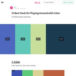
UI Garage - Specific mobile and web design patterns for your ins. Collection. 12 Best Tools for Playing Around with Color — Muzli -Design Inspiration. 9. colourcode — find your colour scheme colourco.de is an online designer tool, which allows you to easily and intuitively combine colours.
Empty States. 100 Days UI. How Your Brain Understands Visual Language. Semioticians classify signs or sign systems in relation to the way they are transmitted.
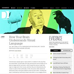
To illuminate one way semioticians look at things, let us peek at stage and film semiotics, which study the various codes and signs on stage and in the movies, and how they are interpreted by the viewer in spite of their artificiality. In film, the actors often stand one behind the other, facing the audience and not each other; recalling the past is indicated by switching to black and white or via a wiggly picture; squeaky doors and shadows moving on stairways are associated with horror, and so on. Historian Pamela Smith’s book, Symbols, Images, Codes: The Secret Language of Meaning in Film, TV, Games and Visual Media provides many examples.
Designers are quite familiar with product semantics, which is a branch of semiology (Semioticians prefer the terms "Design Semiotics" or "Product Semiotics") that studies of the use of signs in the design of physical products. Understanding Web UI Visual Hierarchy. More than being creative, a good artist must also consider subtleties like composition, colors, size, what to include, and — perhaps more importantly — what to leave out.
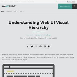
That’s no easy feat, which is why we hold the masters like da Vinci and Van Gogh in such high regard. Web UI designers must do the same. As discussed in Web UI Best Practices, a website is a form of visual art in its own right, and follows many of the same rules as more traditional artforms. It is the science of aesthetics, mixed with the principles of business, and an extraordinary website interface must feel effortless yet enticing. Creating Visual Organization In his paper Communicating with Visual Hierarchy, Luke Wroblewski, author and Senior Principal of Product Design at Yahoo! Informing users — Like an invisible hand, the interface should guide users from one action to the next without feeling overbearing. The end goal of your UI design is to answer three questions: 1. 1. I. II. 2. GoodUI. How to Become a Video Game UI Artist. This interview is part of our Quest for Your Career series.

Each week, we focus on a specific job in the video game industry by interviewing an expert in the field. You'll learn what they do, how they got started, and find out whether it's a good job for you. Ui mockup collection Collection. UIHAUS - The best selection of mobile UI designs ever made. Designer for Apps, User Interfaces, Responsive Webdesign and Wordpress › desiign. Animating your UI designs in Keynote in 7 simple steps. Motion in UI design isn’t new—but it’s definitely the next thing you should be getting familiar with.
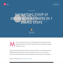
The future’s bright for those who can design and guide people with motion. To get you started, I’ll show you how to mock up the animation in the video below using Apple’s Keynote. Along the way, we’ll cover principles you can use to create custom interactions that’ll add a whole new level of fidelity and interactivity to your prototypes. Want to follow along? Download the source files. Step 1: Design your beginning and end states Animations in user interface design have a beginning, middle, and end. While you’re designing, identify which elements will move or change in your animation and export them individually. Here’s how that works with our design. Step 2: Fire up Keynote Open a new blank Keynote file, click Document in the top right corner, and change your slide size to a mobile screen size, like 750×1334 for an iPhone 6.
Step 3: Position your assets Step 4: Start animating And boom. P.S. A Brief History of User Interface. Free to-do app UI kit for Photoshop and Sketch. Lovely ui. Boxes and Arrows. Mobile Patterns. The Iskeletor – Pushing Usability to the Forefront – Hyperlinks. Pttrns - Mobile User Interface Patterns.
Luis Abreu: Why and How to avoid Hamburger Menus. We now have data that suggests Sidebar menus—sometimes called Hamburger Menus/Basements—might be causing more harm than good.
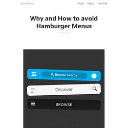
Here’s some public data: One thing to have in mind is that this is a nuanced issue. I’ve observed these issues in user testing and others have also gone through the same realization. I only ask you to read the problems, solutions and be aware of the consequences before committing to this pattern. The Problems Lower DiscoverabilityLess EfficientClash with Platform Navigation PatternsNot Glanceable Lower Discoverability “what’s out of sight, is out of mind.” In its default state, the Sidebar Menu and all of its contents remain hidden.
People need to first be able to identify the Sidebar Menu button as actionable — companies are supplementing the menu icon with a ‘menu’ label or tooltip, and they also have to feel the need to do so — which might not be the case in applications where the main screen offers majority of the value.