

UI-Patterns.com. Library. 21 Stunning Serif Fonts for the Modern Website. Website design is inarguably one of the most influential aspects of your company’s brand.
It provides (hopefully) an interactive and engaging platform to tell more about what your company does and why that service or product is important to your target audience. But what about the typeface? Typefaces can be finicky. There are quite a few different types of serifs to choose from, such as Old Style, Didone, Slab, and Glyphic, among others, and it is important to choose one that fits your brand. It is also important to consider that choosing a serif typeface can also enhance readability, allowing readers to easily move through the text on the page. Check out this list of 21 serif typefaces and how they work for brands: 1. Www.alistapart.com Juxtaposed next to a sans serif title and heading, A List Apart wisely chose Georgia for the body text. 2. Www.thegreatdiscontent.com. Build Atomic Design Systems. Style Guide - Barebones. Sections Linked The main page header of this guide is an h1 element.
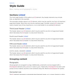
Any header elements may include links, as depicted in the example. The secondary header above is an h2 element, which may be used for any form of important page-level header. More than one may be used per page. Consider using an h2 unless you need a header level of less importance, or as a sub-header to an existing h2 element. Third-Level Header Linked The header above is an h3 element, which may be used for any form of page-level header which falls below the h2 header in a document hierarchy.
Fourth-Level Header Linked The header above is an h4 element, which may be used for any form of page-level header which falls below the h3 header in a document hierarchy. Fifth-Level Header Linked The header above is an h5 element, which may be used for any form of page-level header which falls below the h4 header in a document hierarchy. Sixth-Level Header Linked Grouping content Paragraphs All paragraphs are wrapped in p tags. ! Figures. Style Guide Boilerplate. Usage Add your personalized documentation here.
Example Lorem ipsum dolor sit amet, consectetur adipisicing elit, sed do eiusmod tempor incididunt ut labore et dolore magna aliqua. Ut enim ad minim veniam, quis nostrud exercitation ullamco laboris nisi ut aliquip ex ea commodo consequat. Duis aute irure dolor in reprehenderit in voluptate velit esse cillum dolore eu fugiat nulla pariatur. Lorem ipsum dolor sit amet, consectetur adipisicing elit, sed do eiusmod tempor incididunt ut labore et dolore magna aliqua. In voluptate velit esse cillum In voluptate velit esse cillum In voluptate velit esse cillum. Style Tiles. Typewolf → Typography Inspiration for the Modern Web. 960 Grid System.
Designer's guide to DPI. DPI or Dots Per Inch is a measure of spatial dot density initially used in print.
It's the number of ink drops your printer can put in an inch. The more dots per inch, the sharper your image. This concept is applies to computer screens under the name PPI for Pixels Per Inch. Same principle: It counts the number of pixels your screen displays per inch. The name DPI is also used in screens. For a concrete and relatable example, Windows computers had an initial PPI of 96. Asking someone what the size of a pixel is is a good way to confuse him or her because it’s a trick question. Here’s an applied example: A Mac Cinema Display 27” has a PPI of 109, which means that it displays 109 pixels per inch of screen. As you might have noticed in my explanations, “Resolution” stands for PPI, in this case “109” but not “2560x1440”, like you might commonly see everywhere on the web. “2560x1440” is the pixel count, as referred in the first paragraph as “Pixel screen size”. 4K starts at 3840x2160 pixels.
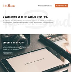
Hip Bundle: Amazing mock-up collection. Great for presenting your logos, sketches, notes, scrapbooks, doodles, drawings, art work, design wireframes, presentations, photos or anything else.
View Mock-ups. NounProject.