
Portfolio tips for UX professionals. The foundation of a great UX portfolio. In the past year I’ve reviewed over a hundred portfolios, mostly for “Visual Design” and “Interaction Design” positions on my team.

After reviewing so many portfolios, you begin to see patterns. You start to recognize the gaps that are missing from portfolios. I want to talk about two of these gaps. The first, and most important, thing I ask when I’m looking at your portfolio is: “Can this person do what we need them to do?” Sounds simple, right? But it works against you. If you have lots of print design stuff, but want to move into more UI design, highlight your UI design projects. A good portfolio has a 3 key elements: Describe yourself as you want to be seen, meshing a future version of you with a smidgeon of background context: “I’m a UX designer focusing on interface design for mobile apps.
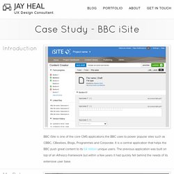
Guess what's most important? I've seen case studies come in all shapes and sizes. You want to tailor your case studies to the type of work you want to be doing more of: Trying for more visual work? Jay Heal Portfolio - Case Study. My role within the team as an Interaction / UX designer was to lead the UX strategy for the project, ensuring we deliver a far more user-centred product than the proceeding.

Working with an information architect, visual designer, business analyst, project manager, product owner, tester and a large team of both front-end developers and software engineers, I worked very much the end-to-end process. End-to-end being from design research (with the IA) and core user journey mapping through to product iterations and product presentation. I successfully embedded a UX process into a fast paced Agile environment where was able to quickly iterate on ideas and assumptions based on short user validation / feedback loops. Within the project, I also devised usability testing programmes and scripts for usability experts to conduct as well as running some of these personally. These tests being conducted both on a one-to-one basis (guerilla) and within a purpose built usability lab.
Brittany Mederos ⤬ User Experience Researcher and Designer · Singer & Songwriter. The Problem Employees were confused that the intranet was a cohesive tool because it was broken into three tools; the wiki, the staff directory, and the news.

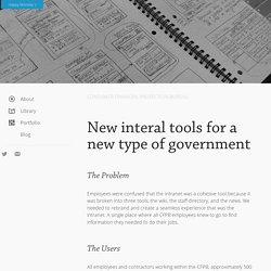
We needed to rebrand and create a seamless experience that was the intranet. A single place where all CFPB employees knew to go to find information they needed to do their jobs. The Users All employees and contractors working within the CFPB, approximately 500 daily active users. The Process The Intranet redesign was the first project that I was handed when I arrived at the CFPB.
Unable to access the intranet my first two weeks because of the security process (oh government), I got together with the product owner and interviewed her to get insight into the current state of the intranet. The chief issues I noticed immediately: 1The design was not unified across the tools on the intranet. Developing with Django I worked with the backend developer to understand how the tools were connected and interacted with each other. Klare - Thoughts from a designer/developer. User experience visual design frontend dev An April Fools stunt that allows bearded men to unlock their phones with their facial hair.

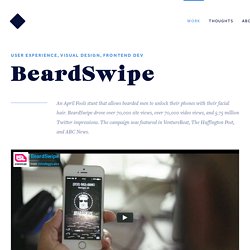
BeardSwipe drove over 70,000 site views, over 70,000 video views, and 5.75 million Twitter impressions. The campaign was featured in VentureBeat, The Huffington Post, and ABC News. What We Built We put together a full experience, including a social media campaign, website and app design, and a promo video to ensure the prank was fully believable. One of the most interesting aspects of our team composition was that work was self-assigned. Full website: Beardswipe.me What I Worked on I choose to tackle both design and development of the product website. Wireframes Working to get in code as soon as possible, I did a quick mockup of interactions with notes on functionality I needed to tackle straight away in code. Art Direction. Beatrice Law. Web Designer à Bordeaux.
Oelwein Studio. Oliver James Gosling - Freelance Web Developer.