

Geometric Abstracts With Architectural Spatial Awareness. Rendering the Fundamentals, 80x110cm, Oil on canvas Using paint, paper tape, pencil and blank canvas, artist Daniel Mullen creates images that examines with space and its representation through movement, fragmentation and the use of perspective.
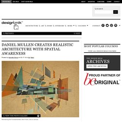
The friction created between the image and the painting, between painted and non-painted surfaces, and activation and deactivation of planes is what gives these creations meaning. This Guy Mocked Up Perfect VHS Cover Art For Modern TV Shows And Movies. These Gorgeous Flipbooks Are A New Creative Way To Propose To Your Love. Matteo mezzadri builds a brick city from urban architectural materials. Feb 09, 2015 matteo mezzadri builds a brick city from urban architectural materials matteo mezzadri builds a brick city from urban architectural materials(above) ‘le città minime #1′, pigmented fine-art giclée, 100×100all images © matteo mezzadri as a result of the painstaking, near-obsessive assembly of dozens of individual brick pieces, italian photographer matteo mezzadri has built an impossible fictitious city within his photo studio, capturing its quality on camera.
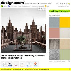
‘città minime’ is a multidisciplinary project comprising a mix of sculptural and installation work, whose finality is realized through a still image. without the over-use of digital enhancing, mezzadri constructs a miniature city using materials found in the making of urban-scale centers. architectural landscapes are created through the careful composition of skyscrapers and smaller structures, pierced by essential elements of any metropolis including roads, trees and bridges and waterways. ‘le città minime #1′ The Sculptor Has Perfected The Art Of Sketching With A Bandsaw. James McNabb created this series of work entitled 'The City Series' for his MFA Thesis.
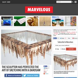
Using a band saw, McNabb cuts unique pieces of scrap wood. These pieces are attached to create what appears to be a cityscape. They have an architectural quality to them, however no two are the same. This series is meant to symbolize the journey of a woodworker from country to city. They also carry a foreign element, representing an outsider’s impression of a city landscape. City Wheel - 53" x 53" x 3" City Table - 41" x 31" x 19.5"
Nostalgic Illustrations By Hollis Brown Thornton. South Carolina-based artist and illustrator Hollis Brown Thornton creates drawings that depict now-obsolete technology of decades past, including cassette tapes, VCR tapes, floppy disks and old video games.
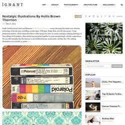
Using permanent markers, which means that there is little margin for error, he creates nostalgia-inducing drawings of these defunct tech products, often stacked up and packed together to create mesmerizingly colorful compositions. We can still remember that the drawers in our childhood homes used to look a lot likes this. The striking illustrations are available as prints here. All images © /Hollis Brown Thornton | Via: Design Taxi. Satirical Illustrations Of Today’s Problems Drawn In The Style Of The 50s. John Holcroft is a well-known British illustrator who has worked for BBC, Reader’s Digest, The Guardian and the Financial Times, among others.
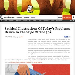
However, what makes him famous are not his employers, but the brilliant satire reflected in his illustrations and the retro style he uses to create them. Everytime Holcroft publishes a new drawing, they inevitably go viral and spread all over the Internet. His style is based on advertisements from the 50’s, and he reproduces everything from their visual design style down to their aged vintage feel. Ink Calendar by Oscar Diaz.
Spanish designer Oscar Diaz has designed a calendar that uses the capillary action of ink spreading across paper to display the date.
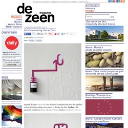
Update: this project is included in Dezeen Book of Ideas, which is on sale now for £12. Each month, a bottle of coloured ink spreads across a sheet of paper embossed with numbers, colouring them in as it goes. Ink Calendar will be exhibited at an exhibition called Sueños de un Grifo - Diseño con Alma de Agua that opens at the Círculo de Bellas Artes in Madrid today. See also our story about the Dramprom light by Roger Arquer that appears in the same exhibition.
Here's some info from Diaz: TITLE : INK CALENDAR DESIGNER: Oscar Diaz ( DIMENSIONS: 420 X 595 mm MATERIALS: Paper and ink. Project Description. Norwegian travel documents receive a minimal makeover. News: Oslo-based Neue Design Studio has won a competition to redesign Norway's passports and ID cards, a month after graphics by Snøhetta were chosen for the country's new bank notes.
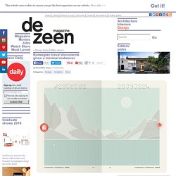
Neue Design Studio's proposal, based on the theme The Norwegian Landscape, was selected by a jury earlier this month as the winning scheme to overhaul Norway's travel documents for "the simplicity of the solution". "Of the submissions for the new Norwegian passports and ID cards, The Norwegian Landscape has been chosen as the best concept," said the jury's statement. "It both illustrates the Norwegian identity and makes sure the passport will be viewed as a document of high value. " Inside the passports, double-page spreads are illustrated with minimal images of landscapes from different parts of the country.
"Nature has always been an essential part of the Norwegian identity and tradition, as well as being a key fundament for our welfare," said Neue Design Studio. 3D Paper Art By Maud Vantours. A weekly illustrated atlas. 17 Practical Uses for Lego in Your Everyday Life.