
Why This Is An Excellent Resume. Example of a good CV. April 23 2016 , 1 Comment When it comes to writing a CV, it helps to have a solid example of a good CV to benchmark your own CV against.

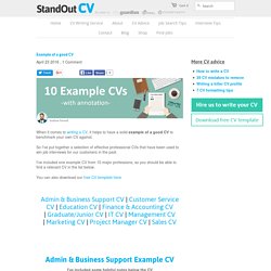
So I've put together a selection of effective professional CVs that have been used to win job interviews for our customers in the past. I've included one example CV from 10 major professions, so you should be able to find a relevant CV in the list below. When Infographics Meet Resume: 36 excellent examples. Resume | Self Promotion by Errol Veloso Infographic CV by Noor Akar Infographic Resume by Chen Zhi Liang My Resume by Gabriel Ghnassia Elegant Modern Resume by Ramzi Hachicho Infographic Curriculum by Andrea Cardinale Resume 2011 by Riccardo Sabatini Infographic Resume by Studio Creosoul Infographic CV by Gary Corr Resume / Curriculum Vitae by Genevieve Dennis Resume 2013 by Ezz Osman Infographic Resume by Qianhui Tan Self Promotion by Jai Mistry Personal CV by Alexander Raubo Self Promotion by Josh Brittain RM Brand Identity by Roland Martial SELF BRANDING || Infographics Resume by Insfire Studios Antonio Sortino (Logo, Business Card and CV/Resume)

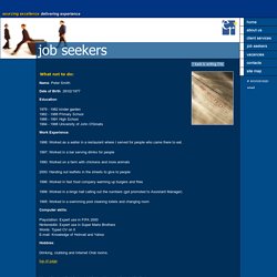
Example of a Bad CV. What not to do: Name: Peter Smith Date of Birth: 28/02/1977 Education: 1979 - 1982 kinder garden 1982 - 1988 Primary School 1988 - 1991 High School 1994 - 1998 University of John O'Groats Work Experience: 1998: Worked as a waiter in a restaurant where I served for people who came there to eat. 1997: Worked in a bar serving drinks for people 1990: Worked on a farm with chickens and more animals 2000: Handing out leaflets in the streets to give to people 1996: Worked in fast food company warming up burgers and fries 1999: Worked in a bingo hall calling out the numbers (got promoted to Assistant Manager) 1995: Worked in a swimming pool cleaning toilets and changing room Computer skills: Playstation: Expert use in FIFA 2000 Nintendo64: Expert use in Super Mario Brothers Words: Typed CV on it E-mail: Knowledge of Hotmail and Yahoo Hobbies: Drinking, clubbing and Internet Chat rooms.

Bad CV Examples. CV Advice The internet has changed the focus of a job search and just because your CV is nice on paper, it doesn't mean it's nice on a computer.

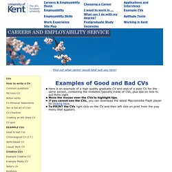
With stacks of CVs arriving in hiring managers' inboxes every day, they quickly grow to loathe some of the things they see. If you don't want your CV to be discarded, take heed of these things to avoid. Spelling errors and poor grammar You don't gain anything by getting it right, but you lose a lot when you get it wrong. Too duty-oriented If you're copying your job description into your CV, you're missing the point. Inaccurate dates Recruiters need to know when you worked where to get a better understanding of your working history and to use the dates for background checks. Inaccurate contact information. Examples of Good and Bad CVs. Here is an example of a high quality graduate CV and also of a poor CV for the same person, containing the mistakes typically made of CVs, plus tips on how to put them right.

Move the mouse over the CVs to highlight tips. If you cannot see the CVs, you can download the latest Macromedia Flash player by clicking here To PRINT the CVs right click on the CV and then left click on print from the pop menu that appears. How to write a good CV. CV formatting A good looking CV is much more likely to be read in full than one which looks a bit shabby or is laid out in a way that makes it hard to digest.

Before thinking about what makes a good CV from a formatting point of view, it is best to have it fully written and saved. If you are still in the process of writing your CV, first take a look at our video below on how to write a good CV. Once you have completed the writing of your CV, it is time to look at the ways in which you might present it. To make your CV stand out, consider the following: The layout The typeface The font size The most suitable CV format Layout Making your CV fit on one side of a page of A4 is a good approach if you have not had work experience before or have perhaps just had one job since leaving school. If possible, keep your CV layout to two sides of A4 and three at the most. Line breaks and bullet points are good ways of keeping the flow of your CV's layout visually appealing. Typeface Font Size. How to create infographic resume?