

Uxdesign.cc – User Experience Design. How Do Users Really Hold Mobile Devices? For years, I’ve been referring to my own research and observations on mobile device use, which indicate that people grasp their mobile phones in many ways—not always one handed.
But some of my data was getting very old, so included a lot of information about hardware input methods using keyboard- and keypad-driven devices that accommodate the limited reach of fingers or thumbs. These old mobile phones differ greatly from the touchscreen devices that many are now using. Gestalt Design Principles for Developers. UX Crash Course: 31 Fundamentals. My New Year’s Resolution for 2014 was to get more people started in User Experience (UX) Design.
I posted one lesson every day in January, and hundreds of thousands of people came to learn! Below you will find links to all 31 daily lessons. Basic UX Principles: How to get started The following list isn’t everything you can learn in UX. UDL Guidelines 2.0. The goal of education in the 21st century is not simply the mastery of content knowledge or use of new technologies.
It is the mastery of the learning process. Education should help turn novice learners into expert learners—individuals who want to learn, who know how to learn strategically, and who, in their own highly individual and flexible ways, are well prepared for a lifetime of learning. Universal Design for Learning (UDL) helps educators meet this goal by providing a framework for understanding how to create curricula that meets the needs of all learners from the start. The UDL Guidelines, an articulation of the UDL framework, can assist anyone who plans lessons/units of study or develops curricula (goals, methods, materials, and assessments) to reduce barriers, as well as optimize levels of challenge and support, to meet the needs of all learners from the start. A Case for Accessible, Usable and Universal Design for Learning. Issues of learning technologies and accessibility are more of a hot topic in our field than usual these days.
EdX recently reached a settlement with the Justice Department to make its website, course creation platform and mobile applications accessible under ADA. Harvard and MIT are facing a lawsuit for lack of online captioning for materials for the general public. Both generated significant conversations about disability accommodations and usability of learning technologies in our pedagogical communities and consortia. It is my hope that any resulting changes being considered and implemented on campus and beyond provide us with an opportunity to discuss not only disability accommodations but proactive approaches to learning design that is at once accessible, usable and universal. First, a clarification of terms: Introduction to User Interface Design (Part 1) - Georgia Institute of Technology. Visual design and colour accessibility - Webcredible blog. Making sure that text colours in your digital interface are accessible for your users is a really important aspect of a well executed visual design.
If you’ve ever been asked “I assume all the colours are accessible?” By your client and were unsure of what to answer, then this post is for you. The tips below will help you to comply with the W3C guidelines for text and colour so that you’ll always be able to make a confident response of “Of course!”. Visual design plays a large role in communicating the business’ proposition and personality. How to Build an Experience Map and Identify New Opportunities - Marvel Blog. An experience map shows the journey a customer has while experiencing a product or service.
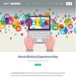
It also shows what competitors and your business are doing relative to this journey. Mapping the experience from a customer perspective helps organisations identify strategic opportunities, customer pain-points and generate innovative projects. Why build an experience map? An Experience map helps the organisation to see the bigger picture, and make decisions about where to focus activity based on research.
Digital Information - Examples. Conversational Interfaces / Tools.