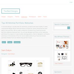

The Best Designs Collections - Top 40 Minimal Portfolio Websites. A minimal design is usually best for portfolios, projects and case studies.

A clean, uncluttered design allows featured works to stand out, which should be the main goal of any portfolio. We've made a collection of some of our favorite minimal portfolio websites featured here. You will see designer portfolios, artist websites, portfolios for projects or case studies, photographers, interior designers, architects and more. At the bottom of this list, we've added some of our favorite minimal portfolio themes from our theme shop partner. Enjoy! Pin ItTweetFacebook Designer: Sam Dallyn Designer: PH Digital Labs (PHDL) Designer: Alchemy Digital Designer: SocioDesign Designer: In-House / Unknown.
In Pursuit of the Perfect UX Portfolio. Radium - Portfolio by Cosmin Capitanu. Fakepaper. 7 Marketing Lessons from Eye-Tracking Studies #CRO. Who doesn’t love a good eye-tracking study?
With the ability to take a lot of guesswork out of conversion rate optimization, eye-tracking software and heat maps can reveal some startling insights into increasing conversions (and avoiding sales killers) that can benefit every business. Today we’re going to go over 7 important eye-tracking studies that give a sneak peek into common browsing patterns and elements of human behavior that all marketers need to know.
Let’s take a look! 1. Beware of “Dead Weight” with Visuals You don’t have to be an expert in UX (user experience) to understand the importance of Fitts’s law. While seemingly complicated at first glance, one of the fundamental lessons Fitts’s law communicates is that object “weight” (in the visual hierarchy) is a big determinant in what attracts eyes and mouse clicks. Consider this recent case study from TechWyse that examined the homepage of a truck service with a heat map: That’s no good. Much better! 2. Why video? 3. 4. 5. 6. 7.
Jargonbuster: mockups, wireframes, prototypes. It can be confusing differentiating the different phases of the design process, especially when the terminology is used so loosely.

But that's no excuse for a designer to not know the difference. While it might seem innocent enough, referring to a mockup as a wireframe is like a carpenter referring to a hammer as a screwdriver. Not knowing how to make a lo-fi prototype is like a surgeon not knowing where to cut. Wireframes, mockups, and prototypes are a designer's tools of the trade, and so should be learned inside and out.
This article will explain the basics: what each can do, why they're useful, some common methods for building each, and even some best practices. Don't miss this! So what's the freakin' difference? Wireframe => Mockup => Prototype That's a gross oversimplification, not taking into account the countless variables in between but for our purpose of explaining the basics, it's a good foundation. Again this is an oversimplification and not a rule set in stone. 01.
Benefits. Do Publishers Need to Rethink the Format of Comics? - SKTCHD. For a relatively large marketplace, the comic industry is a static one.

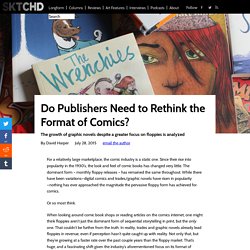
Since their rise into popularity in the 1930’s, the look and feel of comic books has changed very little. The dominant form – monthly floppy releases – has remained the same throughout. While there have been variations—digital comics and trades/graphic novels have risen in popularity—nothing has ever approached the magnitude the pervasive floppy form has achieved for comics. Or so most think. When looking around comic book shops or reading articles on the comics internet, one might think floppies aren’t just the dominant form of sequential storytelling in print, but the only one.
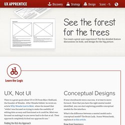
But why is that and where is it coming from? Note: monthly comics will be referred to as floppies throughout the article while trades, collections and graphic novels will be labeled graphic novels. Reading the Tea Leaves There are simple explanations one could use to explain this, of course. Some comic fans may not even know who she is. Strategy : UX Apprentice. UX, Not UI There is a great quote about UI vs UX from Marc Hedlund, the founder of Wesabe.

After Wesabe folded, he wrote an article Why Wesabe Lost to Mint, where he mused that “while I was focused on trying to make the usability of editing data as easy and functional as it could be; Mint was focused on making it so you never had to do that at all. Their approach completely kicked our approach’s ass.” Finding the Kick Ass Approach Time to reconvene with your team for an interactive strategy session. Go broad and brainstorm possible solutions to your customer’s pain points. Expert Tip: Try starting sentences with “Wouldn’t it be cool if insert persona name here could just…?” Storyboarding 101 Once you’ve identified some possible solutions, storyboards can offer a quick way to get feedback on which ideas resonate with your users. See tips for how to craft a story, how to use Mockups in your Agile user stories, and a cautionary tale on how thrilled users ruin design scenarios.