
A Saatchi & Saatchi Project for Students, Educators and Marketers. Estratégico, Operativo y Sectorial. El lujo en la Decoración de escaparates, el escaparatismo y visual merchandising. Www.retailstorewindows.com. Congreso Internacional de Visual Merchandising 2013. El Congreso Internacional de Visual Merchandising es su conexión con los innovadores, que le proporcionarán nuevos productos y oportunidades de negocios para que su marca tenga éxito.

A través de las últimas tendencias, tecnologías y educación en el visual merchandising, descubrirá el mundo real de soluciones prácticas para mejorar la experiencia "retail" y el contacto con el comprador. Hoy en día, con el nuevo giro que ha tomado el marketing, es impensable diseñar sin estrategia. El cliente ya no elige un producto sólo por la ecuación costo-beneficio sino por la experiencia que vive al comprar. 5 Star Plus Retail Design. Marissa wood - creative retail & events. Another Normal - The Art of Window Displays, New York City & Beyond - photographed by Rudy Pospisil. Escaparatismo - decoracion para escaparates - decoracion para tiendas. VISUAL MERCHANDISING DESIGN. L'école supérieure en communication visuelle, spécialisation en Visual Merchandising Design forme ses apprenants à travers des partenariats– entreprises suisses et internationales.

Ce qui garantit une mise à jour permanente des contenus pédagogiques adaptés au terrain professionnel en constante évolution, ainsi que des premiers contacts concrets pour l'étudiant avec des mandataires des différents domaines en Visuel Merchandising; comme le luxe, la grande distribution et l'évènementiel, ceci tout en étant accompagné par des enseignants et intervenants spécialisés lors de l'acquisition de ses futurs compétences professionnelles.
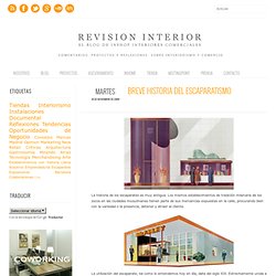
Informations pour les entreprises sur le partenariat (pdf 659 Ko) Ce travail en réseau permet de concrétiser des travaux de recherche, la réalisation de mandats et les échanges de compétences. Le champ d'action établi pour ces collaborations distingue quatre domaines: Candy Shop Design that looks like a drawing by Red Group - Looks Feels WorksLooks Feels Works. Méchant Design. Specialising in retail display and merchandising solutions. Retail Store Lighting. Retail Design & Retail Branding Agency « M Worldwide. Mannequins, Goldsmith Mannequins, Fashion Mannequins. Trend Tablet. Breve Historia del Escaparatismo. La utilización del escaparate, tal como lo entendemos hoy en día, data del siglo XIX.

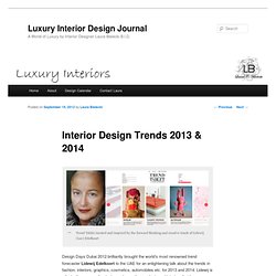
Interior Design Trends 2013 & 2014. Trend Tablet curated and inspired by the forward thinking and creative touch of Lidewij (Lee) Edelkoort Design Days Dubai 2012 brilliantly brought the world’s most renowned trend forecaster Lidewij Edelkoort to the UAE for an enlightening talk about the trends in fashion, interiors, graphics, cosmetics, automobiles etc. for 2013 and 2014.

Lidewij is a fantastic resource for designers in creating products and interiors that have longevity past the current year as she forecasts ahead by at least 2 years. An inspirational design leader shared some of Lidewij’s main points as they relate to the future trends in Interior Design with me. I thought it best to share a few of them with you as I have begun to see many of these trends emerging, most noteably with the recently held ISaloni furniture, kitchen and bath show in Milan and Maison & Objet in Paris. 2013 Color Forecast - Colormix™ 2013 by Sherwin. The Creativity Window – Graphic Design & Visual Merchandising. Visual Merchandising and Store Design. Skintone Guide - 100 real skin colors chart from Pantone color for cosmetics, fashion and designers. An exciting new collection of 110 skin tone shades for inspiration and use in any application where skin tone needs to be matched to a color standard.

The PANTONE SkinTone Guide was created by scientifically measuring thousands of actual skin tones across the full spectrum of human skin types. Specially formulated to be the closest physical representations of skin colors, the library is a comprehensive visual reference of human skin tones for use in any market where skin colors are relevant. It's the only internationally available color standard to accurately match skin tones.
The PANTONE SkinTone Guide Numbering System. Visual Merchandising Trends. Fashion Trendsetter. SPINEXPO. Visual Merchandising. Store Design: Omonia Bakery by Bluarch Architecture. The Omonia Bakery designed by Bluarch Architecture is located at Queens, New York, USA. It is a 1,000 square foot state of the art store design featuring mainly the 1/4 inch mosaic chocolate brown Bisazza tile finish on the ceiling and walls. Thanks to this fluid space the bakery has captured the attention of many. The tiling is a retail design of Astoria’s Omonia Café with bubbles and curves that goes around mid-way down the main walls. It ends with different heights meeting a shelf. This minimalist commercial design allows customers to settle down while enjoying their chosen treats.
The shelf on this amazing store is emphasized by the LED light strips navigating the transition on the chocolate surface. The LED light emerged from the ceiling in a series of ambient six inches incandescent light bulbs hanging vertically from the ceiling. The epoxy flooring of the bakery extends up to the walls through the filleted corners. Modular systems for commercial interiors. Retail Design Blog. K8 Vision. A History of Visual Merchandising in Retail Stores. The rise of the department store, or grand emporium, in the 19th century brought more changes in store design and visual displays.

The early department stores continued with the idea of displaying merchandise in elaborate and luxurious setting. Techniques that were previously used in small dry goods stores, expositions, and arcades were experimented with, and either used or rejected. The department stores of the 19th century transformed the concept of visual merchandising in four ways. In doing so, merchandise display was made one of the most important aspects of the shopping experience. The World Expositions only occurred every few years in a small number of large cities throughout Europe, and, eventually, in the United States.
The second transformation that the early department stores made was in the use of luxurious store interiors that surpassed even the most lavish arcade. These early department stores strived to exude a sense of luxury, even if it was just an impression. Marketing Jazz. TWOSEVEN INC. Márketing. Branding & Visual Merchandising - Empresa. ADD Inc - Retail & Entertainment Portfolio - New Balance Factory Outlets.