

How the human eye reads a website. In this article, Chris Bank of UXPin — the wireframing & prototyping app — explains the theory and practice of creating visual hierarchies in web UI design.
For analysis of UI examples from over 33 companies, check out the free ebook Web UI Best Practices. More than being creative, a good artist must also consider subtleties like composition, colors, size, what to include, and — perhaps more importantly — what to leave out. That's no easy feat, which is why we hold the masters like da Vinci and Van Gogh in such high regard. Web UI designers must do the same. As discussed in our free ebook Web UI Best Practices, a website is a form of visual art in its own right, and follows many of the same rules as more traditional artforms. In this article we'll first look at what visual hierarchy is and how it's achieved, then we'll look at how that works in relation to the natural movement of the human eye.
Event promotion Visual organization The end goal of your UI design is to answer three questions: The ultimate guide to information architecture. Information architecture is equal parts art and science.
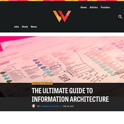
Whether you hire a dedicated IA professional, or just sort of let IA happen on your projects, if you’re designing things with content, you’re using IA. But while you can just kind of “let the content happen,” in whatever way seems to make sense for your project at the time, a well-thought-out, well organized structure for your content can make your site infinitely more usable for your end users. While not every project can have a dedicated IA, understanding the basic principles behind good information architecture can go a long way toward making sure your site’s content is as easy to access and use as possible. What is information architecture? Information architecture encompasses a few related concepts. The ability to create an information structure that makes it easy for users to find what they are looking for is key for any information architect.
A Beginner’s Guide to Understanding UX Design. If you are thinking of working on your conversion optimization and landing page optimization, understanding UX design is essential.
As you know, we write a lot about the user, the single visitor that arrives on your site or landing page and needs to be triggered and helped around. UX design helps make sure that during this process the most important person isn’t left out of the mix: The user. Thank You - Bluewire Media. Instantly download your Website Checklist for Graphic Designers below: Adam Franklin & Toby Jenkins Thanks for downloading the Website Checklist for Graphic Designers.

We hope you find it valuable! Click to tweet this template >> It’s also been sent to the email address you supplied, so you’ve got a copy you can come back to. Thanks, Adam Franklin & Toby Jenkins PS. Web Design 101: How HTML, CSS, and JavaScript Work. Ever wondered how computer programming works, but haven't done anything more complicated on the web than upload a photo to Facebook?
Then you're in the right place. To someone who's never coded before, the concept of creating a website from scratch -- layout, design, and all -- can seem really intimidating. You might be picturing the Harvard students from The Social Network, sitting at their computers with gigantic headphones on and hammering out code, and think to yourself, I could never do that.
15 Examples of Brilliant Homepage Design. You never get a second chance to make a first impression -- that’s why your homepage is undoubtedly one of the most important web pages on your website.
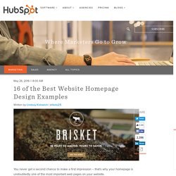
For any given company, the homepage is its virtual front door. If a new visitor doesn't like what they see, their knee-jerk reaction is to hit the "back" button. That's right -- unfortunately, a lot of people still judge a book by its cover. What makes a website's homepage design brilliant instead of blah? Well, it takes more than looks alone -- it also has to work well. Download our full collection of website homepage examples here to inspire your own homepage design.
But before we dive into the 16 examples, let's dissect some of the best practices of homepage design. What Makes a Good Website Homepage Design All of the homepage designs shown here utilize a combination of the following elements. What You Can (and Should) Ask for on Your Landing Page Forms. Your lead generation forms can make or break your online conversion goals.

Because of this, very few other page elements receive quite as much attention as the lead-capture form. In fact, 56% of marketers consider optimizing form logic to have a very significant impact on website performance, and another 46% consider optimizing their form layout to have a very significant impact as well, according to MarketingSherpa. So why is the form so vital? Well, it’s basically the entire point of a landing page -- and the entire crux of lead generation! We marketers need our prospects to provide us with their contact information, because once we have that, we can define these people as leads and funnel them into our various marketing campaigns. How to Design a Site Structure Visitors AND Search Engines Love. Examples of Brilliant Homepage Designs.
The 7 Elements of Modern Web Design. Every year, we see new elements and styles in website design begin to emerge.
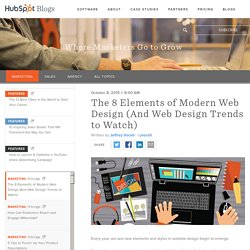
Some elements -- when incorporated thoughtfully -- help tell stories and explain your company. Other elements work to improve how content looks on a specific device. While it's not necessary to include every trend that comes about on your website, many of them have the potential to improve your visitor's experience. But with so many options to choose from, it can be challenging to determine which ones are really worth considering. The Non-Designer's Essential Glossary of Web Design Terms. When I started my first job, I did everything my tiny marketing team needed at a moment's notice.
Although I was more experienced in blogging and social media management, I was soon pulled into design projects. One day I was mocking up an infographic; the next, I was designing an ebook, and then the day after, I was creating and ordering custom die-cut stickers ... and I was woefully unprepared. I had no idea what the difference was between HTML and CSS, JPEGs and PNGs, or fonts and typefaces. When I was speaking with our in-house designer or an outside contractor, I felt so silly. How to Develop a Website Redesign Strategy That Guarantees Results [+ Free Template] So ... you want to redesign your website .
![How to Develop a Website Redesign Strategy That Guarantees Results [+ Free Template]](http://cdn.pearltrees.com/s/pic/th/redesign-strategy-guarantees-48359037)
A redesign can be a huge success -- or a total flop . It can also be a long and tedious undertaking, which is why every redesign needs to start with a clear vision and/or problem to solve. And the better you are at defining that vision at the very beginning, the more successful your redesign will be -- and the smoother the entire process will be as well.