

W3C Sites - Web sites created by designers that conform with W3C standards. 45 Incredibly Useful Web Design Checklists and Questionnaires. 10 Ways to Be a More Productive Web Developer. We could all be more productive.
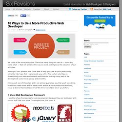
There are many things we can do — some big, some small — that will enhance the way we work and improve the outcomes of our activities. Although I can’t promise that I’ll be able to help you cure all your productivity ailments, I do hope that I can provide you with a few useful, solid tips on streamlining your web development workflow and making every part of the development cycle move quickly and smoothly. Creating Web Design Wireframes: Tools, Resources, and Best Practices. Wireframes can be one extra step in the beginning of any web design project that can save a significant amount of time later on.
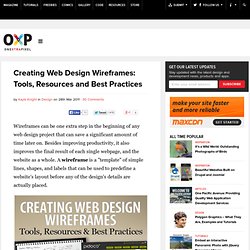
Besides improving productivity, it also improves the final result of each single webpage, and the website as a whole. A wireframe is a "template" of simple lines, shapes, and labels that can be used to predefine a website's layout before any of the design's details are actually placed. Editing a simple wireframe in order to change a layout can be a lot simpler than trying to change the layout of a final coded design, or even a PSD.
Of course, this is both true for personal and client projects. Showing a client a wireframe at the beginning of the design phase can allow the client and designer to collaborate more efficiently on the final content placement, and come to a set agreement to make the design process smoother, and reduce the number of major revisions. 10 Beautiful Examples of Responsive Web Design. These days, everyone is consuming content differently.

My mom has a netbook, I have a laptop, my friend has a 27″ iMac, my girlfriend and I have smartphones and her mom has an iPad. Since your content is now being viewed on more devices and browsers than ever before, you have to design it with that in mind. Websites that adapt to things like screen sizes and operating systems are known as responsive designs, and this list of 10 sites shows off the future of the flexible Web. Bread & Pepper Bread & Pepper is a software company that creates simple interfaces with spicy code. ➤ Bread & Pepper Though most browser windows aren’t constantly dragged around, it’s nice that this site adjusts seamlessly (never jumpy). Food Sense The logo bounces from the side to the top-center on this site. ➤ Food Sense (via Splashnology) Jux ➤ Jux.
My Mommy Says I'm Special. <script type=”application/processing” target=”canvasName”><script type=”application/processing” target=”can010101”>int circX, circY;void setup(){size(500, 280);fill(255);circX = width/2;circY = height/2;} void draw({ellipse(circX, circY, 100, 100);circX=mouseX;circY= mouseY;if(mousePressed)fill(mouseX +mouseY);}</script><canvas i d=”can010101” width=”500px” height=”280px”></canvas> <script type="application/processing" target="canvasName"><script type="application/processing" target="can010101">int circX, circY;void setup(){size(500, 280);fill(255);circX = width/2;circY = height/2;} void draw(){ellipse(circX, circY, 100, 100);circX=mouseX;circY= mouseY;if(mousePressed)fill(mouseX +mouseY);}</script><canvas i d="can010101" width="500px" height="280px"></canvas> Notes: 5564 Notes: 1409 Notes: 1 Notes: 150308.
The Evolution of the Facebook Profile [PICS]
Color Scheme Designer 3. 9 places to get inspiration for your website’s color palette. Color, one of the seven elements of art, is an important aspect of every design. It is so impactful that designers often neglect other elements, such as form and value, to the detriment of their work. Since color has a massive impact on your viewers, it is important know your theory and even a little psychology. Warm colors give off a fiery message, while cool colors have a calming affect. Analogous color schemes, often found in nature, are pleasing to the eye, while complementary color schemes have a more energetic feel.
No matter what color palette you decide on, it should reflect your intentions, and capture the perfect feeling you’re going for. Wear Palettes Looking outside your area of expertise helps you discover different ways of tackling the same problem. . ➤ Wear Palettes. 5 Ways to Start Learning How to Code Right Now. Learning to code is one of the most powerful and satisfying things you can ever do.
If you’re a designer, learning to code can help you understand what you’re creating for, and if you’re looking to build a startup from scratch, being a technical founder can make things exponentially easier for you. No matter why you want to learn, the only thing you really need is curiosity. But if you’re just starting out as a novice and don’t know where to begin, there are plenty of ways to get started. We presented this list of 7 ways to start learning how to code right now for free last month, and now we’re back with 5 more ways to start coding for free!
iTunes U Apple just recently made some dramatic changes to iTunes U, and Stanford’s set of videos is quite an impressive offering. . ➤ iTunes U Kids Ruby. NounProject: 100's of Free Pictographs for Designers. 2 February '12, 07:59pm Follow Pictures often speak louder than words, and if you take a look at the way-finding symbols that surround any given urban area, you’ll see how visual representations reach beyond cultural and language barriers, communicating ideas instantly.
The Noun Project has been building a catalog of these types of symbols for quite a while now, and just last week it released new features to its site that let you to see the most popular symbols, watch real-time downloads and browse recent submissions. If you have never heard of The Noun Project, all you need to do is imagine hundreds of gorgeous black and white symbols that are completely free for anyone to use. What will our (future) interfaces feel like? The visual language of our interfaces has gone through a lot of changes over the past decade.
Remember what the Web 2.0 interfaces felt like? Giant type, ginormous forms, and buttons that would make Fitt’s Law insignificant. God forbid you went off task or didn’t know exactly what to do next. Icons lined our digital streets (and still do in some parts). Need to cancel something? These days it’s about the content. “Nothing says Send Message, like the words “Send Message”. Gestural Interfaces: A Step Backwards In Usability. One step forward, two steps back.
The usability crisis is upon us, once again. We suspect most of you thought it was over. After all, HCI certainly understands how to make things usable, so the emphasis has shifted to more engaging topics, such as exciting new applications, new technological developments, and the challenges of social networks and ubiquitous connection and communication. Well you are wrong. In a recent column for Interactions (reference 2) Norman pointed out that the rush to develop gestural interfaces - "natural" they are sometimes called - well-tested and understood standards of interaction design were being overthrown, ignored, and violated. Recently, Raluca Budui and Hoa Loranger from the Nielsen Norman group performed usability tests on Apple's iPad (reference 1), reaching much the same conclusion.
Why are we having trouble? · The lack of established guidelines for gestural control · Visibility (also called perceived affordances or signifiers) · Feedback · Scalability. Clear: A To-Do List App With A UI From The Future. To-do list apps are lame.

Why? Because managing the system--learning how to input items, strike them out, sync them, tag them--is often more complicated than low-tech methods like writing something on a Post-it. But people still keep inventing them. The latest, an iPhone app called Clear, is at least interesting for what it doesn’t do. It doesn’t sync. As you can see from the demo video, Clear boils basic to-do list functionality down to something like a pure sensory experience. Interaction-design greybeards like Donald Norman and Jakob Nielsen would say Clear’s gestural UI breaks two fundamental rules: "Visibility (also called perceived affordances or signifiers)" and "Discoverability: All operations can be discovered by systematic exploration of menus. " But designer Francisco Inchauste disagrees.