
What Japanese Etiquette Can Tell Us About Good UX Design. The connections between hospitality and design are well known.

Charles Eames once remarked to his contemporary and collaborator Eero Saarinen that "the role of the architect, or the designer, is that of a very good, thoughtful host, all of whose energy goes into trying to anticipate the needs of his guests. " I hit on a similar idea (much less elegantly and succinctly than Eames) in my critique of delight as an interaction design value. But how can you operationalize this concept of "being a good host" in the constantly shifting context of mobile digital interfaces?
Seven years ago, a Panasonic interaction designer named Kerstin Blanchy was wondering the same thing. As a westerner working in Yokohama, Japan, she became inspired by the cultural concept of motenashi (or omotenashi), a traditional code of conduct outlining the ideal guest-host relationship. Shitsurai, or "preparations for the guest," describes structures that put the guest at ease. Fumihiko Sano creates ritualistic space for gift wrapping service. Members of a private club pay to exchange elaborately wrapped presents in ceremonies held inside this dimly lit, wood-lined room in Paris (+ slideshow).

Japanese architect and founder of Studio Phenomenon Fumihiko Sano designed the wood-lined interior for MIWA, a members club in the Saint-Germain-des-Prés district of Paris. The Japanese cultural club specialises in a type of decorative and ceremonial gift wrapping called origata – where presents are covered in elaborately folded paper before being presented to recipients. The process originated in Japan around the 14th century, when followers of the Shinto religion decoratively wrapped their offerings to deities. Complex folding techniques are used to cover the gifts, with no sticky tape or glue. The intricately manipulated paper is bound by lengths of red and white twine, representing the opposing but balancing forces, Yin and Yang.
Kenya Hara on the 21st Century as an Age of Discovery, Making the Ordinary Unknown & Imagining the Future at 6.8. We all have myriad seeds of thoughts and ideas lying dormant or actively sprouting in every nook and recess of our brains.

Over time, some of these seeds will erupt into full-blown concepts and form relationships with other kernels of thoughts. My favorite phase of the creative process is what I have come to term the ‘festering’ phase. In the festering phase, two or more kernels of ideas start to hatch, and one can almost feel the ideas pecking at the membranes that isolate them, seeking to break out of their containers to intertwine with other ideas and concepts. Wabi sabi perfectly imperfect (front runner for my next tattoo. Mori Inc. ( 株式会社もり ) Decoding the cult of Muji, the Japanese minimalist retailer. The sets of colouring pencils and felt-tip pens notwithstanding, the fiery red stanchion snaking inside the mall on press preview night is the most colourful thing about the new Muji store.

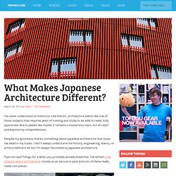
The retailer has 385 locations in Japan and 255 elsewhere, now including its first Canadian store, in Toronto, a stone’s throw from the Eaton Centre. Since 1980, the retailer has built a cult following by offering what you might call affordable restraint. What Makes Japanese Architecture Different? I’ve never understood architecture.

Like fine art, architecture seems like one of those subjects that requires years of training and study to be able to really, fully appreciate. But to plebes like myself, it remains a mysterious topic, out of reach and beyond my comprehension. Despite my ignorance, there’s something about Japanese architecture that stops me dead in my tracks. I don’t always understand the history, engineering, theory, or artistry behind it all, but I’m always fascinated by Japanese architecture. The Design Philosophies of Toshiyuki Kita and Naoto Fukasawa. A warm welcome to you dear reader!

If you have not already, why not subscribe to The Design Sojourn Newsletter and get my latest thoughts on Strategies for Good Design conveniently delivered right to your inbox? It's free! You can also follow me on Twitter and Facebook as well. Thanks for visiting and please keep in touch? Our resident contributor py, inspired by “Theories behind Japanese Designs” writes about the time spent working in Japan with Naoto and Kita, and how they have applied such Japanese design theories into their work.
Japanese Style Interior Design. 7 Japanese aesthetic principles to change your thinking. 7 Principles Of Japanese Interior Design - Spacious Planet. Japanese interior design is not easy to define. It encompasses both traditional Japanese design and modern. Japanese interior design also incorporates countless styles and design elements that are not easy to draw into a single definition. However, there are several principles that are common features of Japanese interior design: 7 Japanese Aesthetic Principles to Change your Thinking.
Design Principles FTW. The Design Philosophies of Toshiyuki Kita and Naoto Fukasawa. Kenya Hara On Japanese Aesthetics. By Oliver Reichenstein What makes Japanese design so special?

Basically, it’s a matter of simplicity; a particular notion of simplicity, different from what simplicity means in the West. So are things in general better designed in Japan? Well, actually, it’s not that simple… The New York Times asked us to put them in touch with Kenya Hara, creative director of MUJI and professor at the Musashino Art University. How Japanese Culture influences their Designs. A warm welcome to you dear reader!

If you have not already, why not subscribe to The Design Sojourn Newsletter and get my latest thoughts on Strategies for Good Design conveniently delivered right to your inbox? It's free! You can also follow me on Twitter and Facebook as well. Thanks for visiting and please keep in touch? Three marks of existence. The Three marks of existence, within Buddhism, are three characteristics (Pali: tilakkhaṇa; Sanskrit: trilakṣaṇa) shared by all sentient beings, namely: impermanence (anicca); suffering or unsatisfactoriness (dukkha); non-self (Anatta).

There is often a fourth Dharma Seal mentioned:[citation needed] Together the three characteristics of existence are called ti-lakkhana in Pali or tri-laksana in Sanskrit. By bringing the three (or four) seals into moment-to-moment experience through concentrated awareness, we are said to achieve wisdom—the third of the three higher trainings—the way out of samsara. Thus the method for leaving samsara involves a deep-rooted change in world view. Anicca[4][edit] [Pronounced Anitcha/Anitya] All compounded phenomena (things and experiences) are inconstant, unsteady, and impermanent. Dzongsar Jamyang Khyentse Rinpoche states that in the four seals of the Mahayana, Nirvana should be viewed as "beyond extremes".
Impermanence. Impermanence (Pāli: अनिच्चा anicca; Sanskrit: अनित्य anitya; Tibetan: མི་རྟག་པ་ mi rtag pa; Chinese: 無常 wúcháng; Japanese: 無常 mujō; Korean: 무상 musang; Thai: อนิจจัง anitchang, from Pali "aniccaŋ") is one of the essential doctrines or three marks of existence in Buddhism.

The term expresses the Buddhist notion that all of conditioned existence, without exception, is transient, or in a constant state of flux. Theories behind Japanese Design. A warm welcome to you dear reader! If you have not already, why not subscribe to The Design Sojourn Newsletter and get my latest thoughts on Strategies for Good Design conveniently delivered right to your inbox? It's free! You can also follow me on Twitter and Facebook as well. Thanks for visiting and please keep in touch? Interview Archives. YTU #1 - Kenya Hara's design philosophy. A case study of Kenya Hara’s design philosophy Objectives: l By discussing the case study of this famous Japanese designer, learn two of the most important creative concepts of his design philosophy – Redesign and Haptic, to think different, through introductions of several interesting examples from exhibitions directed by Kenya Hara. l By practicing the activities within the concepts and ideas, let people implement the concepts they learn in this case study to solve the challenges and problems we are encountered in daily life, thus get a deeper understanding on Hara’s creative philosophies.
Japanese Garden - The Helpful Gardener. Design Principles There are certain intrinsic principles that one needs to grasp to successfully capture the spirit of the Japanese garden. Most importantly, nature is the ideal that you must strive for. You can idealize it, even symbolize it, but you must never create something that nature itself cannot. For example, you would never find a square pond in the wild, so do not put one in your garden. You may certainly use a waterfall, but not a fountain. Another key point to remember is balance, or sumi. Rocks can represent whole mountains, pools become lakes. How Japan Copied American Culture and Made it Better. Kenya Hara: the future of design.
Sitting at a plain white table in a meeting room high up on the 12th floor of a narrow building in central Tokyo, product designer Kenya Hara asks me to picture a shallow plate in my mind. “Now imagine a slightly deeper plate,” Hara says, “that gets deeper and deeper and eventually becomes a bowl.” Hara is dressed in a crumpled black suit that is thrown over the top of a simple black T-shirt. He is rarely seen in public wearing anything else. He looks at me through a pair of tiny round glasses as he continues speaking. “Now see the bowl get deeper and deeper and deeper,” he says, “until it turns into a cup.” I’m sitting opposite the country’s most important living thinker on contemporary design, but he is far away, quietly visualizing a plate turning itself into a cup.
BODW 2010 Conference Digest 設計營商周2010 論壇精選. ARTINFO Goes to China — Kenya Hara at Beijing Center for the Arts. Theories behind Japanese Design. 7 Design Principles, Inspired By Zen Wisdom. One of the best-known photographs of the late Steve Jobs pictures him sitting in the middle of the living room of his Los Altos house, circa 1982. There isn’t much in the room, save an audio system and a Tiffany lamp. Jobs is sipping tea, sitting yoga-style on a mat, with but a few books around him. The picture speaks volumes about the less-is-more motive behind every Apple product designed under his command. Interface Design based on the philosophy of Japanese Hospitality.
The Craftsman - A Reflection of the Japanese Spirit. Horikitsune – Official website. Mingei. Mingei (民芸, lit. Yanagi Sōetsu. The Unknown Craftsman: A Japanese Insight Into Beauty - Muneyoshi Yanagi. Designing Design – Kenya Hara. “Creativity is to discover a question that has never been asked. If one brings up an idiosyncratic question, the answer he gives will necessarily be unique as well.” – Kenya Hara , Designing Design . This philosophy is the thread that runs through the entire text of Kenya Hara’s deep and thoughtful book, Designing Design (Amazon: US | DE ).
The book begins with several exhibitions that Hara organised and for which he devised the question that should be answered. Another look at a key Japanese principle. Butagumi 豚組- Tokyo, Japan. こだわり、極める。。。 Kodawari, Kiwameru… These are 2 principle words which define Japanese artistry and culture, and is especially true of Japanese cuisine.
One must understand the intention behind these 2 words in order to truly appreciate the beauty of Japanese food. こだわりKodawari means an uncompromising and relentless devotion to pursuing something. It is when special consideration and attention is given to a particular subject matter.