

I Heart Frameworks! When we tackle a new design challenge, we are constantly faced with making sense of new domains, complex information, and huge data sets – in a very short amount of time.
Imagine trying to understand how to help diabetes patients better manage their care. Frameworks can be used as tools to understand complex problems such as these because they: Allow us to quickly organize and broaden our thinking about complex problemsProvide a starting point to leverage rich work from other fields of studyForce us to focus on the most important point of what we want to communicateAre visual in nature, making information easier to comprehend and remember.
Using frameworks to broaden our thinking Frameworks help us during the initial ‘understanding’ phase of the design process to architect our research. Tip: Apply several different frameworks to ensure breadth. Using frameworks to organize and analyze insights Using frameworks can also allow us to organize insights as we collect them. Final words. No More Bad Workshops. Over the course of my career I have lost a good year of my life that I will never get back.
I lost time to poorly run meetings without clear goals. I lost time to product “brainstorm” workshops that yielded nothing more than poorly defined wish lists. I lost time to meetings where people were more interested in asserting their opinion than understanding a problem space. Nine rules for running productive design critiques. This article was originally published at Fast Company.
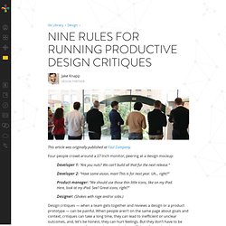
Four people crowd around a 27-inch monitor, peering at a design mockup: Developer 1: “Are you nuts? We can’t build all that for the next release.”Developer 2: “Have some vision, man! This is for next year. Uh… right?” Vital Elements of the Product Design Process. Product design can look like magic.
When I started doing it ten years ago, the small team I worked on made decisions intuitively. There was no system and it worked fine. But as the company grew, I found myself unblocking teams and diagnosing problems. When I saw patterns repeating themselves I decided to codify the questions I was asking. I hope that by sharing my techniques, people will learn to unblock themselves and diagnose their own product design problems. The categories I introduce below aren’t arbitrary. You can broadly separate product design into two phases. 50 Selected Design Methods. About the author: Rob Curedale was born in Australia and worked as a designer, director and educator in leading design offices in London, Sydney, Switzerland, Portugal, Los Angeles, Silicon Valley, Detroit, and China.
He designed and managed over 1,000 products and experiences as a consultant and in-house design leader for the world's most respected brands. Rob has three decades experience in every aspect of product development, leading design teams to achieve transformational improvements in operating and financial results. Rob's designs can be found in millions of homes and workplaces around the world. 50 Brainstorming Methods. About the author: Rob Curedale was born in Australia and worked as a designer, director and educator in leading design offices in London, Sydney, Switzerland, Portugal, Los Angeles, Silicon Valley, Detroit, and China.

He designed and managed over 1,000 products and experiences as a consultant and in-house design leader for the world's most respected brands. Rob has three decades experience in every aspect of product development, leading design teams to achieve transformational improvements in operating and financial results. Rob's designs can be found in millions of homes and workplaces around the world. Mapping Methods. About the author: Rob Curedale was born in Australia and worked as a designer, director and educator in leading design offices in London, Sydney, Switzerland, Portugal, Los Angeles, Silicon Valley, Detroit, and China.
He designed and managed over 1,000 products and experiences as a consultant and in-house design leader for the world's most respected brands. Rob has three decades experience in every aspect of product development, leading design teams to achieve transformational improvements in operating and financial results. Rob's designs can be found in millions of homes and workplaces around the world. Learning to See. By Oliver Reichenstein Learning to design is learning to see, an adventure that gets more and more captivating the further you go. A love letter to my profession… Our mind is not a camera. Seeing is not a passive act. Google’s Dead-Simple Tool For Making UX Decisions: 2 Jars Of Marbles. Nothing is perfect.
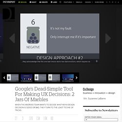
So even for the most successful platforms, design needs to continuously evolve. But beyond mere gut instinct or that ephemeral talent of taste, how can you know when a design decision is good or bad? How can you be sure that change is actually for the better and not for the mere sake of change? As it turns out, Google’s Android User Experience team has a fantastic trick to settle these debates. In their presentation at Google I/O, the designers shared it with the rest of the world. It starts with a mindset, that every design decision they make affects user emotion in a positive or negative way. With that 3:1 ratio in mind, Google sets up two jars (maybe metaphorically--we couldn’t quite tell). Yves Behar on skeuomorphic design and Apple at 100% Design. Developing hardware and software at the same time is design's "new frontier", according to industrial designer Yves Behar.
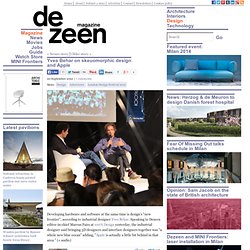
Speaking to Dezeen editor-in-chief Marcus Fairs at 100% Design yesterday, the industrial designer said bringing 3D designers and interface designers together was "a whole new blue ocean" adding, "Apple is actually a little bit behind in that area. " (+ audio) "What I've been really interested in is, when these things get designed together, as one, really new interesting paradigms, really new interesting experiences are happening," said Behar. "And let me say just one thing; probably it's going to be a little bit provocative: nobody is really doing that today.
Even Apple is designing their product and their software separately. " Behar rejected the "skeuomorphic" approach adopted by companies including Apple, which has led to the grainy leather-effect Calendar and wood-effect bookshelf applications in its products. How to Identify the Best Design Problems. One of the core principles of UX is to solve existing problems, or problems that people are already struggling with.
While this might not be as glamorous as inventing a brand new thing it is more practical: it makes identifying problems easier and people are much more receptive to your design. If you’re solving a known problem you don’t have to convince anybody that your design is valuable…they already know exactly why they want to use it. Unfortunately, there are far more problems than there are designers to solve them. So how do you know you’re solving a problem that’s worth solving?
How do you know that the problem you’re trying to solve is a real pain point that people will pay money for? From Google Ventures: 4 Steps For Combining The Hacker Way With Design Thinking. Jake Knapp is like the middle-school teacher everyone should have had. Tall, with clear blue plastic glasses, he holds a classroom-clock-sized timer like a football while explaining the first activity of the day: an exercise called "Crazy 8s" that involves drawing eight different solutions, with 40 seconds for each, to address one design challenge.
On a whiteboard nearby, he’s sketched out a five-step game plan for redesigning the Blue Bottle Coffee website. Below the first box in the schedule, labeled “Understand,” there’s an unsure emoticon. It turns to a smiley face by the next step, “Diverge," sticks its tongue out for “Decide,” sports a toothy grin under “Prototype," and alternates between despair and glee under “Validate.” Blue Bottle, I am told, is currently somewhere between the number two and number three emotional states. “Yeah, yeah, that was years ago,” Knapp responds. They’re not. 1. “You can talk about, ‘Ooh, should we do a scrolling page or a step-by-step?’ 2. 3. 4. Taking Action with 99U. Recently, Behance Network held their two-day annual conference, the 99U . The entire mission of the conference is to focus on bringing ideas to life through action – as Thomas Edison is famously quoted: “Genius is 1% inspiration, 99% perspiration.”
Method held the kick-off studio session for the conference with a workshop that aimed to get attendees taking ideas to action. We led participants through a 90-minute Lightning Brand Hackathon, working through potential design opportunities for IKEA and Airbnb. We quickly broke attendees up into groups of 7-8 to dive deep into their assigned brand. The goal was to develop uniquely branded product and service experiences that engage users in ways that are authentic to the brand and true to the core brand values.
The first part of the workshop focused on articulating attributes using various stimuli to generate both literal and abstract ways of expressing the brand. 1: Feedback is important for more than just building a good product.