

Gridset · Responsive Report 2014. 4 Ways to Test Your Product In the Wild. These days, you can test more user experiences than ever before.
Here at UserTesting, we recently launched our new mobile recording technology, which makes it possible to test user experiences in real-world locations like retail stores, restaurants, stadiums, airports, and buses. You can even test non-digital experiences. For example, we’ve run user tests on activities like doing the laundry, using a Nest thermostat, and even mowing the lawn! Today, we’re going to show you four exciting user experience research techniques. We’ll break them down into categories based on what you’re testing and where you’re testing it. Device testingBeyond-the-device testingDestination-based testingParticipant-defined location What experience do you want to test?
1. Device testing refers to a test of a digital experience on a desktop computer, smartphone, or tablet. Here are some of the most common types of device tests: Mockup - Brainstorm and express your ideas on paper. Non-app Mockup is a beautiful printable PDF that will help you brainstorm and explain websites, mobile/tablet applications.
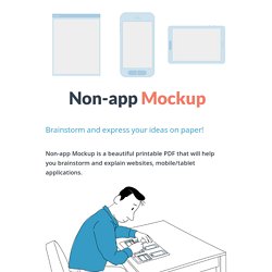
It includes: A web application thumbnails overview Tablet and mobile application thumbnails overviews A web application detailed view Tablet and mobile application detailed views. Products – UX Kits. The Dawn Wall: El Capitan’s Most Unwelcoming Route. 32 Posters That Debunk Common UX Misconceptions. UX Project Checklist. Quickpanel: More UX Futures. UX Futures is a one-day virtual conference that will take place November 5.
Hosted by Rosenfeld Media and Environments for Humans, the event features six inspiring speakers—Steve Krug, Jesse James Garrett, Margot Bloomstein, Andy Polaine, Nathan Shedroff and Abby Covert—all focusing on what’s next for user experience. To give you a taste of what to expect, we’ve asked three of them—Margot, Andy, and Jesse—to answer a few questions on the future of UX. Be sure to use discount code UXMAGAZINE for 20% off when registering. It's 2024. You've just finished your UX education and you're at the graduation party your parents have thrown for you. Andy Polaine: Relationships. Margot Bloomstein: Simplify. Jesse James Garrett: Science. It's 2029. Andy: Macro and micro. Image of algae courtesy Shutterstock. Margot Bloomstein: Andy raises good points about the impact of our work: we have to address the forest and the trees, or both the algae and the pool (or the fish) if we want it to be successful.
The Next Big Thing In Responsive Design. Responsive design, which allows designers and developers to build websites that adapt to every screen size, is one of the most empowering web tools to be adopted in the last decade.
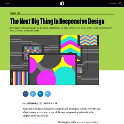
But adapting to the screen is only the first frontier of a new, responsive web. Today, users expect online experiences that not only respond to what device they're using, but also their location, time of day, what they’ve already read, and events happening in real time. To capture a user’s attention for the next generation of the web, you’ll need more than just responsive design.
You’ll need a responsive philosophy. Patterns of Card UI Design. Card-based User Interface (Card UI) is the new hotness.
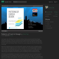
Recent announcements from Google around the unification of their user interfaces across mobile and web using Material Design show that that the big players are firmly behind this new UI trend. Android L Material Design And User Interface Changes. What Is a Card? Even as the notion of cards as the next big software interaction paradigm continues to gain momentum, it hasn’t gotten much easier to explain to the uninitiated what, exactly, a card is.
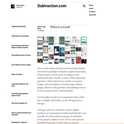
When asked this question, I find it hard not to ramble on at great length, and even harder to avoid using technical jargon, which usually produces diminishing returns in conversations with “normal people.” So I thought I would try to unpack this idea a little bit, as simply and briefly as I can. No guarantees, though. To begin, when we talk about cards in digital products, it’s important to understand that there are actually two, interrelated concepts at work that some people conflate as one. I’ll use some grossly simplified language to label them as cards as presentation and cards as third-party content. Cards as Presentation This is the most visible permutation of cards right now. The Uncanny UX Valley. Users do not give genuine feedback unless they believe what they’re experiencing is genuine.
Even if the person giving feedback is a software designer themselves, the mindset for evaluating a wireframe is starkly different than if they were evaluating the real thing.How do I know this? Scope creep. I’m not talking about the things that were not spec’d out in the beginning of the project. Build Atomic Design Systems. 2014 — The Year of Interaction Design Tools. Webflow a month | Web appWebflow is a web app that allows users to design websites in the browser and that are completely coded and live.

Webflow’s friendly WYSIWYG editor gives designers full control over the output, including the appearance on mobile devices. Call to Idea - Get inspired!
UI. Prototyping. Worst practices. UI walkthrough. UX Strategy. Measure & Calculate. Stakeholders interviews. Structure. Design patterns. Industry types. Mags. Understand what is UX design. Various good reads. Best practices. Debunking UX Myths. Touch UX. Mobile UX. Glass UX. Referrences.