
WordPress Starter Themes. Download Ponder. You want it?

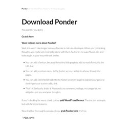
You got it. Grab it here Want to learn more about Ponder? Well, this won’t take longer because Ponder is ridiculously simple. When you’re thinking thoughts you really just need to be alone with them. You can add a favicon, because those tiny little graphics add so much flavour to the URL bar.You can add a custom menu, to the footer, so you can link to all your thoughtful pages.You can add a brief bit of text into the footer (on every page) to explain your general thinkingness or to even add a link.That’s it. If you’re looking for more, check out my paid WordPress themes. Now that I’ve thoroughly convinced you, grab Ponder here. —Paul Jarvis. Best of Themes - The simplest way to browse thousands of website themes.
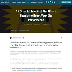
15 Great Mobile First WordPress Themes to Boost Your Site Performance. Mobile first theming isn’t just about making your site work well on mobile devices: it will also make your site faster and so enhance SEO.

A mobile first theme includes far fewer style declarations for layout than a traditional responsive theme that works desktop-first, mainly because it eliminates the need to declare 100% width for elements on small screens. Making your site fast and mobile friendly are two of the most important things you can do to boost your search engine rankings and it will make your site visitors happy, too. Here are some facts and figures which should convince you to start looking for a mobile first theme: Mobile first design means a smaller stylesheet, with fewer declarations.
You can see this in action in a tutorial I wrote on converting a theme to make it mobile first.Mobile first design enhances performance when it comes to downloading images. However there is a caveat to some of the above: many mobile first themes use the bootstrap framework for their layout. Download Bootstrap Template.
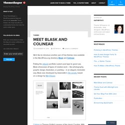
Meet Blask and Colinear. We’d like to introduce another pair of free themes now available in the WordPress.org directory: Blask and Colinear.

Putting the Jetpack portfolio custom post type to good use, Blask showcases all types of creative work – like photography, graphic design, illustration, or painting – in an elegant, minimalist way. Blask was developed by Automattic’s Ola Laczek, based on a design by Mel Choyce. Colinear is Thomas Guillot’s revamp of the classic Coraline. With six layout options accessible via the Customizer, Colinear offers tremendous flexibility in displaying large amounts of content, perfect for news or magazine-style sites. Both Colinear and Blask support a Site Logo with Jetpack active, and are fully responsive, looking spiffy at any screen size. Like this: Like Loading...
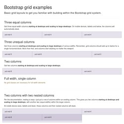
Portfolio. Kyoto temple. Omotenashi. HTML5. Joomla. Grid Template for Bootstrap. Three equal columns Get three equal-width columns starting at desktops and scaling to large desktops.

On mobile devices, tablets and below, the columns will automatically stack. .col-md-4 Three unequal columns Get three columns starting at desktops and scaling to large desktops of various widths. .col-md-3 .col-md-6 Two columns Get two columns starting at desktops and scaling to large desktops. Full width, single column No grid classes are necessary for full-width elements. Two columns with two nested columns Per the documentation, nesting is easy—just put a row of columns within an existing column. At mobile device sizes, tablets and down, these columns and their nested columns will stack. Mixed: mobile and desktop The Bootstrap 3 grid system has four tiers of classes: xs (phones), sm (tablets), md (desktops), and lg (larger desktops). Each tier of classes scales up, meaning if you plan on setting the same widths for xs and sm, you only need to specify xs. .col-xs-12 .col-md-8. Components. Available glyphs Includes over 250 glyphs in font format from the Glyphicon Halflings set.
Glyphicons Halflings are normally not available for free, but their creator has made them available for Bootstrap free of cost.
Voyage ou blog. Poker.