

8+ Web Design Myths Busted: Old Ideas & Modern Best Practices. There are a few ideas about website design that seem to never fade away, even though they are not so true anymore.
203+ Web Design Resources You’d Actually Want to Use (& Bookmark) Church Logo Design Tips — A Branding Guide For Churches. Church Logo Design Tips — A Branding Guide for Churches Why Is Having a Logo Important in Church Branding?
It might seem a little bit strange to have a logo for your church. While having a logo and developing branding, in general, is a standard practice for almost every business ever to exist (it is virtually impossible to remain competitive without something that would let your customers recognise your brand), churches as establishments are more controversial when it comes to branding. After all, many people argue, the church is not a for-profit organisation; hence it does not have to compete with other churches for people. This is both correct and incorrect. This can only be achieved if they are heard.
Apart from raising brand awareness as such, church logo design is important for the following reasons: Having a Clear Logo Helps You to Define the Message and Reinforce Your Church’s Vision Logo Shows Relevance of the Church. Elementor On Click Popup for Team Member - Tasvir Web Solutions. 10 excellent font pairing tools for designers. If you’re on the hunt for the perfect font combination for your next design project, look no further.
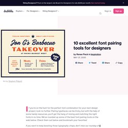
Pairing typefaces can be tricky, but with the help of some handy resources, you’ll get the hang of mixing and matching the right fonts in no time. We’ve rounded up some of the best font pairing tools on the web below. Check them out below and bookmark your favorites! If you want to keep boosting those typography chops, don’t miss our roundup of 5 online typography exercises to help you level-up! 1. Eight Essential Tips for Extended Remote Work - The Media Temple Blog. By now, you’ve likely made the basic adjustments to working remotely: You’ve got the essential software installed, you’re starting to understand the point of Slack, and you can even meme yourself with Zoom backgrounds.
The long haul can still be a challenge with all the most clever tools in place, though. A few years ago, the bulk of our teams at Media Temple shifted to remote work. Mega list of Remote Job Websites & Freelance Websites - DesignXplorer. There is a growing need for remote jobs.
The current global epidemic has made us realize working from remote locations is not only possible but is here to stay for long. Remote job websites list all the remote job opportunities available and you will see a lot of professionals currently visiting these websites to find jobs. With coronavirus spreading globally, it only makes sense to keep social distancing, and working from home helps you maintain social distancing and stay safe. With that intention, we have shared with you this list of remote job website. Remote jobs allow professionals to work outside of regular office space. 5 ways to get creative with gradients in graphic design. Ever since the gradient trend first took off, designers have continued to find new and innovative ways to use gradients in their work.
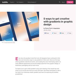
Gone are the days where gradients ruled the UI world—we’re seeing the color trend being used in so many different applications across the design spectrum from graphic design, to illustration, packaging, and so much more. To inspire you to get a little gradient crazy, we’re sharing a few simple tips and tricks to try out the next time you work with them. Use these techniques to add a fun twist to an otherwise classic gradient and have fun exploring the endless possibilities! 1. Design Inspiration Resources 2019 - Muzli - Design Inspiration. The 30-second trick that can make anyone more creative. Sprout Social: Social Media Management Solutions. Elegant Themes Blog. Why I ignore the design industry on purpose. Untitled. Hopefully, the Ultimate Guide to a Flat Icon Set. The 5 Types of Logos for Your Blog & Business - MintSwift. The Top 14 Google fonts For Strong Headlines and Headings. As a web designer, you’re probably well aware that Great fonts are essential to great design.
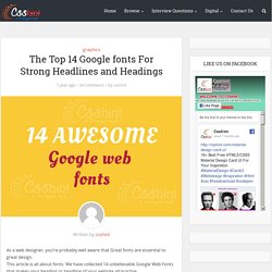
This article is all about fonts. We have collected 14 unbelievable Google Web Fonts that makes your heading or headline of your website attaractive. The fact is that the headlines are more important than you may think. and Many designers also agree this point. Google Webfonts is the largest source of free fonts with hundreds of typefaces to pick from. Google Fonts, launched in 2010, helps solve that problem and It’s a fantastic resource . I will not make you wait any longer, so here are the list of top 14 Google Webfonts For Strong Headlines and Headings: 1.Bree Serif Bree was originally released in 2008. 2.Montserrat The old posters and signs in the traditional Montserrat neighborhood of Buenos Aires inspired Julieta to design this typeface and rescue the beauty of urban typography that emerged in the first half of the twentieth century. 3.Open Sans. Design with Gradients. How and When to Create a Website with a Black Background Design. Black has always been—if not the most popular design color—the color which designers talk about the most.
It is sophisticated, energetic, mysterious, elegant, powerful, stylish, and the complete opposite of the default white. Now, I want to focus on the fact that it’s the exact opposite of white (I will talk about this more further in the text) because this is the kind of thing that you want and need in design— Why do you need it, though? Anatomy of a Winning Email Design. Build a Better Homepage – Eric Karjaluoto. Friday, January 19, 2018 When you redesign your website, the homepage seems like a blank canvas.
It’s your company’s “Hello, World!” And you can put anything on it. Everybody wants to make a mark on that homepage. Sales wants product placement. Great Questions Lead to Great Design: A Guide to the Design Thinking Process. Great designers help teams and stakeholders make better decisions by using questions to identify opportunities, reveal underlying needs, and understand user context.
James Dyson, having been inspired by a centrifuge used to separate paint particles from the air, came up with the world’s first bagless vacuum cleaner in 1983 after famously going through 5,127 prototypes—the epitome of design thinking. He must have asked a lot of questions along the way… Designers face tough problems every day—problems that require them to find design solutions that deal with business and technical constraints while also addressing user needs. At the same time, the urge to find solutions quickly shouldn’t preclude designers from thoroughly understanding the heart of the problem, as well as the user context, from the outset.
The essential guide to colour correction. 5 Design Techniques for Better CTA Buttons. When we visit most websites, we often have a goal in mind. Web Usability Articles, Reports, Training Courses, and Online Seminars by NN/g. Store Finders and Locators October 7, 2018 | Article: 6 minutes to readFinding addresses and location information on company websites has gotten dramatically easier, but users increasingly turn to search engines or native map apps first for this task. Visibility of System Status June 3, 2018 | Article: 6 minutes to readCommunicating the current state allows users to feel in control of the system, take appropriate actions to reach their goal, and ultimately trust the brand. Working Memory and External Memory April 29, 2018 | Article: 6 minutes to readHuman working memory holds information relevant to the current task; a physical or virtual external memory can help in tasks with a high working-memory burden. 5 things every designer should probably stop doing – UX Planet.
Hello world. I think the title explains what you can expect from the write up below. Stereotypes exist for a reason, patterns exist for a reason, typecast exists for a reason. At times, it's a safe place for us designers, knowing what to expect, and how to approach a certain problem. But at times, in our pursuit to fit in, we confine ourselves too much into these stereotypes and lose our creativity and ourselves in the process.
True creativity only fosters in an environment where patterns don't exist. Stop being the machinist One thing that we all designers do, is spend a lot of time in front of our machines. 10 Questions to Ask When Designing Your Company's Logo. A Five Minutes Guide to Better Typography – Muzli -Design Inspiration. How To Build A Better Website. Nailing the Whiteboard Design Challenge – prototypr. Brand to interface: A slice of a product design process. Unleashing The Full Potential Of Symbols In Sketch. Advertisement Today, too many websites are still inaccessible. Intro to the 8-Point Grid System – Built to Adapt. How to Create a Fullwidth Gallery with the Divi Gallery Module.
Learning from Lego: A Step Forward in Modular Web Design. With hundreds of frameworks and UI kits, we are now assembling all kinds of content blocks to make web pages. However, such modularity and versatility hasn’t been achieved on the web element level yet. How To Make An Insanely Powerful Business Card - The Daily Positive. Sympli: complete collaboration tool for designers and developers.