

Arper. LITTERATURE / « A NOIR, E BLANC, I ROUGE : VOYELLES, JE DIRAI CHAQUE JOUR VOS NAISSANCES LATTENTES (…) (RIMBAUD, Voyelles, in Poésies) par Anne BERTONI. « Moi qui ai connu Rimbaud, je sais qu’il se foutait pas mal si A était rouge ou vert.
Il le voyait comme ça, mais c’est tout« Peut-être faut-il repenser les choses dès le départ, ne pas s’emberlificoter dans les théories savantes trop élaborées et tenter de se souvenir de ce que nos prédécesseurs ont pu éprouver. Il était une fois les couleurs : 1 : Le bleu - La couleur qui ne fait pas de vagues. L'œuvre Nu bleu II. 'Camouflage', Andy Warhol: Online caption. Les Guerriers du Moyen-Age. I - A propos des couleurs eu Moyen Age.
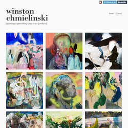
Studio Visit// WINSTON CHMIELINSKI. Winston Chmielinski’s Neukölln studio space is impeccably organized.
Cheeky remarks about the artist’s type-A tendencies lead to a confession: he just moved in yesterday. This is why the paints are organized by colour and lined up side by side on his high desk, untouched, and the space looks so clean, more like the stage set replica of what an artist’s studio should look like. He assures us that once he gets going, all the apparent order is turned on its head. A self-professed “e-hoarder,” Chmielinski has saved over 1500 images in a Dropbox folder on his computer, organized by pattern. He sifts through the thumbnails in his image bank – made to appear homogenous by the meticulous categorization – and pulls up the pictures that catch his eye. Winston Chmielinski – “A Round of Crossfire Prayers Goes Clip Clap Clip”, oil on canvas, 50 x 70 cm; courtesy of the artist.
Tour du monde du design éditorial avec Booketing #13. Passionné d'image et de littérature, Clément Buée, designer graphique, partage quotidiennement ses recherches et inspirations sur Booketing, un blog qu'il a créé en 2009.
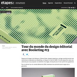
Il s'invite aujourd'hui dans nos colonnes pour vous proposer une sélection d'ouvrages, remarqués pour le soin porté à leur graphisme. Pour ce dernier tour du monde éditorial de 2014, traversons les continents sous le signe de la géométrie. Départ pour le Pologne à la rencontre du studio Manuka qui a réalisé une collection d'ouvrages pour les travailleurs sociaux du pays. Winston chmielinski. HARDEST WATER150 x 120 cmoil and acrylic on canvas.
BEN WISEMAN. WALLSBLOG - Fireworks In the Rain by Steven Brust, upcoming... Bowl Chair by Lina Bo Bardi. Arper presents Bardi’s Bowl Chair, designed in 1951 by Lina Bo Bardi.

Sharing values, humanistic approach and the design philosophy of the architect italobrasiliano, Arper is confronted with an unprecedented project, in collaboration with the Instituto Lina Bo Bardi and P.M. in Brazil, the current interpreter of his artistic legacy. Past the Pillars of Hercules : aaronsmithart. Andy Warhol: Camouflage at Honor Fraser. Andy Warhol: Camouflage, an exhibition that includes silkscreens on canvas, unique trial proofs on board, and screenprints is now showing at Honor Fraser through February 5, 2011.
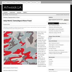
Honor Fraser is now showing Andy Warhol: Camouflage, an exhibition that includes silkscreens on canvas, unique trial proofs on board, and screenprints. This marks the first comprehensive west coast exhibition, in over ten years, of Warhol’s late series, the Camouflage works. The exhibition will run from October 30, 2010 – February 5, 2011 and will be accompanied by an exhibition catalogue with an essay by Vincent Fremont.
Here are excerpts from his essay: While Andy Warhol was still alive, I can only remember on one occasion that a Camouflage painting of his was exhibited. The Camouflage paintings were not shown publicly until six years after Andy’s death. Fondation Beyeler. Winston chmielinski. KOLCHOZ. Sam Vanallemeersch Draws For You! SHIT I FIND - Big Bang Dog. Marsh-Dondurma and StudioPoink*- The shower at the end of the day. Light Motif. Paint Showers. Adam Ferriss. Fun Thursdays with Hardy Seiler. Fun Thursdays with Hardy Seiler Some beautiful graphic work from the Bureau of Hardy Seiler and his re-brand for the Freies Theater in Hannover.
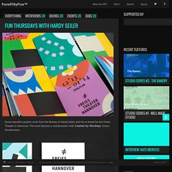
The work features a collaboration with Created by Monkeys, Simon Kondermann. www.hardyseiler.dewww.createdbymonkeys.com@HardySeilerBehance. Imprimerie DC - Print Shop Identity by Charles Daoud. Isn’t it a striking visual identity?
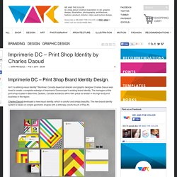
Montreal, Canada based art director and graphic designer Charles Daoud was hired to create a complete redesign of Imprimerie Domcocayer’s existing brand identity. The managers of the print shop located in Blainville, Québec, Canada wanted to affirm their place as leader in the high-end print business in the region. Charles Daoud developed a new visual identity, which is colorful and simply beautiful. The new brand identity system is based on simple geometric shapes with a strikingly colorful touch of Pop Art. Kokoro & Moi – Strictly concentrating on wait hey look is that a bird. - Torikorttelit Visual Identity. Estudio Pum - Editora Bote. ABC DE FRANGO: A bit of dork, childish, adult, funny, jolly kind of way to create a alphabet.
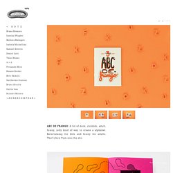
Entertaining for kids and funny for adults. That’s how Pum sees the abc. AMÁLGAMA {en. AMALGAM}: independent publication edited, illustrated and printed by Estudio Pum. It is composed by 6 chronicles which belongs to the journalist Brunna Radaelli. Description: "Homely reliquary made from heaven, salt, sun, sea and rocks. . ☞ 2739 ☜ it’s the second edition of PumZine. This zine works as a folder and turns into a A3 poster. . ⊙ Pum Zine ⊙ The first edition of PumZine. Media Tube Visual Identity on Behance. MediaTube Media Tube is an art organization in China, Shanghai. Founded in 2012 April, it is an independent art gallery that exhibits and present contemporary media artists within a progressive curatorial framework. Media Tube also publish a booklet which shares the art news and critic of internatonal movie and media art pieces.
The design is used the art of broad cast as the main visual, and tailor made an official typeface for its publication use. Love Street Studio › PIM. HEYPETETONG Branding on Behance. Jiri Geller. The Future of Food on Behance. Sugar Rush: Artist Showcases The Best Sweets By Color. Who loves candy? Emily Blincoe does! The artist just released visuals from her latest project called the Sugar Series, in which she takes the best candies and groups them by color. The only thing better than art is candy art.
Not only does she group the candies together, but she diligently situates each piece in a certain way to create the perfect shot. From Tic Tacs to Toblerone bars and a heart shaped pool of Nerds, Blincoe demonstrates exactly what the sweet life looks like… literally. We think her images would look great as blown up, framed posters. Photos courtesy of Emily Blincoe. Les aliments classés par couleur : les photos d'Emily Blincoe. Je vous parlais récemment d’Emily Blincoe. Cette jeune photographe indépendante, qui réside à Austin au Texas, aime jouer avec les couleurs et la lumière.
Je vous avais présenté « Sugar Series » où elle classait les sucreries par couleur, un projet original qui donnaient de belles affiches à encadrer pour une déco punchy. J’ai voulu en savoir plus sur son travail et lui ai envoyé quelques questions… Je la remercie d’ailleurs d’avoir pris le temps de me répondre et je vous conseille vivement de suivre son travail (je suis super fan, ça ne se voit pas non ?). Business&Design Booklet. Carnet de Notes Tamyras. Art Art— EditionEditorial design Notebook de 250 pages édité par la maison d'édition Tamyras.
L'objet est rythmé par 5O illustrations s'inscrivant dans la thématique "Positive Lebanon" Notebook of 250 pages with 50 illustrations. Www.lesabattoirs.org/enseignants/dossiers/2011/horslesmurs/couleur.pdf. Info 391 - La couleur des oeuvres d'art. La couleur est un aspect de la perception visuelle qui attribue aux lumières un caractère très spécifique permettant de reconnaître les choses autrement que par leur forme ou leur texture et dont seul le langage permet d'apprendre et de communiquer les particularités.
La couleur dans l'art - John Gage, Lucile Gourraud-Beyron. COULEURS, histoire de l'art.