

Branding blog for advisory businesses and nonprofits. Transitional Interfaces. Designers love to sweat the details.
Much time is spent pixel-fucking buttons, form styles, setting type, & getting those icons as sharp as a tack. A+, great job, don't stop you guys. ...but there's little consideration about how it all fits together outside of a static comp. You tap a button and the form just ...appears? You swipe to delete an item and it just vanishes? Oh, ok sweet.
Reputation systems. Roles, types, permissions. The 10 best design trends of 2013. How can big data and smart analytics tools ignite growth for your company?

Find out at DataBeat, May 19-20 in San Francisco, from top data scientists, analysts, investors, and entrepreneurs. Register now and save $200! This year renewed our hope in the future of web and mobile design. Landing pages. Great Startup Product Design Is Telepathic. I never thought learning how to write better might help me understand product design but it has.
Great literature and well designed products share one defining attribute: they create a telepathic connection between the creator and the consumer. Before you chuckle and write me off as a palm reading gypsy, hear me out. The idea isn’t mine, but Stephen King’s. Over the weekend, I read King’s blunt and inspirational autobiographical narrative, “On Writing.” In this book, Stephen King accomplishes two things.
In quite a few ways Stephen King’s path to literary success parallels many entrepreneurs. While King’s story is impressive, his description of writing is more compelling. Great products evoke the same telepathy. Well designed products feel human because empathy underpins their design. The simple elegance of timeless writing and skillful product design are one in the same. The power of behavioural design: looking beyond nudging. Over the past two years, a growing number of conferences, papers and articles have looked beyond the technique of nudging people to change their behaviour.
The question is: what comes next now that nudging is not seen as the silver bullet? Judging on both questions and answers from the leading voices in the field, the journey beyond nudging offers promising solutions to the challenge of getting people to behave more sustainably. First, consensus on the importance of return on investment seems to be evolving. This deserves strong applause. Quite simply, this indicates a steady movement away from buzzword bingo towards strategic decision-making creating real-world value for as many people as possible. The Behavioural Design Lab in London is one of the most promising institutions working on this front. The potential for synergy between energy consumption and behavioural design is significant. How To Interview Your Users And Get Useful Feedback. Customer Analytics from trak.io, Metrics Dashboard, Event Tracking, A/B Testing, Cohorts - trak.io - Customer Analytics For Data-Driven Startups.
Human-computer Interaction, INTERACT '99: IFIP TC.13 International ... - Google Books. Why I Love User Stories. I love user stories.
Why? They’re a great way to communicate requirements. Combined with epics, user stories tell a product narrative so everyone understand the essence of what they are building, yet don’t restrict creativity. User stories are an outgrowth of agile methodologies, and are used to state requirements without writing endless pages of documentation. Groups of user stories are called “epics”, and if a user story is too big, it can be broken up into smaller stories for the developers to work with. While they may not replace high-level product requirement documents in all organizations, they can be used to break those requirements into bite-sized pieces that are easier to digest, understand, and build against. GoodUI. Arnaud Lagardère placardise son «suicide médiatique» EXCLUSIF.

Stop Copying Your Competitors: They Don’t Know What They’re Doing Either. 230inShareinShare I hear this all the time.

“Our competitor, X, is doing Y, we should do that too” or “X is market leader and they have Y, we need to have Y“. There are 2 key things wrong with this reasoning: The reason they setup Y (menu, navigation, checkout, home page layout, etc) is probably random. In 50% of cases the layout is what their web designer came up with (he/she most likely did not perform a long, thorough analysis and testing), or they simply copied another competitor.What works for them won’t necessarily work for you You’d be surprised by the number of people who actually know their shit. “Don’t focus on the competition, they’ll never give you money.” – Jeff Bezos Your competitors don’t know what they’re doing I talk to a lot of people about their websites and conversion challenges – many of them large, well-known companies.
Image credit The other common way these companies setup a website is to hire a web design company. Get a free and easy online store - Tictail. Google’s Dead-Simple Tool For Making UX Decisions: 2 Jars Of Marbles. Nothing is perfect.
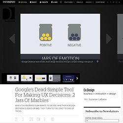
So even for the most successful platforms, design needs to continuously evolve. But beyond mere gut instinct or that ephemeral talent of taste, how can you know when a design decision is good or bad? How can you be sure that change is actually for the better and not for the mere sake of change? As it turns out, Google’s Android User Experience team has a fantastic trick to settle these debates. In their presentation at Google I/O, the designers shared it with the rest of the world.