

How to improve the accessibility of overlay windows – part 1. Lightbox, modal window, dialog, overlay… There are many names used to describe a component with the same (or very similar) functionality.
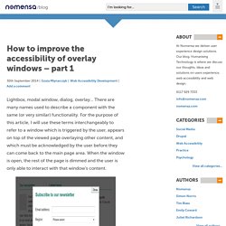
For the purpose of this article, I will use these terms interchangeably to refer to a window which is triggered by the user, appears on top of the viewed page overlaying other content, and which must be acknowledged by the user before they can come back to the main page area. When the window is open, the rest of the page is dimmed and the user is only able to interact with that window's content. Overlay windows can be used to display a larger version of an image featured on the page, show additional information relevant to the main page content, or to ask the user for some input or response (for example, a login form).
Keyboard accessibility. Why ‘Ok’ Buttons in Dialog Boxes Work Best on the Right. By anthony on 05/25/11 at 11:30 pm Designers often question where to place their ‘Ok’ and ‘Cancel’ buttons on dialog boxes.
OK-Cancel or Cancel-OK? Summary: Should the OK button come before or after the Cancel button?
Following platform conventions is more important than suboptimizing an individual dialog box. We get countless questions about small details in UI design that don't matter much to the overall user experience. One classic is the order of buttons in dialog boxes: OK/Cancel Cancel/OK Both are reasonable choices, and people can argue for hours about their preferences: Listing OK first supports the natural reading order in English and other languages that read left-to-right. In cases like this, it often doesn't matter what you do.
So, to make this specific choice — as well as many other small choices in application design — it's best to follow the platform GUI standard. Inconsistency Costs More Time than It Saves Deviate from the standard, and you'll easily cost users several minutes — or possibly hours — as they overlook or misuse UI elements. Windows puts OK first Apple puts OK last. ARIA Dialog Example. The dialog follows the best practice design patterns from Making a Dialog Modal.
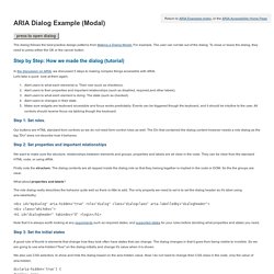
For example, The user can not tab out of the dialog. To close or leave the dialog, they need to press either the OK or the cancel button. In the discussion on ARIA, we discussed 5 steps to making complex things accessible with ARIA. Let's take a quick look at them again. Alert users to what each elements is: Their role (such as checkbox). Step 1: Set roles. Our buttons are HTML standard form controls so we do not need form control roles as well. Step 2: Set properties and important relationships We want to make sure the structure, relationships between elements and groups, properties and labels are all clear in the code. Firstly note the structure. What about properties and labels? Making Modal Windows Better For Everyone. To you, modal windows1 might be a blessing of additional screen real estate, providing a way to deliver contextual information, notifications and other actions relevant to the current screen.
On the other hand, modals might feel like a hack that you’ve been forced to commit in order to cram extra content on the screen. These are the extreme ends of the spectrum, and users are caught in the middle. Depending on how a user browses the Internet, modal windows can be downright confusing. Modals quickly shift visual focus from one part of a website or application to another area of (hopefully related) content. The action is usually not jarring if initiated by the user, but it can be annoying and disorienting if it occurs automatically, as happens with the modal window’s evil cousins, the “nag screen” and the “interstitial.” However, modals are merely a mild annoyance in the end, right? Well, imagine that you had to navigate the web with a keyboard. Including Focus States Link Dismissing Link.
Advanced ARIA Tip #2: Accessible modal dialogs – Marco's Accessibility Blog. One question that came up more and more in recent months is how to create an accessible modal dialog with WAI-ARIA.
So without further ado, here’s my take on the subject! An example To lay the ground work for some terms we’ll be using, let’s look at an example. A dialog is basically a sub window of an application that asks a question, requires some input, or allows to set options etc. Desktop applications have dialogs of all shapes and sizes, but there are some unique properties that distinguish them from other windows. Let’s look at a simple example: Open your favorite word processor, type in something or paste your lorem ipsum, and then just close the window. A title that contains the name of the application or some phrase like “Save the document”.Text that states that you haven’t saved the document and what you want to do now.A series of buttons like “Save”, “Don’t Save”, “Cancel” etc.
Create a New Pen.