

Catering to Your Customers: 15 Restaurant Website Best Practices A website is a website is a website, except when it's a restaurant's website.
There's something extra tricky about restaurant websites -- they have to be cool, branded, creative, but also simple and clean. And the best ones capture all relevant information in just a few pages. There's no need for deep websites with tons of clicks and pages. At ChowNow, we stare at restaurant websites all day.
And when we're not staring, we're working with clients to help improve and refine their sites to maximize traffic and online orders. Homepage: Your website is only as good as your homepage, period. Photos: Beautiful, enticing, high quality photography goes a long way. Above the fold: Make sure the action/most important information is happening in the top half of the screen. Navigation menu: Getting around your site should be intuitive. Ask for emails: Customer emails are like gold for a restaurant owner. Location: Make your address clear on the homepage, and as a footer on all pages.
Questions? 5 Restaurant Websites Best Practices - Restaurant Engine. Our last post covered 5 restaurant websites worst practices.
Now let’s dig into restaurant websites best practices to help your restaurant thrive on the web and attract more customers. The success of a restaurant business depends on many factors. But these days, their web presence is among the most important areas a restaurant should focus their efforts. Your customers are finding you via the web more than ever before. It’s crucial to make the right first impression that converts casual web visitors into booked reservations. My previous post told what you want to avoid. 1. We’ve already covered why Flash is bad for your restaurant website (it isn’t visible on mobile devices like iPhone and iPad, it does nothing to help SEO).
So what’s a good alternative to using Flash? Technically speaking, WordPress alone isn’t the Flash alternative. The anatomy of a perfect restaurant website. Top restaurants are all about ‘the experience’.
It’s not just the amazing food, or the wonderful service, or the charming ambience, or the table with a view. As such, it is somewhat ironic that restaurant websites are serial offenders when it comes to bastardising the user experience. There can be no excuses for it any longer: it is 2013, not 2003. The age of animated Flash websites is long gone, yet many top restaurants persist with awfully wacky loading sequences and the kind of ‘innovative’ navigation that requires superhuman levels of patience, and a degree in particle physics to work out how to use it. I thought I’d cobble together a handy A-Z checklist of dos and don’ts, for anybody interested in revamping or building a new website for a restaurant, or for restaurateurs that need to know what to ask for.
Autosound Turn it off. Bookings The odds are that some visitors will want to reserve a table. Content Detail Attention to detail is what makes web experiences great. Entry Pages. Best Practice Restaurant Websites bring in $5 of revenue PER WEBSITE VISITOR! How do they do it? - Marketing 4 Restaurants. We were looking at creating some new metrics to define the best practice online marketing for restaurants and stumble across a number that frankly amazed us – nearly 10% of our customers are bringing in $5 per visitor to their restaurant website.
This is an incredible figure. We have always known that some of our customers are making a lot of money from their website – we have one customer who regularly takes in over 1,000 seats a month, but on drilling down into the data, it is interesting how high the best practice restaurant websites are doing and we found some interesting correlations between those high performing websites. Here are our tips to increase the average revenue per website visitor for your Restaurant.
Have a website. So this is kind of obvious, but many restaurants miss the importance of having a website. If you need help either building the number of people visiting your website, please contact us. Essential advice for restaurant websites. Restaurant websites have become infamous for their outdated designs, and frustrating user experience.
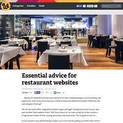
How many times have you visited a restaurant website and asked, “What was this web designer thinking?” We see the same (often laughable) problems again and again: background music as you skip past another Flash website “intro”; PDF food menus (or no menu at all); all of the content is image-based instead of text, causing extremely slow load times. The list goes on and on… As you would in any website design project, you must start by putting yourself in the visitor’s shoes and pinpointing their most pressing needs. For restaurants, we know that visitors want to easily browse the food menu. It amazes me that in 2012, so many restaurant websites still fail to meet the most essential must-haves that visitors have come to expect. Create web-based food menus, not PDFs It’s been common practice, for some time, for restaurants to simply post links to download their menu in PDF format.