
ACRL Visual Literacy Competency Standards for Higher Education. Approved by the ACRL Board of Directors, October 2011 Introduction The importance of images and visual media in contemporary culture is changing what it means to be literate in the 21st century.

Today's society is highly visual, and visual imagery is no longer supplemental to other forms of information. New digital technologies have made it possible for almost anyone to create and share visual media. 10 rules of photo composition (and why they work) In photography, it’s not just what you shoot that counts – the way that you shoot it is crucial, too.

Poor photo composition can make a fantastic subject dull, but a well-set scene can create a wonderful image from the most ordinary of situations. With that in mind, we’ve picked our top 10 photo composition ‘rules’ to show you how to transform your images, as well as offered some of our best photography tips from the experts who do it on a daily basis. Don’t feel that you’ve got to remember every one of these laws and apply them to each photo you take. Instead, spend a little time practising each one in turn and they’ll become second nature.
You’ll soon learn to spot situations where the different rules can be applied to best effect. Photo composition doesn’t have to be complicated. In the real world, you’ll be working with a wide range of subjects and scenes, and this requires a more open-minded approach. Practical Guidelines for Visual Design. Practical Guidelines for Visual Design The following are some practical guidelines to follow in the design of instructional visuals.

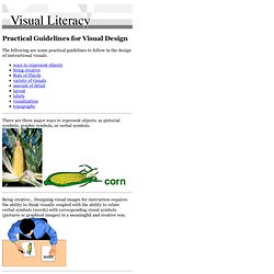
There are three major ways to represent objects: as pictorial symbols, graphic symbols, or verbal symbols. Being creative... Designing visual images for instruction requires the ability to think visually coupled with the ability to relate verbal symbols (words) with corresponding visual symbols (pictures or graphical images) in a meaningful and creative way. Research on eye movement states that people from Western cultures tend to look at the upper left-hand area of a visual first. Keeping these two principles in mind it is important to place important information near the dividing lines and place the start of the main message where the eye first strikes the area. Understanding Balance in Photography. Balance is a compositional technique in photography that juxtaposes images within a frame so that the objects are of equal visual weight.

When different parts of a photo command your attention equally, perfect balance is achieved. In photography, there are two main techniques of balance you should be aware of: formal and informal. We’ll discuss the difference between each and how they can affect your photo. *** To learn more about White Balance, see our Photography 101 Workshop in our store. Knowing how to effectively balance objects within a photo is a skill that all serious photographers must learn. Balancing elements in photography becomes important when you frame your shots. Color Contrast in Photography" In a black-and-white photo, the color palette is restricted to white, black and shades of gray.

To create contrast, the photographer pits lighter elements against dark, sun against shadows. In color photography, the artist's palette is infinite and good contrast requires more consideration. Good color contrast starts with the color wheel. On one side of the wheel are the "warm" colors: shades of yellow, orange, red and pink. On the other side are the "cool" colors: hues of violet, purple, blue and green. Colors like red and green that live on opposite sides of the color wheel are called complementary colors -- think of Christmas decorations. Keep these complementary color pairs in mind when you're composing a shot. For the best color contrast, keep things simple [source: Tang]. Let's finish with some tips on getting great contrast in black-and-white photography.
Visual Design. Some foundational ideas are so thoroughly ingrained in modern life that we hardly see them for their ubiquity and familiarity.

The concept of “module and program”—regular building blocks of repeating patterns that when joined together produce an organized whole—permeates our information-age lives even more thoroughly than it did the lives of our ancestors in the industrial revolution launched by manufacturing innovators like Eli Whitney. As the industrial world grew more complex, document designers in the mid-1800s began to adapt modular programs to newspaper, catalog, financial, and other publications, and modern page layout was born.
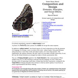
In the early twentieth century the Bauhaus designers adopted the elements of visual logic discovered by the Gestalt perceptual psychologists, and those German and Swiss designers created modern graphic design (see Visual Design Principles sidebar, below). Composition and Design Principles. ----------------------------------------------------------------------------- Everybody immediately responds to subject matter in art.

A picture of a butterfly and a picture of a snake do not get the same response. In addition to subject matter*, the formal aspects of visual composition are like the grammar of a language. In writing, a story is written with words - subject matter. Like good literature and good poetry is more than words and subject matter, art is more than pictures. The organization, the sentence structure, the style, and so on can make or break a good story.