

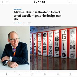
Color and color. Transparent Textures. Graphic Means. RECENTLY REJECTED. It's Nice That : Home. My Modern Met. Michael Bierut is the definition of what excellent graphic design can do. Twitter’s product and engineering departments will bear the brunt of the 300-plus job cuts the company has planned.
Can the survivors accomplish what a larger team couldn’t? For years, Twitter has trailed the competition in terms of features. While Facebook managed to incorporate photographs, links, and long status updates into its billions of users’ feeds without skipping a beat, Twitter struggled just to serve up 140-character bursts of texts with consistent reliability. In fact, many of the innovations we associate with Twitter didn’t even come from within the company. Hashtags began as a way to organize groups in IRC, and former Google designer Chris Messina was the first to suggest Twitter incorporate them: But management at Twitter reportedly wasn’t into it. Twitter also didn’t come up with the bird icon, or even the word “tweet.” When you consider the features still noticeably missing from Twitter, cutting hundreds of engineers from the company might seem like a strange move.
New show at Cooper Hewitt examines How Posters Work. We feature a fair amount of poster deign here on It’s Nice That but in the pell-mell rush for aesthetic appreciation it’s rare to take time out to consider how this particular design discipline works.
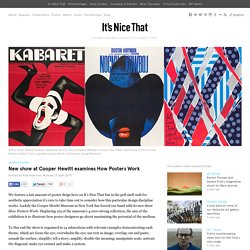
Luckily the Cooper Hewitt Museum in New York has forced our hand with its new show How Posters Work. Graphic design 1920s 1930s 1940s 1960s 1970s in paper ephemera. This brochure is another example of a series of brochures issued by the South Manchurian Railway as part of a beautiful series in the second half of the 1930s (previous).
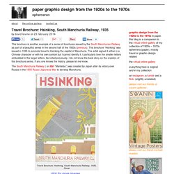
This brochure “Hsinking” was issued in 1935 to promote travel to Hsinking the capital of Manchuria. The artist signed it either in a Chinese character or with his own symbol but I cannot identify it. I particularly love the smaller letters embedded in the larger letters. Graphic Design projects on Behance. Exhibition Design projects on Behance. THE BACKMATTER. MeetDistrict by skinn branding agency / skinn.be Meetdistrict was developed by skinn branding agency for their client Ghelamco as a vision on future work places.
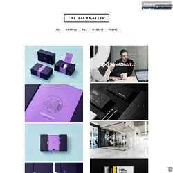
Our contribution was the realisation of a complete strategy, a new brand and vision for the interior design of the concept on future working places. The result is a responsive workspace where the atmosphere is compliant with the needs of the entrepreneurs and their visitors and has inspiring workplaces and meeting spots. And more, there are sports facilities, shops, diners and coffee shops, day care, etc. In fact Meetdistrict is a 10.056m2 professional space where working is part of an inspired life. Quim Marin Design. Edmund Clark. Guglielmo Rossi. Half way in between an illustrated book and a graphic novel, the book wants to marry the story of Martin Luther King Jr as narrated by African-American writer Arthur Flower, to the scrolls illustrated by Manu Chitrakar, artist from the Bengal region of India, making art according to the style and colour palette of the Patua tradition.
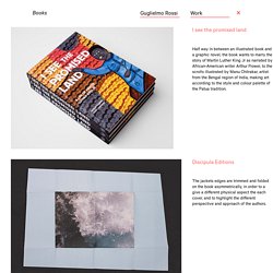
The design consisted of a meticulous dissection and re-arrangement of text and images into a story aimed at a young audience. At times the pages turn purely typographic or entirly visual, looking for a dynamic design and high contrast on the page. Dates, name of places and of the heroes of the struggle of the blacks in America are emphasised with the intention of highlighting the historical aspect of the book. 2013 Black history Collaboration Hardback India. The search for Hip Hop's forgotten typeface. CHRONOGRAPHY - Motion Graphics & Graphic Designs. Graphic Design Inspiration. Women of Graphic Design. Matthieu Venot. Van Peel Design. Alexander Vidal blog. Painting a handsome whaler.
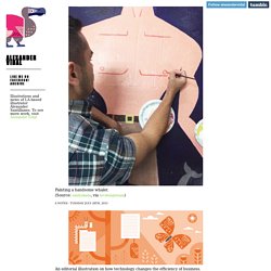
(Source: emilyokada, via hrcdesignteam) An editorial illustration on how technology changes the efficiency of business. Around Hollywood, by Alexander Vidal. Hollywood skyline, by Alexander Vidal. Gin at Giraffe Manor, by Alexander Vidal. Black Sage Blemish Free Hand Balm. Almost gin and tonic season! Alessandro Aru, illustrator. Often minimal. GAME & GRAPHICS. HIROMU TSUBOI. MAN WITH A SPADE.
Lambert Duchesne. Art by Lambert Duchesne - Videomaker and VJ • Lambert Duchesne I’m also on facebook !
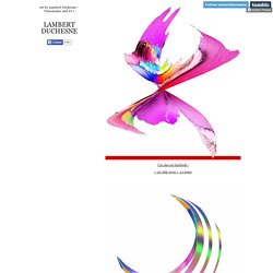
• 22 July 2015 • 21 notes lambertduchesne: From my music video for “Manda Le” by Dehousy • 19 July 2015 • 64 notes From my music video for “Manda Le” by Dehousy • 13 July 2015 • 43 notes • 12 July 2015 • 79 notes • 11 July 2015 • 126 notes • 11 July 2015 • 51 notes 1 2 3 4 5 6 7 8 9 10 Next. Nicanel. 969years. Museum of Moeda by Costa Lopes The roof establishes a square that both denotes the underground museum and enables the celebration of public space.
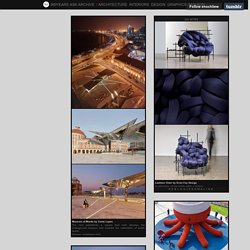
(Source: costalopes.com) Theo Inglis. Somebody submitted this question to my other blog (midcenturymoderndesign.tumblr.com) and I ended up writing quite a long answer, so I figured I may as well post it on here, just in case it helps anyone in anyway at all!
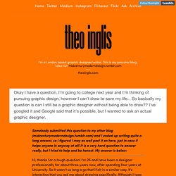
It is a very hard question to answer really, but I tried to help and be honest. My answer is below: Hi, thanks for a tough question! Gabe Rios Design. Studio Jimbo Graphic design & Art Direction. Noichigo_source. Matters of Consequence. TEDISON. Yusef Alahmad يوسف الأحمد. Peggity Leggity Press. If you need to stimulate a little brain wave action with your kiddos this summer download ZooZaLoo!
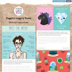
And alphabet of animals acting amazingly! This ebook is great conditioning for learning the ABC’s and understanding alliteration. Download it here for only $2.99 Beautifully illustrated, quirky and so much fun to read, ZooZaLoo is an absolute blast. ZooZaLoo illustration art artist animals animal bear antelope coyote kids kid children. Callin Mackintosh. Symmetry Symptom. Theme by Themeber. TypeToy - Graphic Finds. Thesis Book: Kyung-Joo Min: Design Observer. A longread guide to what to consider when starting a new magazine. There is an awful lot of discussion around starting a new magazine and for many creatively inclined people it remains one of their foremost ambitions.
Last week Makeshift founder Steve Daniels wrote an excellent blog about the things to consider when planning a new publication, and in doing so summed up many things we too feel are important. The Little Magazine in Contemporary America, Morris, Diaz. Magazine Wall. Cross Connect Magazine. Editorial Design love. Daily inspiration for Print lovers. TEXT-MODE. Gretel was a Minitel service that was hacked and transformed into one of the earliest chat services around 1982. Video here. A C64-tracker on a shirt with a QR-code that points to a music album: Shirbum.
Made by PET.CORP and Goto80. Available here. Nail’s ANSI-version of Tom Waits’ Bone Machine album cover, via sixteencolors. In 1995 some countries started to broadcast a new British teletext protocol called level 2.5. But now ZXGuesser has extracted level 2.5 teletext data from VHS-tapes and figured out how to display it. Texter. Dismal Garden.
Broadcasting Architecture Worldwide. Staircases architecture and design. House design and architecture in Japan. Batman 75 years project. The evolution of the dark knightBatman’s overall look has evolved over the decades in the different universes of comic books, TV shows, movies and even video games, resulting in hundreds of different versions. Superhero Bits: Superman, Captain Marvel, X-Men: Apocalypse, Avengers: Age of Ultron, Batman - Page 3 of 3. Moviepilot. They say the clothes maketh the man, but do they maketh the bat? By the looks of some of the older costumes, should be glad he's avoided some of the more...interesting incarnations. The sleek black number from The Dark Knight Rises is pretty cool, but it takes some real charisma to pull off the 1957 Hot Pink...What's your favorite Batsuit? The Art of Steven Chorney.