

FEATURE. Pinterest. Pinterest. Pinterest. Pinterest. Pinterest. Pinterest. Résidence Villeneuve à Montréal par Atelier Barda architecture. Quincy-bay-residence-go-logic-architecture-massachusetts-usa_dezeen_2364_col_0. Stair Design Idea - 9 Examples Of Built-In Handrails. Recently, we’ve been seeing more homes and buildings that have built-in handrails to accompany the stairs.

They look great and take up less space than typical handrails that are mounted on the wall instead of being built-in. Stairs Design Idea – Combine Wood And Metal For A Warm Industrial Look. Stair Design Idea – Built-In Stair Handrail. Photography by Pedro Pegenaute It’s the small details that sometimes stand out in an interior and these built-in handrails are no exception.
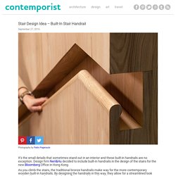
18 Examples Of Stair Details To Inspire You. Stairs have the surprising ability to determine how a home feels.
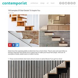
They’re seen and used often so having a staircase that stands out is a great way to make your house feel unique. Here are 18 examples of sleek, stylish stairs in modern homes. 1. These wood and black steel stairs almost create an optical illusion if you get too close! Aarhus Residence by Dinesen. 2. Architecture by Paul Jones. 3. Designed by Bates Masi Architects. 4. Designed ESTUDIO 30 51. 5. Designed by Brininstool + Lynch Architects. 6. Designed by Pitsou Kedem Architects. 7. Designed by Zaetta Studio Architecture & Design. US firm KieranTimberlake has nestled a home into a rocky outcrop in New York State, with mirrored cladding that reflects the forested landscape and sky (+ slideshow).
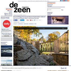
Called the Pound Ridge House, the dwelling is situated on a south-facing site that rises over 100 feet (30 meters) as it ascends from a wetland to the top of a ridge. The 33-acre (13-hectare) escarpment is strewn with boulders, trees and remnants of old farm walls. It is located in the town of Pound Ridge in Westchester County, which is about 50 miles (80 kilometres) outside of New York City. A brown cashmere coat, a pair of sand-coloured shoes and a piazza in Rome influenced Note Design Studio's renovation of this 1930s loft apartment in Sweden.
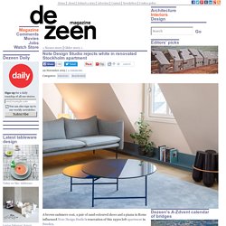
The renovation is the first residential project by the Stockholm studio, which is better known for its furniture and homeware design, including a range of chairs for Spanish brand Sancal, and a curved steel clothing rail. Since its construction in the 1930s, Casa Ljungdahl had undergone multiple renovations. "When it was our turn to renew the apartment our first step was to simplify everything we felt was too much, in terms of dimensions and materials," said Note Design Studio. "The task was to create a relaxed, soft environment and the main interior feature is a dark, low-lying base line that runs like a unifying horizon through the whole apartment.
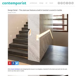
" Referencing images of a brown coat and some beige-coloured sports shoes, the studio opted for a soft colour palette. "The images were our inspiration," Note's Susanna Wåhlin told Dezeen. When Quinn Architects were designing this house in Los Angeles, a handrail for the stairs was built into the wall, which was then clad in marble.
Photography by Berlyn Photography and Tim Street-Porter. Architecture firm CONTENT, have designed the Kipling Residence, a new home in Houston, Texas.
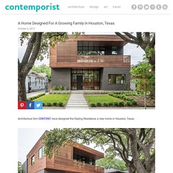
The description from the designer: The Kipling Residence is a new addition to the Montrose neighborhood of Houston just north of the Menil grounds. Designed for a growing family of five, it allows for generous open family zones oriented to large glass walls facing the street and a courtyard pool. The courtyard also creates a buffer between the master suite and the children’s play and bedroom zones. Fixed wood slats provide privacy on the first floor while a large sliding second floor panel allows the street balcony to exchange privacy control with the study.
This zinc-clad mews house in London by Paul Archer Design looks like a two-storey home from the front, but actually contains four storeys inside (+ slideshow).
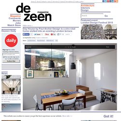
Day House by Paul Archer Design was built for a couple who previously lived in an apartment and wanted more space. It replaces a 1970s house in Islington, London, and sits within a terrace of mews homes that feature a mixture of architectural styles. "The owners bought the house knowing they were going to do some work, but it was only when we realised the extent of the work needed that it became clear we should replace it," architect Richard Gill told Dezeen. Architects: Preston Lane Architects Location: Sandy Bay TAS 7005, Australia Design Team: Daniel Lane, Nathanael Preston, Justin Hanlon, Garth Ancher Area: 260.0 sqm Project Year: 2014 Photographs: Derek Swalwell Builder: Mark Young Engineer: Burbury Consulting Interiors: Preston Lane Architects, Sophie Burbury From the architect.
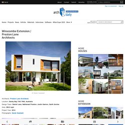
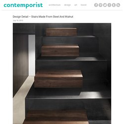
The Winscombe Extension Project called for a new rear addition to a 1920’s Californian Bungalow in an inner city suburb of Hobart. This house in Montreal, Canada, designed by Natalie Dionne Architecture, has stairs that feature a combination of steel and walnut.
Textured stone and wood surfaces are oriented both horizontally and vertically to emphasise spaces within this house for two doctors in Belgium (+ slideshow). Local studio Contekst was responsible for designing the interior of the detached property, which is located in a small village called Pulle – not far from Antwerp, where the "world's largest pivoting window" was recently added to a townhouse. The clients don't spend much time at home but, befitting their profession, they wanted a simple and calm interior that can be cleaned easily with minimal hassle.
Another key aspect of the brief for Project Pulle was to include interconnected spaces that enhance the character of the layout and its relationship with the surrounding garden. "The clients asked for everything to be connected with lines and open spaces," designer Sam Peeters told Dezeen. Architects: Eduardo Souto de Moura Location: Tavira, Portugal Area: 8164.0 sqm Project Year: 2012 Photographs: Luis Ferreira Alves Coordenator : Tiago Figueiredo Collaborators: Elisa Lindade, Ana Rita Alves, Ana Fortuna, Tiago Coelho, João Pedro Mendes, Patrícia Sobral, Ricardo Prata, Pedro Oliveira, Isabel Neves, Diogo Guimarães, Cláudia Romão, Jorge Domingues, Junko Imamura, Marta Pinho Strutural Consultants: A2P – Estudos e Projectos, Ltda.
Client: EGI – Entreposto Gestão Imobiliária, S.A. Project: December 2006 – May 2009 Site Area: 10.992m2 From the architect. Rotterdam architect Antonia Reif has renovated and extended a modest 1960s bungalow, creating a two-storey living room and a generous bedroom that both open out to the garden (+ slideshow). Situated next to a dyke on the outskirts of the city, the residence was originally built to accommodate a couple with no children. It is now home to a larger family, so Antonia Reif was tasked with doubling its floor area. "The new owners have two children and the house was too small for them," she told Dezeen. The existing property's main orientation was towards the street and the rear facade was predominantly closed, which meant the connection with the large garden at the rear was not optimised. After winning a competition to develop the site, instead of building a new house, Luigi Rosselli Architects chose to revive the existing house, so that it could maintain its closeness to the waterfront in Sydney, Australia.
The project description It is quite rare, in Woollahra Council’s municipality, to have a house waterfront residence so close to the water. One gets the feeling of being in Sydney Harbour when looking out of the oversized wafer-thin framed windows. C'est au milieu des sous-bois longeant l'estuaire de la Cornouaille que le propriétaire de cette maison a déniché, un beau jour, le terrain de ses rêves. Lui qui voulait une simple cabane en bois se plaît alors à imaginer une construction estivale en totale harmonie avec la nature. Mais, en découvrant ce site exceptionnel, l'architecte Arnaud Lacoste, de l'agence Lode Architecture, conçoit un projet plus ambitieux, celui d'une architecture contemporaine, discrète et parfaitement intégrée à son environnement.
Le propriétaire est immédiatement séduit par les lignes de ce parallélépipède rectangle simplement posé en pente douce, vêtu de bois et de verre et coiffé d'un toit plat. Concrete House by Studio Gil dezeen 468 6.