

Design's Next Big Frontier? Shaping Behavior In Real Time. Behavior Model - Triggers. The third element of the Fogg Behavior Model is Triggers.
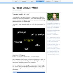
Without a Trigger, the target behavior will not happen. Sometimes a Trigger can be external, like an alarm sounding. Other times, the Trigger can come from our daily routine: Walking through the kitchen may trigger us to open the fridge. The concept of Trigger has different names: cue, prompt, call to action, request, and so on. Examples of TriggersFacebook uses Triggers effectively to achieve their target behaviors. Here’s one example: I hadn’t used my “BJ-Demo” Facebook account in a while, so Facebook automatically sent me this Trigger to achieve their target behavior: Sign into Facebook. Note how this specific behavior -- signing in -- is the first step of Facebook’s larger goal: reinvolve me in Facebook. Three Types of Triggers My Behavior Model names three types of triggers: Facilitator, Signal, and Spark.
Look at the Facebook example above. An effective Trigger for a small behavior can lead people to perform harder behaviors. "Social Objects are the future of marketing." Behavior Model - Triggers. BEHAVIOR DESIGN – Persuasive Tech. The best design solutions today change human behavior.
Yet despite decades of research, challenges remain for people who design to influence. No to NoUI – Timo Arnall. ‘The best design is invisible‘ is the interaction design phrase of the moment.
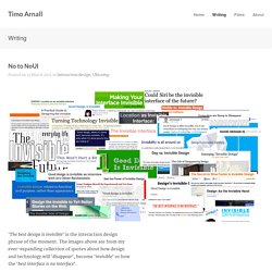
The images above are from my ever-expanding collection of quotes about how design and technology will ‘disappear‘, become ‘invisible‘ or how the ‘best interface is no interface‘. The Verge has recently given both Oliver Reichenstein and Golden Krishna a platform to talk about this. Conditional Loading for Responsive Designs. My UX Designer’s Workflow & Methodology. Posted on September 17, 2011 I finally have decided to write an article on the methods I use everyday of my designer’s life. It basically explains the main steps and workflows used in a project lifecycle from a UX Designer’s perspective. The main concept is to try to use developer’s methodology and apply it to the design field.
Halo: Reach character customization detailed. By Richard Mitchell on Mar 25th 2010 6:00PM G4 has posted an article detailing the 'Player Investment' system.
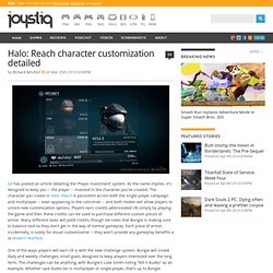
As the name implies, it's designed to keep you -- the player -- invested in the character you've created. The character you create in Halo: Reach is persistent across both the single-player campaign and multiplayer -- even appearing in the cutscenes -- and both modes will allow players to unlock new customization options. Players earn credits (abbreviated cR) simply by playing the game and then these credits can be used to purchase different custom pieces of armor. One of the ways players will earn cR is with the new challenge system. 3 Ways To Predict What Consumers Want Before They Know It. The insight that sparks innovation appears to occur randomly.
After all, the iconic shorthand for innovation is a light bulb, implying that ideas come from sudden flashes of inspiration. While such flashes are surely good things, it is hard to depend on them, particularly if you are at a company that needs to introduce a steady stream of innovative ideas. Steve Jobs once said, “It is not the customer’s job to know what they want.” That’s absolutely right. It is yours. The quest to identify opportunities for innovation starts with pinpointing problems customers can’t adequately solve today. A/B Split Testing vs. Usability Testing - Which should you use? Full infographic featured below A/B testing is often spoken of as though in opposition to usability testing.

In reality, the two types of tests answer different questions and serve different purposes. Blog.fuzzymath.com/wp-content/uploads/2011/07/Fuzzy-Math-How-to-design-a-wireframe.pdf. Ignore the code. Essential and Desirable Skills for a UX Designer. By Janet M.
Six Published: December 20, 2010 Send your questions to Ask UXmatters and get answers from some of the top professionals in UX. In this edition of Ask UXmatters, our experts discuss what skills are essential and desirable for a UX Designer. Each month in Ask UXmatters, our panel of UX experts answers our readers’ questions about a broad range of user experience matters. The following experts have contributed answers to Ask UXmatters this month: Evolving Interfaces: Voting group: grouping visitors to add immersion. How to Make Progress Bars Feel Faster to Users. By anthony on 05/29/12 at 1:52 pm In today’s age of instant gratification, making users wait too long for your application to load is a user experience issue.
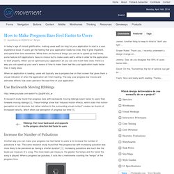
If users get the feeling that your application loads too slow, they’ll grow impatient, and spend their time elsewhere. While there are technical things you can do to speed up load times, some feature-rich applications have no choice but to make users wait a while in order for the application to work properly. When you’ve optimized your application all you can and it still feels slow, there’s a way you can speed up your user’s sense of time to make them feel like your application loads faster than it really does. When an application is loading, users will typically see a progress bar on their screen that gives them a visual indication of when the application will finish loading.
How To Win The Talent War. Advanced Search and Filter Tools. Useit.com: Jakob Nielsen on Usability and Web Design. 7 Ways To Disrupt Your Industry. Massive disruption is coming, and the only question is whether your firm is going to cause it or fall victim to it.

Disruption is not easy--either to create or to confront. We have no illusions about that. But in the spirit of helping established firms best serve their customers, we offer seven ways your firm could disrupt its own industry, raising the standards of customer experience and creating new opportunities for growth: 1) Totally eliminate your industry’s persistent customer pain points. Each industry has practices that drive customers crazy. Technology providers drive customers crazy with technical support that often requires long waits on hold and hopelessly complex interactions (“Just find the serial number on the back of your device and type that into the space provided along with your IP address and the exact wording of the error message you encountered”). Guiding Principles for UX Designers. Editor's Note: This is a republication of a very popular article Whitney Hess (@whitneyhess) originally wrote on her blog, Pleasure & Pain, back in November.
We usually avoid duplicating popular content, but this is such valuable information that we wanted to make sure as many people saw it as possible. Five months ago I wrote a post titled, "So you wanna be a user experience designer," in which I gathered all of the resources in my UX arsenal: publications and blogs, books, local events, organizations, mailing lists, webinars, workshops, conferences, and schooling. Design for Interaction: Ideation and Design Principles. You know what needs to be designed. You’ve listened to your business stakeholders and to your users. You’ve made models of the strategy and of the design research.