
I've been doing lineless work so long I've completely forgotten my way around inking. Fav artists to study for inking values? Anyone?
Les 8 types de nuages les plus spectaculaires qui flottent au-dessus de votre tête. Pas besoin d’avoir tout le temps la tête dans les nuages pour apprécier ce qui suit, mais ça peut quand même aider !

Si vous en avez assez de voir des nuages communs à perte de vue dans le ciel, voici des photographies de nuages impressionnants qui vous plairont certainement ! Les nuages n’ont bien sûr pas tous la même forme mais sont néanmoins composés de la même façon : des gouttelettes d’eau condensées en vapeur et qui prennent différentes formes dans le ciel. Ce sont ces formes très spéciales qui nous intéressent : si tout le monde connait déjà les cirrus, les cirrostratus ou encore les cumulonimbus, il en existe d’autres types très impressionnants… 1.
L’arcus L’arcus est un nuage en rouleau qui peut se former sur plusieurs kilomètres à la suite. 2. Ce nom est dérivé du latin qui signifie « mammaire ». 3. L’asperatus est un type de nuage très rare qui prend la forme d’ondes sombres aux airs menaçants. 4. 5. 6. Et oui, le voilà finalement. 7. 22 photomontages surréalistes qui vous feront voir l’architecture d’un tout nouvel œil. Un photographe d’architecture et d’origine belge, nous invite à découvrir son univers où le photomontage et le collage numérique dominent.

Le résultat : une belle série de maisons totalement impossibles et surréalistes ! Le photographe Filip Dujardin étend sa fascination pour l’architecture à travers une série de montages photos de bâtiments extraordinaires et carrément improbables.
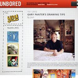
Poses. Couleur. Gary Panter's drawing tips. One of UNBORED‘s favorite artists of all time is Gary Panter — who became well-known in the 1970s as one of the first New Wave cartoonists (with his post-apocalyptic comic JIMBO) and graphic designers, and who went on to win three Emmy Awards for his Pee-Wee’s Playhouse set design; example of the latter below.

How much do we dig Panter? So much that Joe Alterio put him into a pantheon of Do It Yourselfers in one of his comics (“Don’t Wait for Permission!”) For our book; see image below, Panter is at bottom right. These days, Panter’s artistic activity includes comics, painting, prose, music, and light shows. He teaches at School of Visual Arts in Manhattan. PS: All drawings and sketches below are the property of Gary Panter. Get a book-size (or paperback-size)d sketchbook. You might want to draw more realistically or in perspective or so it looks slick — that’s is possible and there are tricks and procedures for drawing with more realism if you desire it. 1. 2. 3. 4. 5. 6.
The Technique Trap. Email A perceptive (and talented) art student by the name of Chris Campbell recently asked me this impressive question: “What do the animation industry pros say about us when we’re not around?”

He elaborated… “Have they noticed any common mistakes or bad habits in current student portfolios?” 2423 A.D.
Character design. Références. More Great Comic Book Resources. If you enjoyed Michael Cho's inking handout, here are a few more comic book resources that I've posted before (but not for a while).

All of them apply not only to comic books, but storyboarding and drawing as well. I haven't reposted this in years, but the artist Carson Van Osten created this handout years ago when he was drawing Disney Comics (I briefly worked with Carson when I did a short stint at Disney Consumer Products). I think most of it is printed in Frank and Ollie's book, "The Illusion of Life". Carson's handout is a great primer on common mistakes made in comic book design and layout. I posted some xerox copies of it years ago and it got a bit of attention on other websites.
Legendary Comic Artist Wally Wood did a piece that shows up everywhere on the web entitled "22 Panels That Always Work". If you're wondering what "Ben Day" refers to, they were transparent sheets with dots on them that comic artists would cut and lay onto panels to create grey tones or colors. Dr. Chris Mullen, The Visual Telling of Stories, illustration, design, film, narrative sequences, magazines, books, prints etc. This site records a range of material dedicated to the study of the Visual Narrative.

The original site, intended by me for part-time students and other interested parties was closed down by the University of Brighton in 2004. I was subsequently denied access to the original images most of which, however, were in my own collection. I have developed the site on a daily basis thereafter. It remains exclusively educational and is in constant use. Many thanks to those in the UK and beyond who shared my irritation at events. Chris@fulltable.com Wherever possible I have tried to get copyright permissions. Chris Mullen addendum July 2012. Poule de cristal. Image design.
Matériel.