

How Five Web Design Principles Boost Student Learning in an Online Course. “Our team realized quickly that we needed to do a better job cross referencing material on our course site.
Introduction to Information Design. Differences between Information Architecture and Information Design I believe I got this originally from Jesse James Garrett some time ago.
Between the two names we have different concerns. The Difference Between Information Architecture and UX Design. Newsletter Sign Up Original UX articles Curated Resources Never miss an issue!

Information architects form the blueprints of the web. Uxpin web ui design best practices. 6 Interface Design Principles and Tips Every Web Designer Should Know. Good interface design is like the air we breathe - it's there when you need it and you use it without thinking.
If you've ever used a bad interface design, struggled to get around a site, clicked away because you couldn't figure out what was going on, not been able to complete a task you had in mind, or just been plain confused, you'll know the perils of going wrong in this area. Websites are not pretty pictures, they are there to be used and consumed, so it's pretty important that as web designers we spend a good portion of time thinking about usability. In this article we'll consider some of the big usability issues and my tips for being a better interface designer. UX is not UI. Design Better And Faster With Rapid Prototyping. Advertisement The old adage, “a picture speaks a thousand words” captures what user interface prototyping is all about: using visuals to describe thousands of words’ worth of design and development specifications that detail how a system should behave and look.
In an iterative approach to user interface design, rapid prototyping is the process of quickly mocking up the future state of a system, be it a website or application, and validating it with a broader team of users, stakeholders, developers and designers. Doing this rapidly and iteratively generates feedback early and often in the process, improving the final design and reducing the need for changes during development.
Prototypes range from rough paper sketches to interactive simulations that look and function like the final product. The keys to successful rapid prototyping are revising quickly based on feedback and using the appropriate prototyping approach. The Rapid Prototyping Process Scoping A Prototype Find the Story Do… Don’t… Applying the Pareto Principle to the User Experience: MeasuringU. Jeff Sauro • September 12, 2012 In 1906 Vilfredo Pareto, an Italian economist, observed that wealth was unequally distributed in Italy.
He noted that 80% of the land and wealth was owned by 20% of the people. A similar relationship can be observed in the wealth and income across most countries. A minority of the population tends to generate the majority of the income and controls most of the wealth. The Anatomy of an Experience Map. Experience maps have become more prominent over the past few years, largely because companies are realizing the interconnectedness of the cross-channel experience.
It’s becoming increasingly useful to gain insight in order to orchestrate service touchpoints over time and space. But I still see a dearth of quality references. A step by step guide to scenario mapping. 6 minutes read Scenario mapping is a really quick, easy and dare I say it even fun way to collaboratively create, discuss and communicate user scenarios.
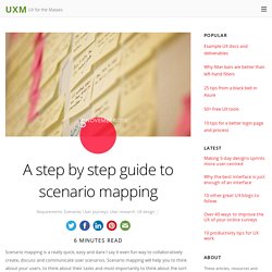
Scenario mapping will help you to think about your users, to think about their tasks and most importantly to think about the sort of user experience you want to provide. It will also help to ensure that your designs are grounded in the real world because scenario mapping forces you to consider the context in which a design is likely to be used. In this article I walk you though step by step how to go about creating scenario maps and why they’re so damn useful in the first place. 10 Heuristics for User Interface Design: Article by Jakob Nielsen. Download a free poster of Jakob’s 10 Usability Heuristics at the bottom of this article. #1: Visibility of system status The design should always keep users informed about what is going on, through appropriate feedback within a reasonable amount of time.
When users know the current system status, they learn the outcome of their prior interactions and determine next steps. Predictable interactions create trust in the product as well as the brand. A guide to carrying out usability reviews. Think that you need to be a usability expert to carry out a usability review?
Well I won’t deny that it helps (spoken like a true expert!) But since user experience certainly isn’t rocket science anyone can have a good stab at carrying out a usability review and learn a great deal in the process. In this article I walkthrough a method for examining the usability of an interactive system (website, application, mobile app etc.) by using a combination of a scenario based and heuristic (i.e. best practice guidelines) based review. I also discuss when usability reviews are most useful and outline some of the pros and cons of the technique. Kick Ass Kickoff Meetings. During project-based work, every freelancer, agency, or internal department has “the kickoff meeting.” In theory, this meeting should have all the energy, excitement, and potential of the opening salvo of the Superbowl.
Project team members should be inspired coming out of that meeting, full of ideas, and a desire to begin exploring solutions. Agencies and freelancers should begin to see their clients as friends and collaborators with unique insights that can only come from frank, open discussion of the design challenge at hand. 6.10 ‘Agile’ Design: flexible designs for learning. Mike: Hey, George, come and sit down and tell Allison and Rav about that weird course you’re taking from UBC.George: Hi, you two. Yeah, it’s a great course, very different from any other I’ve taken.Rav.: What’s it about? Lovely ui. Redirecting. Signify 2 - Icon Font. Five Factors for Successful Persona Projects. By Jared M. Spool Originally published: Jul 06, 2011. How We Redesigned Our Product in Less Than a Week. Step 1: Patterns and intent Before the design sprint, the sprint leader (me, in our case) was responsible for finding websites and products we might seek to emulate, “patterns.”
These patterns could be as high-level as the “personality of website X” or as granular as a typeface or other visual style. UX_DecisionFlow.png (PNG Image, 1855 × 1200 pixels) - Scaled (55%) 6 principles of visual hierarchy for designers. First there were stone tablets, papyrus scrolls and paper. Then came computer screens and electronic tablets. As the technology to display a page evolves, it remains the designer’s job to arrange the content clearly. But what’s the best way? It’s an increasingly important question, as responsive frameworks force designers to think about many different pages at once. Faced with dense text and short attention spans, designers developed 6 principles to guide the reader’s eyes to the most important information.
These 6 principles of visual hierarchy will help you design everything from brochures to apps, guaranteeing a positive reading experience for the end-user. Clay tablet: Wikipedia (left); iPad: apple.com (right) 1. Scenarios. Scenarios describe the stories and context behind why a specific user or user group comes to your site. They note the goals and questions to be achieved and sometimes define the possibilities of how the user(s) can achieve them on the site.
Scenarios are critical both for designing an interface and for usability testing. What to Consider When Writing Scenarios Good scenarios are concise but answer the following key questions: Bad UI/UX Design. iOS UI Animations. Use Your Interface. Lovely ui. Use Your Interface.