

iOS 7 UI Transition Guide. Infographic: The Web Design Trends Of 2013. Click image to view entire infographic Click image to view entire infographic Put together by the team at Enfuzed, this is an infographic that entails some of this year’s web design trends.
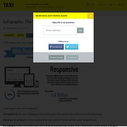
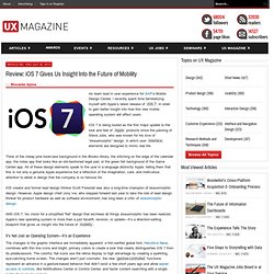
However, this infographic is not merely a list but also explains the rationale for certain design choices. For example, taking a minimalist approach is all about keeping things simple, while a fixed header enables people to navigate through websites easily. What do you think—are some of these trends here to stay? Generate app icons of all sizes in a click! (5) UI/UX Design Patterns: What are some design patterns galleries for the iPad. iPad User Experience Guidelines. Review: iOS 7 Gives Us Insight Into the Future of Mobility. As team lead in user experience for SAP’s Mobile Design Center, I recently spent time familiarizing myself with Apple’s latest release of iOS 7 in order to gain better insight into how this new mobile operating system will affect users.
A Look at Flat Design and Why It's Significant. There has been a growing tidal wave of flat designs on the web, and recent trend reports have confirmed that they're only increasing in popularity.
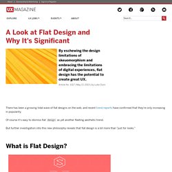
Of course it's easy to dismiss flat design as yet another fleeting aesthetic trend. But further investigation into this new philosophy reveals that flat design is a lot more than "just for looks. " What is Flat Design? Flat design can be seen as the more sophisticated and versatile cousin of minimalism. While flat designs look great when made within the restraints of minimalism, they can also handle a lot more complexity; these designs have a crispness and clarity that can only be achieved by stripping away three dimensional effects. Embracing the limits of the screen and working within those parameters rather than trying to disguise them.Using this newfound simplicity as a starting point for streamlining designs, and making websites faster and more functional. A Look at Flat Design and Why It's Significant.
Sizes of iPhone UI Elements. How to detect the current device size and kind Other dimensions common to all screen sizes: Points vs.
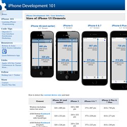
Pixels Apple introduced retina displays starting with the iPhone 4. You don't have to modify your code to support high-res displays; the iOS coordinate system uses points rather than pixels, so the dimensions and position in points of all UI elements remains the same across all devices. iOS supports high resolution displays via the scale property on UIScreen, UIView, UIImage, and CALayer classes. To refer to an image in your code (or in Interface Builder), use the filename of the standard sized image. iOS will automatically detect and use the @2x version if the device supports it: imageView.image = [UIImage imageNamed:@"button.png"]; Adjusting Sizes Click here to see how to adjust View Frames and Bounds. Additional References Apple Documentation: Points vs. iPad Application Design. I held a 6-hour workshop at NSConference in both the UK and USA recently, focusing on software design and user experience.
Predictably, an extremely popular topic was the iPad, and how to approach the design of iPad applications. I gave a 90-minute presentation on the subject to start each workshop, and I want to share some of my observations here. Please note: this is about the user interface conventions and considerations which apply to creating software for the iPad platform (and touch-screen tablet devices in general). First look: iOS 7 on the iPad [U] Does iOS 7 work the same magic on iPad as it does the iPhone?
![First look: iOS 7 on the iPad [U]](http://cdn.pearltrees.com/s/pic/th/first-look-ipad-electronista-62822962)
Apple's iOS 7 beta is now available for the iPad after a two week delay since its debut at WWDC. It brings with it all the same UI enhancements and design themes from the iPhone version to the iPad, but some of these have been translated to the larger iPad and iPad mini displays differently. In many ways, seeing the new transitions and animations on a larger display also helps to amplify the comprehensive design changes that Apple has implemented across its latest mobile operating system. The key differentiator between Apple's iPads and its iPhones is the way that iPad apps use the available display area. This was something that Apple critics did not fully appreciate when the first iPad launched in 2010. 5 Things to Know When Designing for iOS.
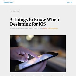
Based on our experience creating great iOS apps, we’ve come up with a list of 5 things we believe designers should keep in mind while conceptualizing interfaces for iOS.
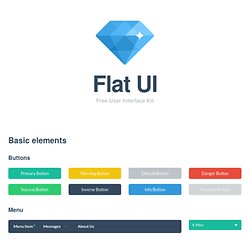
While the focus of this article is only on iOS apps, much of the advice here translates directly to other mobile platforms. 1. Understand Your Medium. Flat UI Kit - HTML/PSD Design Framework. Header 3The Vatican transitions to a Header 4Great American Bites: Telluride's Oak, The Header 5Author Diane Alberts loves her some good Header 6With the success of young-adult book-to-movie Paragraph Cum sociis natoque penatibus et magnis dis parturient montes, nascetur ridiculus mus.
11 Rules For Great UX Design, Adapted From An Original Mad Man. This is the newest piece from design and innovation firm Method in their 10x10 series.
The Mad Men era of advertising has passed. Today, a brand’s communication and engagement strategy is no longer a separate and distinct practice from the design of a product or service. The product is the marketing, and the marketing is the product. So what does advertising mean in the digital age? GoodUI. 12 pro tips for great user interface design. As its name implies, great user interface (UI) design should revolve around the needs of the target user.
That is why user interface design principles are so important. All else is secondary, including the aesthetic - although in many cases form goes hand-in-hand with function. But while the concept of good UI design may be easy to get your head around, it's not so easy to achieve in practice. Here we gather together some expert tips from the cream of the design industry.
Follow these and you won't go far wrong... 01. "A dialed-in creative navigation concept should be central to the UI design. 02. "It depends on the objective of the interface you're designing," reasons Sarah Morris of LBi. 03. "Surprising the user is the job of the creative concept," believes Bernadette Smail of Grip Limited, "but the interface must be intuitive. 04. 05. Sarah Morris' three top tips for great UI design are simple: "Context, context, context," she smiles. 06. 07. 08. 09. 10. 11. 12. India) - iOS 7 - Design. Apple Publishes iOS 7 Transition Guide To Help Developers Adopt Flat Design. As expected, Apple is introducing a completely new design language for iOS 7. For developers, this means they will have to adapt their apps to match the rest of the operating system if they don’t want them to look antiquated. Thankfully, Apple today also published a pretty extensive guide to designing for iOS 7 and transitioning apps to the new version that helps developers understand how they should use new UI elements like borderless buttons, translucent bars and full-screen layouts for their apps.
As Apple notes, iOS 7 provides “a rare opportunity to revisit the way apps communicate their core purpose and functionality to users.” Here are Apple’s three main themes for developing for iOS 7: Deference. One new feature Apple especially stresses in its documentation is Dynamic Type, which now automates many of the text layout functions in iOS. 10 things designers need to know about iOS 7. Apple has long been criticised for the slightly haphazard approach it's taken to the user interface design of its apps, and the iOS platform in general. Some apps have featured heavily skeuomorphic design, while others have been purely functional with little or no design flourish. Yesterday, though, that all changed. At its annual developers conference, WWDC, Apple introduced an all-new design language for iOS 7, eschewing the pseudo-3D patent-leather, wood and felt in favour of a clean approach that’s typography-led and heavily (although not exclusively) influenced by flat design.
This shift in approach is a game changer to designers responsible for crafting iOS app interfaces.