

Font-weight. The font-weight property sets the weight, or thickness, of a font and is dependent either on available font faces within a font family or weights defined by the browser.
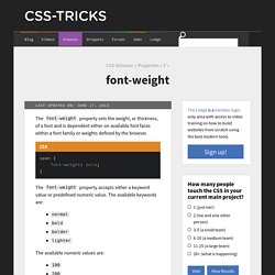
The font-weight property accepts either a keyword value or predefined numeric value. The available keywords are: normalboldbolderlighter The available numeric values are: The keyword value normal maps to the numeric value 400 and the value bold maps to 700. In order to see any effect using values other than 400 or 700, the font being used must have built-in faces that match those specified weights. If a font has a bold ("700") or normal ("400") version as part of the font family, the browser will use that. The following demo demonstrates the use of the alternate weight values: The above demo is using the free font Open Sans, embedded using the Google Web Fonts API. Common fonts like Arial, Helvetica, Georgia, etc. do not have weights other than 400 and 700. Using "bolder" and "lighter" keywords Related Properties font.
Public Service Announcement: Watch Your @font-face font-weight. iPhone 6 Screens Demystified. ExternalCSSinDWCC.pdf. iOS 8 removed "minimal-ui" viewport property, are there other "soft fullscreen" solutions?
Edge Reflow. Five Useful Things You Can Do With Adobe Reflow Right Now. Edge Reflow is a relatively new program from Adobe, having been announced in 2012 and released in February 2013, with the elevator pitch of enabling you to "Design the responsive web" and "Create beautiful responsive designs".

The tricky part is that right now you can't actually use it directly to create responsive websites, only responsive designs. This means you can open up Reflow and use its visual design interface to create fully functioning design prototypes, with color schemes, layouts, form elements, links and text content in place. Exporting SVG for the web with Adobe Illustrator CC. As an artist and a web designer, I am excited about the possibilities that Adobe Illustrator CC offers in its support of Scalable Vector Graphics (SVG) and the flexibility it gives me when creating high-quality graphics.
Since SVG is vector-based, I have a lot more freedom to create images that will automatically scale on all modern devices. Vector graphics can be very interesting for designers who need to create icons, symbols, or logos that will look great on all screens, including Retina displays. SVG graphics naturally scale and are usually small and can be compressed further by web servers. SVG is getting a lot of attention now, but it's not exactly a new format: The W3C started work on it as far back as 1999. The consortium recommends the use of SVG 1.1 (since 2001) because version 1.2 is still a working draft.
Today, SVG 1.1 is supported by the vast majority of web browsers on the desktop and mobile devices. To export SVG files from Illustrator, you need to choose File > Save As. Illustrator CC for web designers. What’s New With InDesign CC 2014. Editor’s note: This article summarizes the most important changes in InDesign CC 2014.

A more in-depth look at all of the new features will be published in issue 63 of InDesign Magazine. For the first time in a year, Adobe now has a major new release of InDesign for Creative Cloud subscribers. There are features for everyone, whether you create layouts for print or digital publishing. The focus of the update has returned to the basics, including dealing with long-standing layout issues: there are new ways to work with color swatches, footnotes, and tables. InDesign has added workflow improvements—easier upgrading to a new version, new ways to package files, and a huge number of EPUB enhancements, including the ability to export Fixed Layout files that require very little preparation.
A New Name Beginning with this release, Adobe is adopting new branding approach for Adobe Creative Cloud applications. Color Groups. Design an Ebook with fixed layout. Share this Episode Please select a language: Autoplay End of Video Show End Screen Default Quality Adjust your embed size below, then copy and paste the embed code above.

Community Translation. Browser testing across devices with Adobe Edge Inspect. Testing your pages with Edge Inspect is even easier than the setup.
Simply browse using your Chrome browser, and all devices that have been connected will follow along. This enables you to test the appearance and behavior of any page on a variety of devices at the same time. Plus, Edge Inspect will keep your device from going to sleep, so you no longer need to unlock the device when you want to test the page. You aren't limited to just browsing within a single tab; Edge Inspect will display the content within the current tab as you switch across tabs.
Edge Inspect also lets you view pages in full screen mode, removing the default Edge Inspect application chrome. Of course, browsing live web pages is useful, but most of the time you will be developing locally. Not surprisingly, Edge Inspect cannot load files browsed via as the file doesn't exist on your devices. CSS3 regions: Rich page layout with HTML and CSS3.