

Médiathèque Numérique Vérification d'email nécessaire. Priority Guides: A Content-First Alternative to Wireframes. No matter your role, if you’ve ever been involved in a digital design project, chances are you’re familiar with wireframes.
After all, they’re among the most popular and widely used tools when designing websites, apps, dashboards, and other digital user interfaces. Article Continues Below But they do have their problems, and wireframes are so integrated into the accepted way of working that many don’t consider those drawbacks. L’accessibilité numérique, et si nous agissions ? Home - Seeing Data. Scrum in a Nutshell: How it Works. Scrum has already proved to be one of the most effective methodologies for managing a product development process.
It helps teams set a workflow and make the work on a project as productive and efficient as possible. We have a separate article explaining what Scrum is, the philosophy behind it and its main benefits for the development process. You can read it here. Yet, if you didn’t hear much about this approach before, it might be quite challenging to figure out how Scrum works. This is because unlike more conventional project management methodologies (for example, Waterfall), Scrum has its own terminology and quite strict rules which have to be followed. In this article, we’ll try to explain Scrum in simple words, so you can clearly understand all the nuts and bolts and appreciate its advantages yourself.
Scrum Team All Scrum team members have their own roles with specific responsibilities. A Scrum team consists of a Product Owner, Development Team and Scrum Master. Epics vs User Stories: the Key Difference and Examples. If you have ever developed any software or just plan to do this, you’ve probably heard the words “epic” and “user story”.
There are also good chances that you’ve seen epics and user stories in a budget estimation received from IT outsourcing company, in case you’ve ever requested such. This is because both terms are pretty popular in the tech world since coding teams and other participants of the development process use them quite often. The problem, however, is that different people usually mean different things when they talk about epics and users stories. Nothing is engraved in stone and teams tend to adapt terminology to what is convenient for them. The bad news is that such state of affairs may lead to some misunderstandings between developers and a client, which is a rather unfortunate outcome.
In this article, we’ll try to sort things out and explain what is epic and what is user story based on our practical experience. Userfocus Newsletter. Online UX User Experience Training. Tree testing 101 – Optimal Workshop. Analyzing tasks one by one will help you to see clear links across the data visualizations, and the overall Task result is where you’ll start.
It gives you a success and directness score for each task, the average time taken to complete the task by participants, and a breakdown of whether each success, fail, or task skip was direct or indirect. Each task also receives an overall score out of 10 (with an 8 or above score considered well-performing). The Success score tells you what percentage of participants went to the correct destination on the tree, regardless of how direct they were. The Directness score tells you the percentage of people who went straight to a destination without backtracking, regardless of whether they were correct or incorrect. - The easiest way to master UX/UI design.
Timothée - Les Lilas,Seine-Saint-Denis : Designer freelance donne cours de PAO (InDesign / Illustrator / Photoshop), UI/web design (Sketch / Figma / Adobe XD) et d’initiation à l’environnement Mac OS X, dans l’Est de Paris. Analytics Academy. Facilitator’s Guide to Human-Centered Design. FOCUS GROUPE MANUEL MAKESENSE.ppt.pptx. UX Design Masterclass.
Liens & Ressources - Airtable Universe. UX Design Books: What UXers Must Read in 2020 (Updated)? Dont Make Me Think A Common Sense Approach to Web Usability 2nd Ed 2005. USERADGENTS Design for Accessibility. Apprendre à apprendre : des outils mentaux puissants qui vous aideront à maitriser les matières difficiles. UXPressia-CJM-Cheat-Cards.pdf. UXPressia-Persona-Cheat-Cards.pdf. Degreeless.design - Everything I Learned in Design School. – Booklets.io. (4) [UX LIVE] Comment faire des tests et entretiens À DISTANCE □ ? Une sélection des meilleures formations en ligne au design interactif.
Difficile de naviguer dans les formations en ligne consacrées au design, tant elles sont hétérogènes en termes de qualité et d’objectifs pédagogiques.
Celles qui sont qualifiantes sont plutôt rares, comme les programmes du Laptop que nous recommandons. Nous avons dressé une liste des contenus, en anglais mais aussi en français, qui abordent un éventail assez large de compétences de design : architecture de l’information, design d’interface, recherche utilisateur, UX…Pour compléter cette liste, n’hésitez pas à m’adresser vos suggestions (bd@designersinteractifs.org). Le Laptop propose des certificats de compétences, des modules à la carte et des masterclasses.
L’avantage de ce programme est qu’il est modulaire et très aligné avec les exigences actuelles du marché : Design sprint, design systems, facilitation, product design. 5 things to tick off before launching a remote card sort - Optimal Workshop. Card sorting is a tried and true research method that has been used by researchers across the globe for decades.
It’s a user-centred design technique to help improve your information architecture by understanding how people expect items to be labeled, grouped and organized on your website. Ultimately, the goal of any card sort is to maximize the probability of users being able to find information on your site. You can run card sorts in person, or remotely using online card sorting tools. Remote card sorting has many benefits. For one, it’s affordable, convenient and easy to set up. When you’re launching a card sort, there are a few things you need to tick off before you invite your participants. Intro to UX research - The ultimate getting started guide. UX research What is UX research UX research, or user research as it’s commonly referred to, is an important part of the design process.
Primarily, UX research involves using different research methods to gather information about your end users. Une sélection des meilleures formations en ligne au design interactif. Une sélection des meilleures formations en ligne au design interactif. Measure customer satisfaction: CSAT, CES and NPS. In market research we love acronyms almost as much as the IT world does.
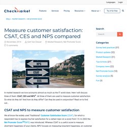
Here I will discuss three of them: CSAT, CES and NPS®. All three of them are used to measure customer satisfaction. Build Product Faster and Better. Gestalt principles in UI design. - Muzli - Design Inspiration. Here’re the Gestalt principles which can inform today’s UI design.
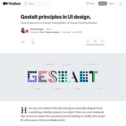
Elements arranged close to each other are perceived as more related than those placed further apart. This way different elements are viewed mainly as a group rather than as individual elements. How does the Proximity principle apply to UI design? We can use the Proximity principle in UI design for grouping similar information, organising content and decluttering layouts. Its correct use will have a positive impact on visual communication and user experience. As the principle states, items that are related should stay close to each other, while the unrelated items should stay further apart. We can apply the Proximity principle pretty much everywhere from navigation, cards, galleries and banners to lists, body text and pagination. Similarly to the Proximity principle, elements placed within the same region are perceived as grouped. Writing for Web & Mobile. Learn the Fundamentals of UX Writing Online.
Chatbot Writing & Design. Portfolio UX : tout ce que vous avez toujours voulu savoir. Comment tirer son épingle du jeu lorsqu’un recruteur passe en moyenne 6 secondes sur un curriculum vitæ et 30 à 60 secondes par portfolio ?
Other Projects — Chris White. User Experience Design & Research Intern. Bring world-class user experiences to our customers one signature at a time. User Experience Design & Research InternProduct User Experience | Paris,France Closing Date: 31st March 2020 Our agreement with employees DocuSign is committed to building trust and making the world more agree-able for our employees, customers and the communities in which we live and work. You can count on us to listen, be honest, and try our best to do what’s right, every day. At DocuSign, everything is equal. The team Our Product Experience team - Design, Information, and Insights - focuses on our customers and their business needs. We are passionate customer advocates who not challenge ourselves but others as well in the broader product organization to fall in love with the problem, not the solution. We contribute from the concept all the way to the building of world-class product experiences by partnering with Product Managers, Program Managers, Software Engineers and other cross-functional teams.
6-Steps-to-Land-Your-UX-Job.pdf. UX Apprentice. UX Design Course Curriculum.