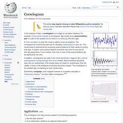

Correlogram. A plot showing 100 random numbers with a "hidden" sine function, and an autocorrelation (correlogram) of the series on the bottom.

Example for a correlogram In the analysis of data, a correlogram is an image of correlation statistics. For example, in time series analysis, a correlogram, also known as an autocorrelation plot, is a plot of the sample autocorrelations versus (the time lags). STAT 510 - Applied Time Series Analysis. Printer-friendly version Assignments: Read pages 1-10 and 28-33 of your text.Read through the Lesson 1 online notes that follow.Complete Lesson 1 Assignment.

Overview: This first lesson will introduce you to time series data and important characteristics of time series data. We will also begin some basic modelling. Inferential Statistics. Pearson product-moment correlation coefficient. In statistics, the Pearson product-moment correlation coefficient (/ˈpɪərsɨn/) (sometimes referred to as the PPMCC or PCC or Pearson's r) is a measure of the linear correlation (dependence) between two variables X and Y, giving a value between +1 and −1 inclusive, where 1 is total positive correlation, 0 is no correlation, and −1 is total negative correlation.

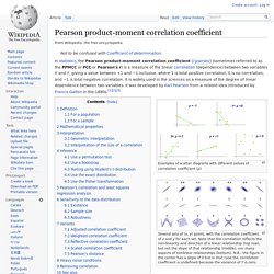
It is widely used in the sciences as a measure of the degree of linear dependence between two variables. It was developed by Karl Pearson from a related idea introduced by Francis Galton in the 1880s.[1][2][3] Examples of scatter diagrams with different values of correlation coefficient (ρ) Several sets of (x, y) points, with the correlation coefficient of x and y for each set. Note that the correlation reflects the non-linearity and direction of a linear relationship (top row), but not the slope of that relationship (middle), nor many aspects of nonlinear relationships (bottom).