

Edit fiddle. CSS-Tricks. The ::before and ::after pseudo-elements in CSS allows you to insert content onto a page without it needing to be in the HTML.
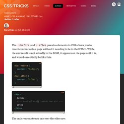
While the end result is not actually in the DOM, it appears on the page as if it is, and would essentially be like this: <div> before after </div> The only reasons to use one over the other are: You want the generated content to come before the element content, positionally.The ::after content is also “after” in source-order, so it will position on top of ::before if stacked on top of each other naturally. Note that the content is still inside the element they are applied to. The value for content can be: A string: content: "a string"; – special characters need to be specially encoded as a unicode entity. A Whole Bunch of Amazing Stuff Pseudo Elements Can Do. By Chris Coyier On June 13, 2011 It's pretty amazing what you can do with the pseudo elements ::before and ::after. For every element on the page, you get two more free ones that you can do just about anything another HTML element could do.
They unlock a whole lot of interesting design possibilities without negatively affecting the semantics of your markup. Here's a whole bunch of those amazing things. A roundup, if you will. 12 Little-Known CSS Facts. CSS is not an overly complex language.
But even if you’ve been writing CSS for many years, you probably still come across new things — properties you’ve never used, values you’ve never considered, or specification details you never knew about. In my research, I come across new little tidbits all the time, so I thought I’d share some of them in this post.
Admittedly, not everything in this post will have a ton of immediate practical value, but maybe you can mentally file some of these away for later use. 1. The color Property Isn’t Just for Text Let’s start with the easier stuff. Take a look at the demo below: Notice in the CSS, only one color property is used, on the body element, setting it to yellow.
Less. Customizing bootstrap. Parallax. An Introduction to Gulp.js. This article was sponsored by New Relic.

Thank you for supporting the sponsors who make SitePoint possible! We’ve discussed many ways to reduce page weight and increase performance of obese websites. Some are a one-off undertakings, such as enabling gzip compression, switching to an appropriate image format, or removing unnecessary fonts. Other tasks require repeated effort every time you make a change… compressing new or modified imagesremoving console and debugger statements from scriptsconcatenating and minifying CSS and JavaScript filesdeploying updates to a production server You may start with good intentions but the most infallible developer will forget to compress an image or two.
What you need is an automated task runner — or build process. That Sounds Scarily Complicated! Defining your build process is more complex than performing each task individually but, over time, you’ll save hours of effort and reduce human error. Parallax backgrounds with centered content · Minimit. Responsive parallax background images with content centering and overflow Here's a simple and customizzable Css and jQuery solution to achieve parallax scrolling background animations like on spotify It's based on the fullscreen backgrounds with centered content solution and they shares some of the code, and the same features like: vertical and orizzontal centering of content, content overflow (the background scale to fit content if it's higher than the window) and also do fullscreen backgrounds relative to the container (by using .not-fullscreen class instead of .fullscreen) The parallax is disabled on touch devices, because it doesn't work with the touch scrolling, but it gracefully degrade to full-size images, like the fullscreen background solution.

If you don't need centered content you can remove the .content-a and .content-b tags and Css. The Markup You have to apply the background-image style using the url of the image you want as background. Advanced Parallax Scrolling Effect. Get SourceView Demo Introduction Previously, we looked at a simple implementation of parallax scrolling.
In that tutorial, the background remained fixed while the foreground scrolled as normal. We used only CSS to achieve this, covering the available space with big and bold background images. In this tutorial, we'll look into achieving a more true-to-life representation of parallax scrolling. The Markup & Structure Our markup is the exact same as before. Building With Flexbox. Get SourceView Demo Introduction A while back, I wrote an article for SitePoint introducing flexbox.
In that article, I investigated and tried to answer the question: Are we ready to use flexbox? Back then, I said you'd have to choose wisely when to use it, but insisted that you should start getting familiar with the syntax and incorporating it into your modern projects. Yes, we are ready to use flexbox! If you're unfamiliar with flexbox, then here's a quick primer.
Html tmplating. Bootstrap grid. Media queries. Transitions & transforms. Sprites and sprite builders. Text effects & plugins. Javascript sprite sheet animations. Footers.