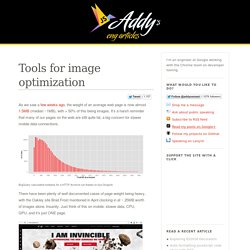

Tools for image optimization. As we saw a few weeks ago, the weight of an average web page is now almost 1.5MB (median ~1MB), with > 50% of this being images.

It’s a harsh reminder that many of our pages on the web are still quite fat, a big concern for slower mobile data connections. BigQuery calculated medians for a HTTP Archive run thanks to Ilya Grigorik There have been plenty of well documented cases of page weight being heavy, with the Oakley site Brad Frost mentioned in April clocking in at ~ 25MB worth of images alone. Insanity. Just think of this on mobile: slower data, CPU, GPU..and it’s just ONE page. Images are a non-trivial problem to solve because they occasionally need to be high-res, but at the same time small enough to not kill your users mobile data cap. The page cost of using images on the web is however not a new problem but we’re at least moving beyond blaming scripts as the main culprit.
Tools As a general rule run lossy optimizers first, then lossless. Grunt tasks Individual tools PNG Quantizer. Imagemin. Minify images seamlessly Install $ npm install imagemin Usage const imagemin = ; const imageminJpegtran = ; const imageminPngquant = ; async { const files = await console; imagemin(input, options?)

Input Type: string[] File paths or glob patterns. options Type: object destination Type: string Set the destination folder to where your files will be written. Plugins Type: Array Plugins to use. glob Type: boolean Default: true Enable globbing when matching file paths. imagemin.buffer(buffer, options?) Returns Promise<Buffer>. buffer Type: Buffer Buffer to optimize. Related. WebKit Has Implemented srcset, And It's A Good Thing. WebKit has made some serious news by finally implementing the srcset attribute1.

As Chair of the W3C’s Responsive Images Community Group, I’ve been alternately hoping for and dreading this moment for some time now. It turns out to be good news for all involved parties—the users browsing the Web, most of all. As with all matters pertaining to “responsive images”: it’s complicated, and it can be hard keeping up with the signal in all the noise. Here’s what you need to know. What Does It Do? As originally proposed, the srcset attribute allowed developers to specify a list of sources for an image attribute, to be delivered based on the pixel density of the user’s display: Not too scary, this markup.
“Use low-res.jpg as the source for this img on low-resolution displays, and for any browser that doesn’t understand the srcset attribute. Things were starting to look scary, for a little while there. Can’t We Do That With JavaScript? Can’t We Do That With CSS? “Yes” and “No.” So This Is Good News. Tools for image optimization. The 18 best image file compression tools.