
Famous Paintings, Analysis, Interpretation. Using Adobe Illustrator to make Golden Section Grids - long video. Monthly Challenge: Baroque Diagonal - CRISOL STREET PHOTOGRAPHY (Madrid) Story of the 1.5 Rectangle and Basic Armature Through a typical DSLR camera, the shape of our field of view is a rectangle.

It is exactly one square and a half, or 1.5 squares. We have learned in our youth that if a photographer slices this rectangle equally in three parts, vertically or horizontally, and places a subject or various elements on these divisions, it makes a nicer, a cleaner and more pleasing composition. As children we learned this, “children” in the sense that very early in our artistic-photographic experience, we were indoctrinated with this idea of the “Rule of Thirds”. Further, we learned that the points where these lines intersect were particularly powerful. When we grew up a little we learned of the “golden mean” and perhaps of Phidias and later, Fibonacci. Or so we thought. We admired the masters, what they had accomplished.
And then we heard of an old man, an American, teaching a method of composition unlike these others. CRISOL's first month was a test run. Levi. CHIEF » The Golden Section: An Explanation. A lot of people I’ve talked to over the years are familiar with the concept of the golden ratio (φ) and have heard of the golden rectangle or the golden spiral.

While in art school, I studied what my art teacher referred to as the Golden Section, which is different than the basic concept of the golden ratio. This diagram shows a PHI rectangle, also known as the Golden Rectangle or the rectangle of the whirling squares. This is the rectangle that is most familiar to people when I mention the Golden Section.
The Golden Section is a grid system based on very specific proportioned rectangles. The most basic Golden Section rectangle is the root 2 rectangle shown here: There are seven basic golden section rectangles which all derive from the square. The other root rectangles are derived in a similar fashion. The Golden Section can be used in art and design as a grid system to maintain proportions and find dominant directions. You can do this for each of the basic Golden Section rectangles. The Rule of Thirds Killed Design and Left it for Dead - 1 of 365. “A painting that is well composed is half finished.”

Pierre Bonnard Yes, the title is true, the rule of thirds killed design and left it for dead. Sorry to bring it to your attention like this. I should’ve candy coated it, but that’s not going to happen. In fact, the rule of thirds is a cold hearted lazy bitch. I’m on a quest, 365 days actually, to try and expose the limits of the so called “Rule of Thirds” and introduce something that has been around for centuries and is just as easy to use. Do you think Bouguereau used the rule of thirds to design this masterpiece? Well, let’s start off by calling it the “Rule of Design” to keep the same theme going.
My goal with this 365 is to introduce to some of you a secret knowledge that hasn’t been watered down. As we all progress through this 365 together, we should seek out blogs and sites posting about the rule of thirds and politely ask them to delete it from existence. I hope to prove how valuable the canon of design can be for our art. 5 Fundamental Skills Every Artist Should Master. As an artist, your job is to immerse your viewers into a world that you have built and guide them safely through it.

Artists have much in common with storytellers. Storytellers have several tricks that they use to keep their readers coming back for more. Like storytellers, artists can use similar tricks to help them produce more compelling artwork. In this article, we will explain 5 fundamental skills that every artist should master. Let's take a look! ARTSEDGE: Formal Visual Analysis: The Elements & Principles of Composition. Overview In any work of art, all of these elements and principles will be present, but some will be more obvious than others.

When engaging in formal analysis, students should select the elements they feel are most strongly represented in the piece they are analyzing. A good place to start formal analysis is to look at a work of art and take note of how your eye moves around the object. Where does your eye go first, and why were you attracted to that part of the image? What colors, textures, and shapes appear in the image? Formal analysis is an important technique for organizing visual information. George Washington Crossing the Delaware. Go to Navigation Go to Content Go to Search Become a member MyMetSign in / Register METMEDIA see the museum in new ways George Washington Crossing the Delaware Program Information Art Trek: Ages 7 through 12 (10) Shipwreck.

5 Fundamental Skills Every Artist Should Master. A Baroque Composition. -By Howard Lyon I love the Baroque.

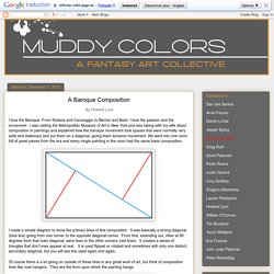
From Rubens and Caravaggio to Bernini and Bach. I love the passion and the movement. I was visiting the Metropolitan Museum of Art in New York and was taking with my wife about composition in paintings and explained how the baroque movement took spaces that were normally very solid and stationary and put them on a diagonal, giving them dynamic movement. Famous Paintings, Analysis, Interpretation. • Fouquet, Jean (1420-81) Portrait of Charles VII of France (1445-50) Louvre Museum, Paris Considered to be one of the greatest portrait paintings of the French school.

Melun Diptych (1450-55) Oil/panel, Koninklijk Museum; Gemaldegalerie, SMPK, Berlin This devotional diptych - commissioned by Etienne Chevalier, treasurer to King Charles VII - could easily be mistaken for a work of modern art, rather than an example of International Gothic. Fragonard, Jean-Honore (1732-1806) The Swing (Fragonard) (1767) Wallace Collection, London French Rococo masterpiece of erotic art in the tradition of Jean Watteau and Francois Boucher. Fuseli, Henry (1741-1825) The Nightmare (1781) Detroit Institute of Arts Highly imaginative fantasy/surrealist painting, now an iconic image. • Gentileschi, Artemisia (1597-1651) Judith Beheading Holofernes (1620) Oil on canvas, Uffizi Gallery, Florence. The secret of good composition. ‘And after drawing comes composition.

A well-composed painting is half done’ Pierre Bonnard Imagine a lovely drawing of a house with a path meandering up to it, trees either side in careful balance, a classic landscape scene that just ‘works’. Where is this masterpiece? The Tate? The National? No, stuck to your fridge door, created by a 4 year old. As a young child visual harmony and composition comes naturally. Children seem to start out with a near perfect sense of composition, if you have small children or are lucky enough to have any of your old drawings you created as a child I’m sure you’ll find the same to be true.