

Pour a Glass of Wine and Sink Into One of These Unusual, Luxurious Bathtubs. DIY dresser round-up. DIY dressers are a theme on the blog this month - check out mine here!

So on trend, i had to post a round-up of these DIY’d dressers that i found on ScrapHacker.com – a fantastic site for upcycling projects. this first one is ikat print… which i love! You know how i love to decoupage! Check out my decoupaged coffee table here. this dresser DIY is originally from Martha Stewart and i love the spin on a sketch of a vintage dresser decoupaged over a modern one! Love this chevron print dresser and i love those giant knobs! Love love this rustic look. this would be great in a Restoration Hardware inspired interior if you paired this with a chandelier near-by – rustic meets luxe. and those rope pulls remind me of the Decorating with Rope post i did a while back. full tutorial for this dresser here.
Ikea hacks are the best! Gift wrap! Geometric design. painter’s tape creates a nifty look! Two half circles in bright shades. Minkette Inspirations. Unusual stairs. Unique and creative designs of stairs from around the world.
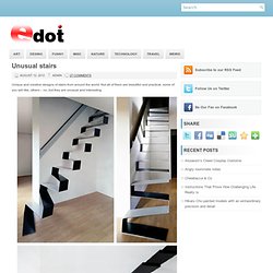
Not all of them are beautiful and practical, some of you will like, others – no, but they are unusual and interesting. Before & after: trolley depot renovation. It’s always been my dream to live in a home with airy, open rooms and lots of exposed bricks, so when this renovation project from Amy came across my desk, I was instantly smitten.
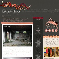
Located in Atlanta, this building is about 100 years old and originally served as a trolley depot. Thankfully, Amy and her husband did a wonderful job preserving many of the original details while adding some modern touches that complement the overall aesthetic beautifully. Wonderful job, Amy! — Kate Have a Before & After you’d like to share? Read more about Amy’s renovation after the jump! Time: 1 year Cost: $500k Basic Steps: The basic steps we took to achieve the look were to preserve the original space as much as possible and use the existing lines (like the arched windows) in other elements, like the niche, and the arched doorway — even the arch of the armoire.
Awesome Things (39 pics) Chalkboard Wall Calendar - Martha Stewart Home & Garden. Thanks to paint that dries into a chalkboard finish, your board can be whatever size you desire and placed wherever you like.
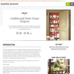
Store-bought formulas come in traditional green and black. But you can also follow our recipe to mix your own batch in any shade. Cleverly applied chalkboard paint means new places to track appointments, keep lists, and leave messages. Or simply use the surface to draw or doodle, which will appeal to kids and the kid in everyone.
Choose from the following ideas or come up with your own homemade chalkboard location. Tip: Start with flat-finish latex paint in any shade. Wall Calendar A home office is the ideal spot for a family planner. Mudroom Mural The bottom half of a mudroom wall is just the right height for pint-size Picassos -- when coated with store-bought green chalkboard paint. Message Center Write-on paint needn't be applied only to walls. Pantry Reminder. DIY! 7 new stylish ways to de-clutter your beauty closet. Brilliant Stairs photos.
Wall Photos. 25 Cool Ideas To Display Family Photos On Your Walls. Family portrait by Lori Andrews (via designcrushblog) We all have family photos that we love.
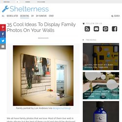
Most of them live well in photo albums but the best of them could and should be displayed throughout the house. It’s one of those things that add a personal touch of coziness to any interior decor. Besides, nowadays there are so many cool ways to display them that your family photos could even become a real design element. Some time ago we’ve already shown you a bunch of cool ideas how you can hang your photos and art in creative ways. Displaying pictures could be challenging but we can and will make the process more easy for you. 31 Insanely Easy And Clever DIY Projects. DIY Doily Light: Simple Suspended-Sphere Lace Lamp Shade.
So simple a child could make it – and have fun in the process, too.
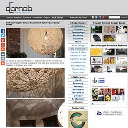
And the result? A shining example of how light and shadow can work together to brighten up a room. Swedish craftswoman Isabelle Dos started with a simple party-shop balloon, blown up big and wrapped in white lace place settings painted with wallpaper glue. The soaked material sticks readily to the sides of the inflated sphere, overlapping to form a contiguous shell, suspended and left to dry overnight like a plaster cast. TetraBox Light by Ed Chew & Yanko Design.
Liquid to Light Designer Ed Chew takes a green step in the right direction with the TetraBox lamp, a light object made from discarded drink packets that would have otherwise ended up in landfills already packed to the brim.

The design is achieved by unfolding the packets and refolding them into hexagonal and pentagonal sections that are then pieced together to form a geodesic sphere or any other desired shape. Here, the Epcot-like ball makes an attractive overhead light and casts an impressive web of shadows and shapes on the surrounding space. Removable Vinyl Wall Art Stickers.