

The Web Font Combinator. Fonts Raleway. 20 Amazing Free Font Pairings. Contrast and Collaboration Graphic designers generally agree that your different fonts should have an element of contrast (i.e. pairing a Sans Serif font with a Serif font) as well as a sense of collaboration-you want your two pieces of type to complement each other and “get along” rather than clash.
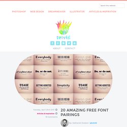
Things like style, flow, width, kerning, thickness, and more can all be attributes that help two different fonts pair nicely with a healthy amount of contrast and collaboration. Free Fonts Below These fonts are all available (as of the moment I published this post) for free! There are download links below each font pairing example. Acknowledgments: Just some awesome people to mention before we get started… Quotes by the insanely cool, QuotesOnDesign.com » Backgrounds for these fonts provided in the sweet background pack available for free at Line25 » Also, double check to make sure any free fonts you download are available for commercial use. 1.
Raleway Download Link » 40 Best Typeface Combinations in Web Design. When it comes to prints or Web Design, typography is one of the most important part.
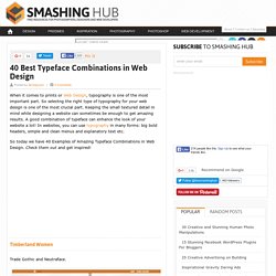
So selectng the right type of typography for your web design is one of the most crucial part. Keeping the small textured detail in mind while designing a website can sometimes be enough to get amazing results. A good combination of typeface can enhance the look of your website a lot! In websites, you can use typography in many forms: big bold headers, simple and clean menus and explanatory text etc.
So today we have 40 Examples of Amazing Typeface Combinations in Web Design. Timberland Women. Typographical twins: 20 perfect font pairings. Finding font pairings that set each other off, don't fight the eye for attention, and harmonise without becoming homogenous and dull is tough for graphic designers.
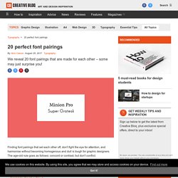
The age-old rule goes as follows: concord or contrast, but don't conflict. But with so many professional typefaces and free fonts to choose from, how do you find two that work in harmony? Here we bring you top font pairing tips, followed by 20 examples of perfect font pairings. Get Adobe Creative Cloud Tip 1: Use font superfamilies The easiest way to find perfect font pairings is by using different fonts within the same overarching typeface family. Fontsmith. FS Joey - Fontsmith. Free Font Exo by Natanael Gama. This license can also be found at this permalink: Copyright (c) 2011 Natanael Gama (exo@ndiscovered.com), with Reserved Font Name “Exo” This Font Software is licensed under the SIL Open Font License, Version 1.1.
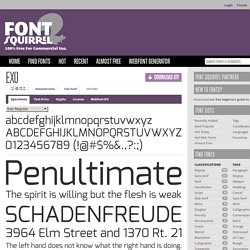
This license is copied below, and is also available with a FAQ at: —————————————————————————————- SIL OPEN FONT LICENSE Version 1.1 - 26 February 2007—————————————————————————————- PREAMBLE The goals of the Open Font License (OFL) are to stimulate worldwide development of collaborative font projects, to support the font creation efforts of academic and linguistic communities, and to provide a free and open framework in which fonts may be shared and improved in partnership with others. The OFL allows the licensed fonts to be used, studied, modified and redistributed freely as long as they are not sold by themselves.
Fonts Open Sans. Grumpy wizards make toxic brew for the evil Queen and Jack.
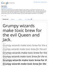
Light 300Grumpy wizards make toxic brew for the evil Queen and Jack. Light 300 ItalicGrumpy wizards make toxic brew for the evil Queen and Jack. Normal 400Grumpy wizards make toxic brew for the evil Queen and Jack. Fonts Source Sans Pro. Grumpy wizards make toxic brew for the evil Queen and Jack.
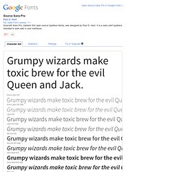
Extra-Light 200Grumpy wizards make toxic brew for the evil Queen and Jack. Avenir® Serifa® Karmina Sans. Karmina Sans follows the steps of its successful award winner cousin, Karmina Serif.
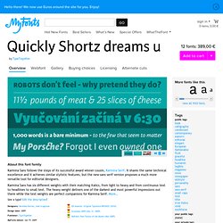
It shares the same technical excellence and it achieves similar stylistic features, but the new sans serif version proposes a much more versatile tool for editorial designers. Karmina Sans has six different weights with their matching italics, from light to heavy and from continuous text to headlines to small text. The heavy weight delivers one of the darkest and most powerful impressions out there while the text weights are perfect companions for Karmina Serif. Karmina. Karmina is a text typeface developed mainly for pocket books and budget editions.
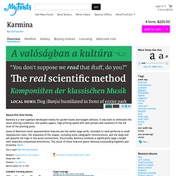
It was built to withstand the worst printing conditions: low quality papers, high printing speed with web presses and variations in the ink level of the printing press. Some of Karmina’s most representative features are the rather large serifs, intended to work perfectly in small reproduction sizes, the sharpness of the shapes, including some calligraphic reminiscences, and the large and yet graceful ink traps in the acute connections. Structurally, Karmina combines a significantly large x-height with relatively compressed letterforms.
The result of these features grants Karmina outstanding legibility and economy. More… Karmina features four weights and 800 characters per weight, including small caps, discretionary ligatures, fractions and a complete range of numerals for every use. LFT Etica. LFT Etica, the-moralist-typefamily-project, was born at the end of 2000, but its development is ongoing, overcoming many hurdles and diversions.
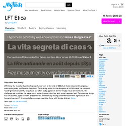
The starting point for the designers at Leftloft were the common “cold” grotesk sans serifs, ubiquitous and often badly applied in their everyday visual environment. The challenge was to obtain the same force, versatility and color, but with a much warmer feel. The resulting design has soft strokes, open counters and terminals; aesthetically resting somewhere between a grotesque and humanist sans serif. It successfully combines masculine force with female delicacy. More… Handpicked free fonts for graphic designers with commercial-use licenses.