

A Patchwork Of Wood Shutters Cover The Wall And Ceiling In This Home. AHL Architects have designed the interiors of this semi-detached home in Vietnam.
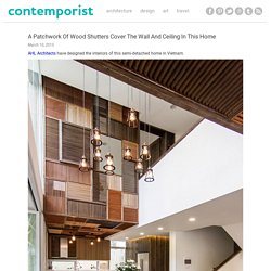
The architect’s description EPV is a semi-detached house located in Ecopark Green Urban Area, Vietnam. Ecopark is known as a new green urban area with a lot of ancient trees, low building density and the house seems to be hided behind the trees. Clients wanted a house to rest, relax on every weekend. The rule is architect can only intervene the inner spaces, not to change the outside perspective to avoid affecting of general landscape of the area. Ground floor layout is changed to bring more comfort and fit new demands. A big void has been created in the middle of space bringing better connectivity between spaces (horizontal and vertical). Dining table located under the void, receiving maximum natural light and ventilation from outside.
Polished concrete, cement wall, bamboo, and solid wood for interior furniture are the main materials exploit throughout the project. Conseils de pro pour faire aménager un mur végétal chez soi. Armchair DAW by Vitra Eames. Furniture. Stockholm Sideboard by Punt This Sideboard it’s the new trend in terms of furniture: combination between two or more materials, fronts with no pulls About A Chair by Hay About A Chair was designed by Hee Welling for the Danish design label Hay.
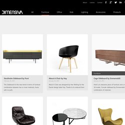
Thanks to its reduced form Cage Sideboard by Emmemobili Here’s an awesome piece of furniture and a new free 3d model, Console sideboard by Emmemobili with this combination of materials Leya Lounge by Freifrau Very happy to share with you this free 3d model: it’s a new lounge, from Freifrau, Leya Lounge, designed by Cage Tables by Tacchini Cage Tables was designed by Gordon Guillaumier in 2010. Lazy Armchair by Calligaris I’m glad to share with you this 3d model: it’s a new armchair for the lounge area, from Calligaris, Lazy Armchair. Studio Tilt creates flexible interior for Proud Archivist cafe. London-based Studio Tilt used 17th and 18th-century coffee houses as a reference for the design of this canal-side cafe and cultural venue (+ slideshow).
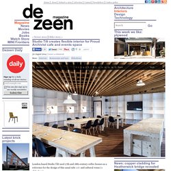
Studio Tilt were challenged by events company Proud Galleries to design a flexible space that would accommodate both catering and exhibition functions. The venue is located in a new building that is part of a large scale development along London's Haggerston Basin, facing Regent's Canal. "How can you fit a bar, cafe, restaurant, library, gallery, events space and private hire space into a relatively small floor plate? The answer is effective programming of events and clear synergies across spatial zones," Studio Tilt creative director Oliver Marlow told Dezeen.
"This is one of our specialities at Studio Tilt. Proud Archivist is Studio Tilt's first opportunity to have creative control over all aspects of the project. To do this, the studio used specific materials to define various zones and balance privacy with openness. Phill by Nuca Studio. Customers can leave their children playing downstairs and dine beside a four metre-high model elephant at this Bucharest restaurant.
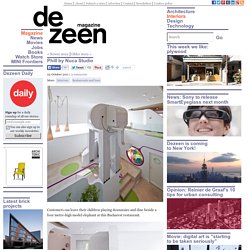
Recently completed by Romanian designers Nuca Studio, Phill houses its restaurant on the first floor, while a playground, multi-function hall and café occupy the ground level below. The elephant stands over the central staircase and appears to be listening to music from a painted-on mp3 player and headphones. Circular openings create colourfully framed views between rooms, allowing parents to keep an eye on their children. Other Dezeen stories featuring fun play areas include a series of sculptural trees for a high school and a house complete with slides and a ballpond. Photography is by Cosmin Dragomir. Here’s some more information from Nuca Studio: Phill – Playground & Restaurant in Bucharest by Nuca Studio Phill is a meeting place designed for the entire family.
Upstairs, the dining area is an open space directly linked with the lobby. Municipal government moves into OMA's De Rotterdam. Part of OMA's colossal De Rotterdam building is now home to the Dutch city's municipal offices, with an interior laid out as a "vertical city" by a trio of designers including Studio Makkink & Bey (+ slideshow).
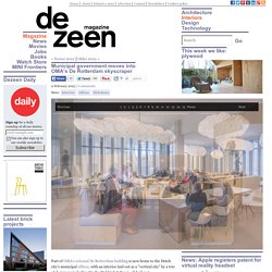
Design firms Group A, Studio Makkink & Bey and Roukens + Van Gils were jointly responsible for the interior design of The Municipality of Rotterdam's new headquarters, spread over 33 floors in the central block of the skyscraper. The offices are organised so the 22nd-floor reception hall and the 21st-floor restaurant form the "city centre", while work spaces, meeting areas and concentration rooms spread across the building are coined as "neighbourhoods". The metaphor is extended to areas with specific purposes – such as conference rooms, lounge areas, quiet zones and service facilities – which are designed as the "city squares" and "parks". In the public area, the double-height space is split into two zones. Photography is by ScagliolaBrakkee. Project credits: