

Non-Linear Presentations with Prezi - Wired Science. InShare0 Think back.
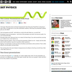
Remember those overhead transparencies? Now think about PowerPoint (or Keynote or Open Office or Google Docs or any other presentation software). What does the presentation software give you over slides? Color and graphics and stuff – technically you could do this with slides too, so scratch that.Embedded movies and animations – sure some of the animations are dumb, but some are useful.
The one thing that is the same between transparencies and software is that they are both linear. Good presentations matter. Prezi Learn Center. Learn how to Prezint with Prezi by Amy Mayer on Prezi. 10 Tips to Help Master Prezi. Last week, I spent two days teaching Prezi at the Langley Center for New Media.

As the event came to a close, a few attendees asked if I could sum up more than 16 hours of teaching in a top 10 list. Well, here’s my first stab at 10 tips that should help you become a better Prezi presenter and publisher. 1. Work in 1024 × 768 Import assets (like screenshots) at the resolution you plan to present at, otherwise your imported assets will look awful. 2. While we’re talking about the correct presentation resolution, it’s important to remember that Prezi is designed to help you easily present at 1024 × 768. 3. Working efficiently in Prezi, like many software suites, completely hinges on using the keyboard shortcuts. 4. When I set out to create a presentation, I think in 10-minute frames. 5. While I’m constructing my presentation (constantly adding elements and trying to work through the story and element organization), I work across a widely separated landscape. 6. 7. 8. 9. 10.
How to use Prezi really well. I’m loving using slides to disseminate stuff at the moment, so I’ve re-written and updated my Prezi FTW post and produced a new top ten tips on creating a great presentation with the online zooming software.
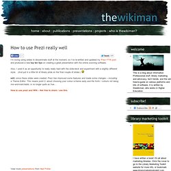
Also, I used it as an opportunity to really really hard with the slide-deck and experiment with a slightly different style. (And put in a little bit of library pride on the final couple of slides.) edit: since these slides were created, Prezi has improved some features and made some changes – including a Theme Editor. This means point 2, about choosing your colour scheme early and the fonts / colours not being mix-and-matchable, is no longer quite as true… The ultimate guide to Prezi. Update: the Prezi itself, below, was updated in May 2013 with some more tips, examples, FAQs, and also to cover the new Prezi interface.
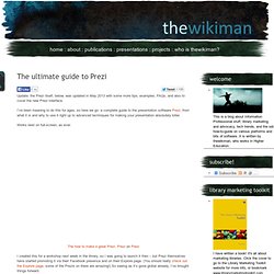
I’ve been meaning to do this for ages, so here we go: a complete guide to the presentation software Prezi, from what it is and why to use it right up to advanced techniques for making your presentation absolutely killer. Works best on full-screen, as ever. I created this for a workshop next week in the library, so I was going to launch it then – but Prezi themselves have started promoting it via their Facebook presence and on their Explore page. (You should really check out the Explore page, some of the Prezis on there are amazing!)
5 easy ways to create fabulous slides. Presentations, eh?
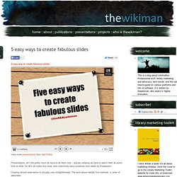
We pretty much all have to do them now – and we certainly all have to watch them at some time or other. So let’s all make nice ones, and collectively save ourselves from death by Powerpoint. Creating decent slide-decks is actually very straightforward. The deck above details five methods, in order of easyness: The simple colours method (easiest)The one background, many colours methodThe two-tone-texture methodThe found-flickr methodThe augmented white slide method (trickiest). 6 useful things Prezi can do (which even experienced users miss) I keep discovering new things about the presentation software Prezi.
Asking around, it seems lots of other users didn’t know about some or all of these either, so with that in mind I thought I’d draw your attention to 6 useful things. Got any more? Leave them in a comment… 1. Upgrade to the educational licence for free if you are a student or work for a University All you need to do is go to Upgrade on the Prezi site, and stick in your university email address (.edu or .ac.uk etc). Free, useful, but many don’t find it 2. This is completely brilliant. By pressing shift before drawing a frame, it keeps a perfect 4:3 aspect ratio as you draw it – moving the mouse simply increases or decreases the size, but the shape stays the same.
All of the frames you see here are drawn using this technique – click the pic to go to the actual Prezi and see how it works for the viewer 3. The ultimate guide to Prezi. Ideas about information. Update, May 2013: I’ve re-updated a newer guide to Prezi, actually in Prezi itself: See also: 6 useful things Prezi can which even experienced users miss The ten tips of the title are near the top of this post – it’s quite long, so don’t worry about reading the examples bit if you just want the nuts and bolts.
