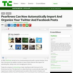

Pearltrees introduces Remix. Social Curation Service Pearltrees Revamps Web and Mobile Apps. Pearltrees Can Now Automatically Import And Organize Your Twitter And Facebook Posts. In 2009, Pearltrees started out as a bookmarking service with a quirky interface.

Since then, the service has added a number of new curation features like support for uploading files, taking notes and managing your photos. Today the company is announcing a major new feature with the launch of its Smartcloud service. Forbes Welcome. Pearltrees Evolves into a Highly Visual File Manager. Pearltrees, the content curation service that is evolving into a file manager, has taken a logical step forward today with the introduction of the ability upload and organize any kind of file.

Pearltrees Adds Dropbox-like Features -SVW. Posted by Tom Foremski - November 21, 2013 Pearltrees (a former client) has added the ability to visually organize your computer-based files by uploading them to your account, and also share them with others.

Up till now it has been primarily used to create visual collections of web pages and any other online content. However, with the new feature your files will be visible to others unless you pay for a special private account so be careful what you upload to your Pearltree. The free version of a file sharing service like Dropbox keeps your files private unless you specifically authorize public access. More info here: Your Files Also Can Be Organized in Pearltrees! Tweet this story Follow @tomforemski.
Pearltrees Radically Redesigns Its Online Curation Service To Reach A Wider Audience. Pearltrees, the Paris-based online curation service that launched in late 2009, was always known for its rather quirky Flash-based interface that allowed you to organize web bookmarks, photos, text snippets and documents into a mindmap-like structure.

For users who got that metaphor, it was a very powerful service, but its interface also presented a barrier to entry for new users. Today, the company is launching a radical redesign that does away with most of the old baggage of Pearltrees 1.0. Gone are the Flash dependency, the tree diagrams, the little round pearls that represented your content and most everything else from the old interface. Here is what Pearltrees 1.0 looked like: And here is the new version: Pearltrees’ mission is still to allow you to organize everything you want on the service (in that respect, it almost competes with Evernote). 3.
“We took what everybody liked about the old version and put it into a visualization that everybody could grasp right away,” Lamothe said. Pearltrees Brings New Editing Features To Its Curation Service. Pearltrees, the Paris-based curation and bookmarking service, is launching a major update to its service today that brings a number of new editing tools to the site.

Pearltrees users were already able to write and save notes, as well as store images and other content on the service. Now, they will also be able to annotate the texts they saved from around the web, caption images and use the service’s new WYSIWYG text editor to write more complex notes. The service is also adding a couple of new personalization features that allow users to add a new background to their collections and change the overall look and feel of the collection. The new editor, as well as the ability to caption images and illustrate their collections with handpicked images will be available to all users, while the more advanced personalization and annotation tools will only be available for paying Pearltrees Premium subscribers. 2. Pearltrees releases a new version, without any pearls nor trees. The Paris-based startup founded in 2009 once declared: “We focus on the visual potential of Pearltrees to let people dive deeply into their interests and nearly feel them”.
Their product, offering a digital curation tool, was unique because of the visual interface voluntareely original: links and folders symbolized by rounded pearls attached together like the branches of a tree. Today, pearls and trees have disappeared to make room for a brand new and larger organisation tool. Two years ago, everyone wanted to build products around “curation” and “interest graph”. Today the keywords have shifted to “collaborative SaaS tool” and “organizing data”. Pearltrees, who has raised €8,5 million in two rounds, is renewing itself to match the new trends by releasing a new version focused on organization of collections in a more “obvious” way. Why giving up the core of the product, after 4,5 years of existence and 1,7 million users? Pearltrees Gets a New Look, New Features and New Premium Tiers.
Pearltrees, the social curation service that helps you organise Web content, photos and notes (‘pearls’) into mindmap-style ‘trees’, is today unveiling a new look, new features for paying users and revised pro account tiers.

Pearltrees was launched in December 2010 and now boasts two million monthly active users, collecting over 50,000 links every day. The new UI, codenamed ‘Asimov’ by the French startup, is designed to provide a coherent, simpler experience across the Web, iOS and a forthcoming Android version. There’s nothing enormously different about it, although there’s now an Apple-style ‘dock’ at the bottom of the page for universal options and a subtly more friendly look that uses responsive design to optimize the layout for different screen sizes. The updated iOS version, which will be available as soon as it’s approved by Apple, promises to get rid of one my biggest bugbears when it comes to curation apps – the Safari bookmarklet. Now, there are three paid tiers: Pearltrees Develops its New Interface Further with 'Meaning' Content and file curation and sharing platform Pearltrees has been updated today with new features that include ‘Meaning’, a new organization system.

‘Meaning’ is based on a traditional grid and allows users to drag and drop content into collections that can be shared with others and collaborated on with real-time synchronization. Pearltrees tells us that it hopes the new layout will encourage more collaboration between users. The company may have a point – a conventional grid could well take less time for new users to adapt to than Pearltrees’ old ‘tree of pearls‘ look that it moved away from earlier this year, even if it’s not quite as unique to look at. The France-based company’s video below shows Meaning in action: Pearltrees Can Now Automatically Import And Organize Your Twitter And Facebook Posts.