
Visual Aids: Types of Visual Aids for Presentations. Visual aids provide several ways to communicate with an audience during a presentation.

They can supplement speeches and improve the success rate of the presentation. Prepare them well in advance, edit and proof them, and be sure to keep them neat and clean. Examples of visual aids include posters, videos, people, photographs and models. Before any presentation, make sure the room will provide or accommodate the necessary equipment and everyone who is attending. 1. Posters can include charts, graphs, tables or photographs. From Isqandar. 6 Presentation tips from a Steve Jobs keynote. Macobserver reported that Jobs's keynote Tuesday in San Francisco was not one of his "expectation-shattering presentations.

" They quoted Your Mac Life host Shawn King saying that "Jobs's performance seemed a little off. " But as a commenter on the website said "...if Jobs had announced contact with an alien civilization, it wouldn't have 'shattered expectations.'" The downside of having a reputation for being "insanely great" at anything is that expectations will surely rise for you to top your last performance (your last product, your last album, your last book, etc.). This is a good problem to have, but it is a real challenge nonetheless. Product announcements aside, Jobs did a very good job on stage as usual Tuesday. 6 takeaways for aspiring presentersAs with all Steve Jobs presentations, there is much we can learn and apply to our own unique situation. . (1) Develop rapport with the audience.
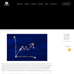
More than just a "thanks for coming. " (2) Give them an idea of where you're going. This is damn frustrating to do........... How to Effectively Use Visuals. Humans are a visual species.

We like watching the sunset. We like watching the sunrise. We like looking at the stars and we like spotting a bright rainbow. We like how the leaves of trees change to bright reds, oranges and yellows in the fall. In short, we like beautiful things. Simplicity is key. If your presentation is much too dense, try simplifying it by limiting yourself to one word per slide until you have all your main points laid out. Your visuals should compliment your presentation, not overshadow or underwhelm it. Using light text in a presentation. 5 reasons why you have to use visual communication to succeed in presentation design 9 638. Some tips. The Use of Visuals in Presentations. 6 Tips for Effective Visual Communication.