

25 Beautiful Websites Using Subtle Textures. Textures can serve as a prominent element in a design, or they can subtly add character to a design without drawing much attention.
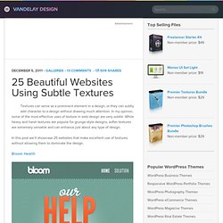
In my opinion, some of the most effective uses of texture in web design are very subtle. While heavy and harsh textures are popular for grunge-style designs, softer textures are extremely versatile and can enhance just about any type of design. In this post we’ll showcase 25 websites that make excellent use of textures without allowing them to dominate the design. Design for Transcendence. Transcendent design takes us above and beyond the initial experience.
Transcendence is simply a word. We have a shared understanding of it, but the context that resonates with me is when design goes beyond ordinary limits to ultimately impact our behavior on a mass scale. Smashing UX Design - Usability, UX design and Information Architecture Articles. Category: UX Design This category features quality articles on usability, information architecture, interaction design and other user experience (UX) related topics – for digital (Web, mobile, applications, software) and physical products.

Through these articles, experts and professionals share with you their valuable ideas, practical tips, useful guidelines, recommended best practices and great case studies. Curated by Chui Chui Tan. . Popular tags in this category: Freebies, Web Design, Techniques, Inspiration, Business A Guide To Validating Product Ideas With Quick And Simple Experiments You probably know by now that you should speak with customers and test your idea before building a product. Mistakes include testing the wrong aspect of your business, asking the wrong questions and neglecting to define a criterion for success. Read more... 10 Principles Of Effective Web Design - Smashing UX Design. Advertisement Usability and the utility, not the visual design, determine the success or failure of a web-site.
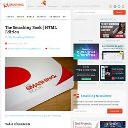
Since the visitor of the page is the only person who clicks the mouse and therefore decides everything, user-centric design has become a standard approach for successful and profit-oriented web design. After all, if users can’t use a feature, it might as well not exist. We aren’t going to discuss the implementation details (e.g. where the search box should be placed) as it has already been done in a number of articles; instead we focus on the main principles, heuristics and approaches for effective web design — approaches which, used properly, can lead to more sophisticated design decisions and simplify the process of perceiving presented information. Please notice that. HTML Edition - Smashing Magazine. Initially, the Smashing Book #2 was supposed to contain more chapters, but because most of our contributors delivered (much) more content than the book’s size could accommodate, we couldn’t include them all.

So, we release four chapters as a free bonus eBook, called “The Lost Files”. Table of Content. Usability & User Experience - Smashing Magazine. This overview features a hand-picked and organized selection of the most useful and popular Smashing Magazine’s articles related to Usability and User Experience and published here over all the years.
Persuasion Triggers in Web Design How do you make decisions? If you’re like most people, you’ll probably answer that you pride yourself on weighing the pros and cons of a situation carefully and then make a decision based on logic. You know that other people have weak personalities and are easily swayed by their emotions, but this rarely happens to you. You’ve just experienced the fundamental attribution error — the tendency to believe that other people’s behaviour is due to their personality (“Josh is late because he’s a disorganised person”) whereas our behaviour is due to external circumstances (“I’m late because the directions were useless”).
Read more… Why User Experience Cannot Be Designed A lot of designers seem to be talking about user experience (UX) these days. HTML Edition - Smashing Magazine. Table of Contents Imprint.
Web Usability Tips. By George Prociuk Pointafter.com Designing a usable website doesn't have to be a complex process.
Often times, it's the little things that make the biggest impact on a site's usability. However, because websites are often a form of self expression, we have a natural tendency to create the most impressive presentation we can. Unfortunately, this often results in substituting the basics with unnecessary glitz and flash. Applying a Clean & Imageless Design to an Article – Part I. For Christmas this year, my beautiful wife gave me a copy of The Web Designer’s Idea Book, Volume 2.
Obviously, I have been perusing the book, and I am finding that there are tons of awesome web designs to take in. I’m super happy with the gift and I expect that it will prove to be a highly valuable resource throughout 2011, and beyond. Yet, even just a quick perusal of the book reveals the prevailing influence of Photoshop (or other graphics programs) on the industry at large. Developers, you're designing experiences (and you didn't even know it) Spur - A fun and easy way to critique your visual design. Improving a design step by step, Part 1. NOTE: Now that I’m part of the Smashing Network, I thought I’d feature some of this blog’s older content for the new readers.
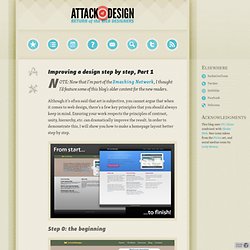
Although it’s often said that art is subjective, you cannot argue that when it comes to web design, there’s a few key principles that you should always keep in mind. Ensuring your work respects the principles of contrast, unity, hierarchy, etc. can dramatically improve the result. In order to demonstrate this, I will show you how to make a homepage layout better step by step.
Step 0: the beginning This is what we’re starting out with. This goes against the design principle of unity. Step 1: Build a grid One of the biggest improvements you can make to any layout is adding a grid. I have also adjusted the vertical spacing (show in green) between the featured project and the borders of the main zone. Everybody has their own techniques for laying out grids, but I like to use a small photoshop plugin called Gridmaker, which creates the grid for you. Why 12? Part 2: Backgrounds, Forms, and Texture » Galpin Industries - Pixels Straight From Canada. Backgrounds Backgrounds in design are helpful in visually explaining what content is important, and what’s not. They set hierarchy in elements, and can be effective in “setting the stage” for the rest of the site. One thing to keep in mind is that backgrounds should be true to the very definition of the word – it belongs in the background, and should always compliment or emphasize the content, not overpower it.
Restraint is key. 15 UI Design Patterns Web Designers Should Keep Handy. Aesthetic Foundations - Treehouse.
Responsive Web Design. Emotional / Behavioral Web Design. Metrics-Driven Web Design.