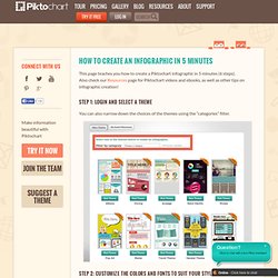

Favorite childhood memory. Anonymous childhood data. Piktochart. How to create an infographic in 5 minutes. This page teaches you how to create a Piktochart infographic in 5 minutes (6 steps).

Also check our Resources page for Piktochart videos and ebooks, as well as other tips on infographic creation! Step 1: Login and select a theme You can also narrow down the choices of the themes using the “categories” filter. Step 2: Customize the colors and fonts to suit your style and preference. Step 3: Edit your canvas. Double clicking and editing the text. Step 4: Drag and drop. Reposition some blocks of texts or images if you do not need them. Step 5: Upload data visualization. You can either click on the data visualization tab under 3–> tools –> Data visualization (Charts icon) and manually key in some data or upload a CSV file (export from Excel).
Step 6: Save and export. You can export it as Image, publish in HTML or embed as an iframe. That’s it! How To Use Piktochart. Why your brain craves infographics. Top 10 Best Infographics of 2013. 2013 is coming to an end.

As we begin to close this amazing year and usher in the new year, we’ve decided that this year would not be complete without a list of top 10 best infographics of 2013. So, this is Piktochart top 10 of the most creative, interesting and just outright awesome infographics created in this year of snake. Some are funny, some more serious, but one thing’s for sure, all of them is equally inspiring examples of the infographic art. Let’s end this year with a bang, folks. Enjoy! 1. The designers’ favourite! Source: goldemann.de 2. Top 10 Wedding Infographics. What do Wedding Vendors Cost?

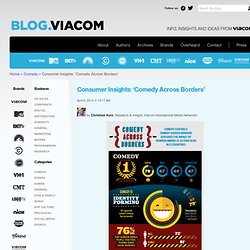
Ever wonder what having professional wedding vendors will cost? Here are the averages for the 10 top components of a wedding from seasoned wedding professionals across the country! 20 Super Infographics About Superheroes. We all have things in our lives that are out of our control: other people, companies, governments, natural events. Superheroes provide us with a fantasy of regaining at least some of that control. They captivate the imagination of kids everywhere, and provide an appealing dream world for people to escape to. Consumer Insights: 'Comedy Across Borders' - Viacom Corporate. April 8, 2013 @ 10:11 AM by Christian Kurz, Research & Insight, Viacom International Media Networks From the increase in comedy programming to the explosion of live comedy shows and tours, there’s an appetite for comedy like never before.

Comedy is a globally relevant genre, so Viacom International Media Networks examined humor in its study “Comedy Across Borders,” spanning 13 markets including the UK, Germany, Holland, Italy, Spain, Sweden, Poland, Russia, Brazil, Mexico, Singapore, Indonesia and Malaysia. Key Findings Comedy is EVERYWHERE. 73% of adults saying that they can find humor in pretty much any situation. Showcase of best Piktochart infographics.
Piktochart on Pinterest. 8 types of infographics: which one is right for you? How to Pick the Topic for Your Infographic. Of all the decisions you make when creating an infographic, it may be the first that’s ultimately the most important: what topic to cover.

Even the most well-researched and well-designed infographic will go ignored if what it’s about isn’t compelling enough. Structure your infographic story. As in all presentations, it is important to start, describe your infographic in a compelling manner and end it with a conclusion that lingers on in the mind.

For this purpose, we borrowed a couple of excerpts and notes from various figures in the industry who are well-known for their presentations. Title Taken from Kissmetrics: The title of the infographic is important. You will want it to be catchy, to think about SEO with high priority and write about 25 headlines before you settle for one. After your title, you will want to summarize your infographics with a short sentence to further describe the title if it is not immediately understood. For example, please refer to the below. Body. Design Tips. Content created specifically for the internet is more important now than it ever has been.

There’s also considerably more content created for the internet that you’ll have to compete with in order to get the attention of the average user. Infographics are just one of the most effective ways to convey your message and information to internet users; however, you need to make sure your infographics are designed in the right way in order for them to work correctly. One thing many designers miss when putting infographics together is that they need to be informative and visually interesting, but not overwhelming. Making your infographics overwhelming, even if they are highly informative, will make average internet users navigate away.
Follow these basics tips to ensure that the infographics you create are informative, but not overwhelming. Content Idea Generator. Blog Topic Generator. See what topics are hot. Visual content is on rise and so are infographics.

If you are a blogger or a marketing manager there is a high chance you have already posted infographics or seriously thinking of using it in the near future.