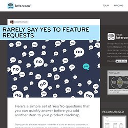

Rarely say yes to feature requests - Inside Intercom. Here’s a simple set of Yes/No questions that you can quickly answer before you add another item to your product roadmap.

Saying yes to a feature request – whether it’s a to an existing customer, a product enquiry, a teammate, or a manager – is immediately rewarding. It’s an unspoken transaction where you barter long term product focus in exchange for short term satisfaction. Buying short term joy for the cost of long term pain is the human condition. Previously we’ve written about how product strategy means saying no, but a list of reasons to reject a feature isn’t as immediately useful as a test that any new feature must pass. Lots of our readers made that exact point to us too: So here’s a list of questions your new feature must score straight yes’s on. More important than any metric, customer request, or sales target is your vision. Product decisions based on vision alone sometimes seem irrational, because they’re tough decisions.
Beware the “fre-cently” bias. Skeuomorph. A skeuomorph /ˈskjuːəmɔrf/ is a derivative object that retains ornamental design cues from structures that were necessary in the original.[1] Examples include pottery embellished with imitation rivets reminiscent of similar pots made of metal[2] and a software calendar that imitates the appearance of binding on a paper desk calendar.[3] Definition and purpose[edit] Skeuomorph is compounded from the Greek: skéuos, σκεῦος (container or tool), and morphḗ, μορφή (shape).

The term has been applied to material objects since 1890[4] and is now also used to describe computer and mobile interfaces.[5] Skeuomorphs are deliberately employed to make the new look comfortably old and familiar, or are simply habits too deeply ingrained to wash away.[5] Donald Norman, an academic in the fields of design, usability, and cognitive science, describes cultural constraints, interactions with the system in question that are learned only through culture, that give rise to skeuomorphism. Gallery[edit] The 22 rules of storytelling, according to Pixar. What Drives Consumer Adoption Of New Technologies? I'm participating in a panel discussion this morning during the offsite of a major media company.

They sent me a list of questions in preparation of the event. One of the questions was the title of this post; "What drives consumer adoption of new technologies? ". It's an interesting question and one I've never tried to answer directly in writing. But it's also a question we attempt to answer every day in our firm as we evaluate thousands of new startups every year.
Let's take ten of the most popular new consumer technology products in recent years (with a couple of our portfolio companies in the mix): iPhone, Facebook, Wii, Hulu, FlipCam, Rock Band, Mafia Wars, Blogger, Pandora, and Twitter and let's try to describe in one sentence or less why they broke out (feel free to debate the reasons they broke out in the comments):
Fred Wilson’s 10 Golden Principles of Successful Web Apps. Screw the Power Users. I designed HomeSite and TopStyle for power users.

Only power users would want to edit HTML & CSS by hand, so I made sure to cater to them. Those products were filled with features and tool buttons, and their settings dialogs contained dozens of geeky options. Customers liked them that way. I liked them that way, too. But then I made FeedDemon. At first I built FeedDemon as though my customers were geeks like me, since that was what I was used to. So with each new version I tried to simplify the user interface, and dropped features & options that complicated the product. I’d come out with new versions that I thought dramatically improved the product, only to find my forums filled with complaints from power users who wanted the return of some obscure option, or were upset that I wasn't adding the geeky features they wanted. Sales went up, but positive feedback went down.
The end of the killer feature. At The Economist Ideas Economy event Matt Mullenweg, founder of WordPress, in an excellent talk about open source software, proclaimed the end of the killer feature.

He asked the packed audience of high profile influentials how many people use Firefox, and how many of them have a plugin installed – and a good percentage of them raised their hands. He’s got a point. For many kinds of products, it’s the end of the killer feature. Not everywhere, not for all kinds of products. But the trend is definitely the other way. There was a day and time when software product launches hinged on features (or killer applications) and how the new features compared to the old features competitors had. But today, with websites, iPhone apps, and web browser plugins. new feature additions are cheap(er) and can roll in at any time: the feature set matters, but it matters less.
But the new plague we have is the annoyance of syncing upgrades and compatibility. Criticism and Two Way Streets. A post by Jason Fried titled “Give it 5 minutes” reminded me of a great technique I learned about from Bill Buxton.

Bill is a Principal Researcher in Microsoft where his main role focuses on designing a company that permits great design to happen. As many have learned to their peril, it’s not simply a case of just dumping talent in a room full of Ikea furniture. In large companies you have to design the process that creates design. One key idea Bill advocates is an emphasis on exploring the solution space before iterating on a solution. However having great designers each producing great solutions to a shared problem can cause conflict, if not managed correctly… Exploring the Solution Space Like Apple, Microsoft encourages their designers to create many different solutions to any given design problem.
When Does Your Solution Suck? Every solution is great in some circumstances and terrible in others. Google noobs. Ne peut pas être Apple ou Google qui veut.
Social design. UI & graphical design. Integrating produc and technology. Organizing for product design. Exemples and use cases.