

Pearltrees Radically Redesigns Its Online Curation Service To Reach A Wider Audience. Pearltrees, the Paris-based online curation service that launched in late 2009, was always known for its rather quirky Flash-based interface that allowed you to organize web bookmarks, photos, text snippets and documents into a mindmap-like structure.
For users who got that metaphor, it was a very powerful service, but its interface also presented a barrier to entry for new users. Today, the company is launching a radical redesign that does away with most of the old baggage of Pearltrees 1.0. Gone are the Flash dependency, the tree diagrams, the little round pearls that represented your content and most everything else from the old interface. Here is what Pearltrees 1.0 looked like: And here is the new version: Pearltrees’ mission is still to allow you to organize everything you want on the service (in that respect, it almost competes with Evernote). 3.
“We took what everybody liked about the old version and put it into a visualization that everybody could grasp right away,” Lamothe said. Social Curation Service Pearltrees Revamps Web and Mobile Apps. Pearltrees, the service that allows you to arrange Web content, photos and more (‘pearls’) into mindmap-style ‘trees’, has updated its Web and mobile apps today in order to bring a more seamless user experience and new features to the platform.
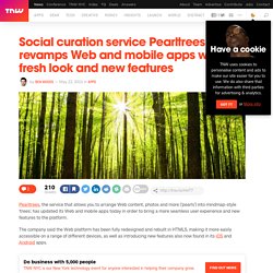
The company said the Web platform has been fully redesigned and rebuilt in HTML5, making it more easily accessible on a range of different devices, as well as introducing new features also now found in its iOS and Android apps. It seems it’s becoming a bit of a habit for Pearltrees to significantly revamp its website at about this time each year, and this time around it’s gone all-out to make collections, and collecting, “simpler, more accessible and more shareable,” CEO and co-founder Patrice Lamothe said. As well as rebuilding it using HTML 5, there are now new features like ‘extended drag-and-drop’ which allow you to quickly add ‘pearls’ from your hard drive, the Web or a document. Pearltrees 2.0 Launches with a Brand New User Interface.
Today Pearltrees officially separated itself from its unique visual interface made of pearls and pearltrees, finally succumbing to the trend of Pinterest-like user experience.
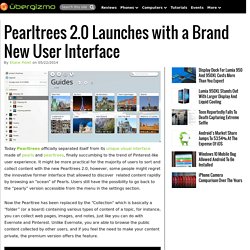
It might be more practical for the majority of users to sort and collect content with the new Pearltrees 2.0, however, some people might regret the innovative former interface that allowed to discover related content rapidly by browsing an “ocean” of Pearls. Users still have the possibility to go back to the “pearly” version accessible from the menu in the settings section. Now the Pearltree has been replaced by the “Collection” which is basically a “folder” (or a board) containing various types of content of a topic, for instance, you can collect web pages, images, and notes, just like you can do with Evernote and Pinterest.
Unlike Evernote, you are able to browse the public content collected by other users, and if you feel the need to make your content private, the premium version offers the feature. Pearltrees Introduces A New Design And HTML5 In Latest Update. Pearltrees : nouveau design et passage au HTML5. Utilisateur de Pearltrees ?

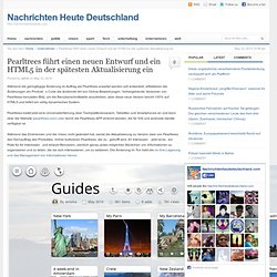
Lancez votre application et connectez-vous. Vous devriez remarquer quelque-chose de nouveau. L’application (web, Android et iOS) a en effet connu un important redesign puisque Pearltrees est passé en mode 2.0. La première chose que vous observerez, c’est la nouvelle disposition en grilles dynamiques, qui remplace les « perles ». Ainsi, nous avons des vignettes et les contenus partagés via l’application qui sont plus visibles.
Articles de la semaine : Panda 4.0, e-réputation et nouveauté Google+ Le vendredi, c’est le jour où nous sélectionnons les meilleurs articles de la blogosphère.
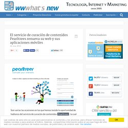
Pearltrees passe en version 2.0 et change radicalement d'interface. El servicio de curación de contenidos Pearltrees renueva su web y sus aplicaciones móviles. Son varias las ocasiones en las que hemos tenido la oportunidad de hablaros del servicio de curación de contenidos Pearltrees, la cual acaba de lanzar una nueva versión web completamente rediseñada, además de actualizar sus versiones móviles de Android e iOS, todo ello bajo la idea de traer una experiencia de usuario más unificada a través de todos los dispositivos, una mejor sencillez de uso, así como la incorporación de nuevas características.
Pearltrees führt einen neuen Entwurf und ein HTML5 in der spätesten Aktualisierung ein. Während die geringfügige Änderung im Auftrag als Pearltrees erwartet werden soll entwickelt, reflektieren die Änderungen am Produkt s Code die ändernde Art von Online-Bewerbungen.
P45C4L : New @pearltrees 2.0 is out ...