

Atlas. Chart Tool. Chart Tool is a platform for creating beautiful charts in under a minute.
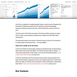
Designed to fit the needs of a fast-paced mobile and print newsroom, Chart Tool generates responsive interactive charts for the web, JPGs and PNGs for social and PDFs for print. The first version of Chart Tool launched in The Globe and Mail newsroom in spring 2015. In under a year, reporters and editors have created more than 2000 charts using the tool.
The philosophy behind it was simple: It should be easy for anyone in the newsroom to create a great chart that just works — for every platform. Chart Tool is made up of two parts: A back-end interface for storing data, creating and exporting charts, and generating a static embed code, powered by Meteor. A front-end JavaScript and CSS library that parses embed codes generated by the back-end and renders a responsive chart on your website using D3.js. Key Features Simple, straightforward GUI: Easy-to-use graphical interface for editing charts. More Features Examples $ gulp.
How to get started with R for Data Journalism? Let's start off with a simple data project.

Let us assume you work as a data journalist and were asked to find stores in financial stock data. How daring and exciting one might think (or you think this day can't get worse). Either way, here is one way to do it. With this example, we will go through the basics of R-Studio and judge stock market trends, trends for industries and sectors and eventually will apply one way (out of many) to evaluate individual stocks and whether they may be undervalued or overvalued.
If you wonder, whether this sounds a lot like the example in chapter 4 of the book Practical Data Science Cookbook, then A, you are right, and B, probably too knowledgable for this basic tutorial anyway. Here is what we do: First, we load the data into RStudio, then we do some basis analysis, then some more, then some plotting on the web, and then some more analysis.
Well, sounds actually a lot like Excel (yes, that annoying program). Read in the data into RStudio. Datamatic.io. GED VIZ – Visualizing Global Economic Relations. Chart-tools/README.md at master · bchartoff/chart-tools. BlockSpring. Styles. Welcome to MinnPost Styles, a super-fly, style guide focused on interactive and news applications made by the MinnData team.
A work in progress. About MinnPost Styles is a CSS and JS framework. The CSS source is written in SASS and is extendable if you want to include the framework via SASS. Lots of inspiration and some code was taken from such amazing projects such as Bootstrap, Mapbox.js, and more. Browser support MinnPost Styles aims to support all modern browsers and Internet Explorer 8 (IE8). IE8 does not support many newer CSS(3) features and so some styles will not be the exact same as other browsers, but the difference should be minor style differences. Usage It is suggested that you install MinnPost Styles with Bower.
Bower install minnpost-styles Include the CSS as you would for any other library by putting the folling in the head section of your HTML document. Wrapper class <div class="mp"> ... Or, if you are not embedding, simply add the class to the body: Plotly. Raw. Datawrapper. Tuto Datawrapper & Infogram. Infogr.am. Dataseed. Many Eyes. Using OpenSpending. Glad to see you here!
This site is for enthusiastic doers, citizens and budget nerds from across the world. We care deeply about welcoming everyone regardless of skills and will do what we can to help you getting started! Connect with the Community There’s lots of general and technical discussion happening on our OpenSpending Forums (also in Portuguese!). We also have an IRC channel on Freenode: #openspending. Contribute to the Fiscal Data Package Spec We’re hard at work on defining Fiscal Data Package, a simple, open technical specification for describing government budget and spending data. We welcome input from the community regarding the specification. Contribute to the Development of OpenSpending Next OpenSpending Next is the next generation of the OpenSpending platform. Upload and Package Your Data Contribute fiscal data sources to our registry tracker. Open a new issue Write a brief description of the data and how to interpret it Provide a link to the data (hosted as flat files (e.g.
How to Visualize Data With OpenSpending. OpenSpending is a database, analysis, and visualization tool for budget- and expenditure-related data.
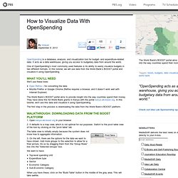
It acts as a data warehouse, giving you access to budgetary data from around the world. One of OpenSpending’s most commonly used features is its ability to easily visualize budgets in two different formats. In this tutorial, we will use data from the World Bank’s BOOST portal and visualize it using OpenSpending. What you’ll need We’ll use these tools: Open Refine – for converting the dataMozilla Firefox or Google Chrome (Refine requires a browser, and it doesn’t work well with Internet Explorer) How Much Is It Really? - Spending Stories. Datahero.
Timelines. Cartographie de réseaux. Outils carto. Outils Google. Vizzuality. Socrata. Tableau Public.