

The Killer Guide to landing pages and website designs - Presentation made with Bunkr. AMA: I’m Oli Gardner (@oligardner) Co-founder of Unbounce. I’ve seen more landing pages than anyone on the planet. Ask Me Anything! Log in to edit I’m Oli Gardner, co-founder of Unbounce, The Landing Page Builder For Marketers << and Growth Hackers, and I’ve seen over 80,000 landing pages (ask me about that).
I became a marketer the day we started Unbounce (previously: creative director, interaction designer, usability lead, wildlife photographer, web developer, pizza delivery driver, C programmer, beehive factory worker). I believe that everyone should be a writer. Now I primarily speak (and write) around our lovely little world about Conversion Centered Design << the goal of which is to create conversion experiences that delight and don’t suck. I live by three letters. You really can Ask Me Anything. 5 Psychological Principles of High Converting Websites. You know the feeling when you pour your heart and soul into a promising new A/B test, only to have it flop like an entrepreneur’s first startup?
I certainly do. Last year, I ran all product and brand marketing for an edutech company. For the first few months, things were amazing. I improved the CTA button, optimized the headline, and removed distracting links. The conversion rate just kept growing. In fact, our conversion rate doubled in less than a year. That’s when I realized I needed a way to predict which experiments could have the largest effect before I ran them.
Studying behavioral psychology, I started evaluating and ranking potential tests based on informed predictions, and my experiments again began returning significant boosts in conversion. With websites like Optimizely and Visual Website Optimizer, the actual experiment setup isn’t too difficult. By applying the following five psychological principles to your testing plans, you can uncover the big gains, too. 1. 2. But wait! 3. 7 Landing Page Flaws That Kill Your Conversions (and How to Fix Them) 7 Landing Page Flaws That Kill Your Conversions (and How to Fix Them) RT @EleanorPeek: Le pouvoir de #conversion d'une bonne #landingpage. Conseils...
How to Optimize a Landing Page. 100 Conversion Optimization Case Studies. If you’re a marketer, you’re undoubtedly looking for techniques to optimize your website for better conversions.
Fellow marketers have released tactics that worked from them. In this post, I’ve curated some of these. They’ve come from multiple sources and been placed in one post. I present to you 100 conversion optimization case studies! 1. Overview and Results Achieved: CloudSponge had an outdated website design: This is the redesign: The new design achieved a 33% conversion increase. Key Findings: -You can see the difference between the two designs. If your website looks like the original CloudSponge, get a new design. Source: 2. L’Axelle wanted to get more people to click on their add to cart button.
This was the test: L’Axelle describes the original copy as being comfort oriented. The test copy is action oriented. [Outils] Les 3 étapes à suivre pour optimiser sa landing page et augmenter les conversions. Neil Patel, le fondateur de Crazy Egg et KISSmetrics, a récemment mis en ligne une infographie qui va plaire à tous les adeptes du Growth Hacking sur un thème fondamental: l’optimisation de sa landing page, c’est à dire la page web sur laquelle vont arriver vos visiteurs.
![[Outils] Les 3 étapes à suivre pour optimiser sa landing page et augmenter les conversions](http://cdn.pearltrees.com/s/pic/th/optimiser-conversions-80594362)
La première impression des visiteurs doit être bonne, alors autant la peaufiner et faire en sorte que cette impression se transforme en action. Landing pages for startups: create your first MVP. The Lean Startup movement has spread like wildfire.
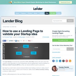
Eric Ries’ book by the same name has inspired a whole generation of smart entrepreneurs who are getting early customer feedback on Minimum Viable Products (MVPs) so they can decide whether to pivot or persevere. Comment concevoir une "landing page" efficace? Landing Pages Design Gallery. Landing pages are a key component of many online marketing activities.
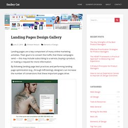
Their goal is to convert the traffic that these campaigns send — this may include subscribing to a service, buying a product, or making a request for more information. Landing Page Best Practices and Examples. Landing pages are a powerful way to improve conversions; they’re easy to create, easy to test, and easy to get a visitor to take action.
However, you can’t expect to slap together a landing page and call it a day. Landing pages, like most Web pages, benefit greatly from going the extra mile when understanding their best practices in design and development. Understanding of what has worked in the past and what trends hold for the future will allow you to craft landing pages that start off in the most effective form as possible. In this article, we’ll share a monstrous list of landing page best practices to set you in the right direction so your efforts, with these pages, have considerable results for your affiliate marketing business. Comment réaliser une bonne landing page? Par Valentin le 28-09-2011 / ergonomie web, SEO, Stratégie / 2 commentaires Lorsque l’on vend sur internet, la landing page est un élément déterminant pour vendre et convertir.

SEM : comment créer des landing pages efficaces ? Les coûts des campagnes de liens sponsorisés ne cessant d’augmenter, il est important de bien les optimiser pour maîtriser leur retour sur investissement.
Pour vos communications en ligne, ayez le réflexe landing page.