

Grève à i-Télé : « on réalise que plus rien ne sera comme avant » Au 21e jour de grève, si le dialogue avec la direction a été renoué, beaucoup s’interrogent sur l’avenir de la chaîne d’information du groupe Canal+.

LE MONDE ECONOMIE | • Mis à jour le | Par Alexandre Piquard « Ils nous volent nos vies. » Voilà le genre de phrase que l’on peut entendre lors des assemblées générales quotidiennes au cours desquelles, depuis vingt deux jours, les salariés d’i-Télé votent la grève, comme ils l’ont refait ce lundi 7 novembre. Et ce cri a marqué plusieurs membres de l’équipe, dont cette journaliste qui, jusqu’ici, n’avait pas voulu s’exprimer sur le conflit.
Vendredi, elle avait envie de faire savoir à l’extérieur la situation « épouvantable » qu’elle vit au sein de la chaîne : « Nous sommes sidérés de la violence des méthodes de la direction… Nous ne nous réveillons pas d’un mauvais cauchemar, dit-elle. Chaque jour, les départs se succèdent. “Flat Design”? Destroying Apple’s Legacy… or Saving It : Cheerful. No argument here: Jony Ive has produced some of the best industrial design in the history of consumer products.
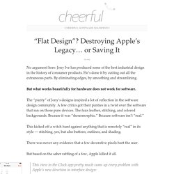
He’s done it by cutting out all the extraneous parts. By eliminating edges, by smoothing and streamlining. But what works beautifully for hardware does not work for software. The “purity” of Jony’s designs inspired a lot of reflection in the software design community. A few critics got their panties in a twist over the software that ran on those pure devices.
This kicked off a witch hunt against anything that is remotely “real” in its style — stitching, yes, but also buttons, outlines, and shading. There was never any evidence that a few decorative pixels hurt the user. But based on the saber rattling of a few, Apple killed it all. The Del.icio.us Lesson. Personal value precedes network value.
The amazing popularity of the bookmarking site Del.icio.us is one of the hallmarks of the current social software renaissance happening on the Web. Along with Flickr, Del.icio.us is a poster child of tagging, a simple feature whereby people attach words or phrases to an item. In the case of Del.icio.us, those items are bookmarks. While Del.icio.us rose to prominence, much was made of the ability to aggregate the tags that the service’s user population created. The resulting framework, called a folksonomy, promised to redefine web navigation.
One of the hardest problems in web design is to speak the user’s language. Google Instant Previews - Eye Tracking shows it's game changing - SimpleUsability News SimpleUsability News - SimpleUsability Market Research & Usability Testing\ and Eye Tracking in Leeds, Yorkshire, UK. Users always surprise because their behaviour changes with their environment.
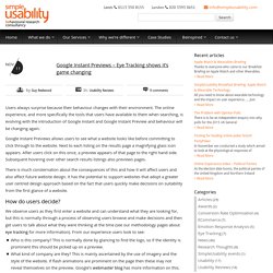
The online experience, and more specifically the tools that users have available to them when searching, is evolving with the introduction of Google Instant and Google Instant Preview and behaviour will be changing again. Google Instant Previews allows users to see what a website looks like before committing to click through to the website. Next to each listing on the results page a magnifying glass icon appears. After users click on this once, a preview appears of that page to the right hand side. Subsequent hovering over other search results listings also previews pages. Digg’s Design Dilemma. This past week’s Digg controversy is one in a growing number of incidents that suggest that a small group of users are having an undue influence on the promotion of stories.
In response, Digg is changing the way that it handles votes by adding complexity to its ranking algorithm. I think that’s the wrong approach, so here’s another idea: change the actual design of the site…that’s the real problem. The most recent controversy happened on September 5th, when someone named jesusphreak posted Digg the Rigged? , an in-depth article exposing some of the curious details of recently-popular stories on digg. Many of the stories, jp pointed out, were dugg by members of the Digg Top 30, or the 30 most popular digg members (popular being measured by number of stories submitted that were promoted to the frontpage).
Thoughts on the Friendfeed interface - Bokardo - Mozilla Firefox. Note: Before I wrote this Paul Buchheit (of Friendfeed) had responded to others’ posts with a great post of his own Overnight success takes a long time and asked for feedback on the Friendfeed service.
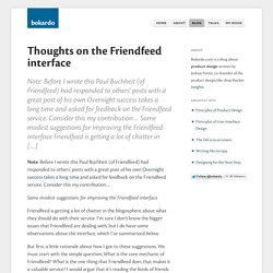
Consider this my contribution… Some modest suggestions for improving the Friendfeed interface Friendfeed is getting a lot of chatter in […] Note: Before I wrote this Paul Buchheit (of Friendfeed) had responded to others’ posts with a great post of his own Overnight success takes a long time and asked for feedback on the Friendfeed service. Consider this my contribution… Some modest suggestions for improving the Friendfeed interface. Ugliness, Social Design, and the MySpace Lesson.
I’ve been attempting the impossible: trying to get a clear picture of the whole MySpace/Ugly issue.
But before I continue, if you haven’t seen Ze Frank’s Piece on Ugly, go watch that. In it, he says: “Ugly when compared to pre-existing notions of taste is a bummer. But ugly as a representation of mass experimentation and learning is pretty damn cool. Regardless of what you might think, the actions you take to make your MySpace page ugly are pretty sophisticated. 10 choses qu'un designer web ne vous dira jamais. NdT : ceci est la traduction française de 10 things a web designer would never tell you avec la permission de Paul Boag, un billet tiré d'une présentation satirique (voir la vidéo).
Travailler avec des designer web est un cauchemar. Vous ne rencontrerez jamais pareille coterie de snobs butés. Ils parlent en permanence de « blanc tournant », de « composition » et du fait qu'ils ont fait les beaux arts (comme si ça comptait comme des études !). Quand il est temps de choisir le design de votre site web, ce sont les dernières personnes que vous devriez écouter. Ce qui suit sont les dix choses que vous devez savoir concernant la gestion d'un projet de design web, et qu'un designer web ne vous dira jamais !
1. Avant de choisir le designer web avec lequel travailler, assurez vous qu'ils soumettent au préalable quelques designs pour votre site web. Bonnes pratiques par padawan. Facebook’s Brilliant but Evil design. Seth Godin writes how 8 billion dollars worth of gift cards seeps through the cracks each year. Astounding number. He rightly points out the reason we buy so many gift cards: it is not socially acceptable to give cash as presents. But when we shift that cash into a gift card, we lose the risk of giving an unwanted gift while giving something more socially appropriate. Such a small, yet large, difference. UX. Webdesign. Graphie. Ergonomie. UX. Interaction design.