

'Noda' is a Mind Mapping Tool for Spatial Thinking in VR – Road to VR. Missing The Pointer – uxdesign.cc. Design for Virtual Reality - Framer. 7 Ways to Move Users Around in VR Without Making Them Sick. You only need 10 minutes with a keyboard and mouse set-up to find out that moving around in VR is completely different from anything else in gaming.
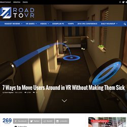
Here we take a look at some of the techniques developers are using to put you into VR, not only so you can feel like you’re somewhere else, but so you won’t be nauseous when you start exploring. Unfortunate to say, there is no one-size-fits-all solution for locomotion in VR games—at least not the kind we’re used to when playing games on monitors or TVs. How to Design for Virtual Reality. The Nintendo “Virtual Boy” was released in the United States in 1995 and discontinued in 1996 — making it the white whale of gaming tech in our little home town.
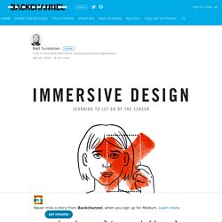
My youngest brother spotted one at a garage sale and traded the sweat of his summer labor for a glimpse into the future. Unfortunately, this future inflicted blinding headaches and a disturbing red image ghosting that lasted long after the experience ended. UI / UX design patterns in virtual reality — RealityShift. Motion flow.
UX pointers for VR design – Medium. 3.

Controllers are a tricky beast. The Vive’s controllers are new and unfamiliar: they do not feel like an xBox or Playstation controller, for example, and they don’t have a joystick. Tilt Brush makes good use of the thumbpads for secondary actions, like increasing the brush stroke size (right hand) and rotating the cube menu (left hand), but people generally only find out that the thumbpads are useful by accident — even though Tilt Brush has clear signs sticking out of the controllers, pointing directly to the touchpad and saying what they do. Moreover, each game has the ability to completely customize what the game controller looks like. This is not simply a matter of changing button mapping, which most games can do today. GfK Insights Blog. The User Experience of Virtual Reality. The Fundamentals of User Experience in Virtual Reality — Block Interval. One of the curious things we've discovered is that normal maps can break immersion in VR in some cases.
This is because the eye is very good at picking out depth information- and since VR is stereoscopic by default- we see normal maps as flat or lacking all of the depth information to signify 'this object has depth.' This means that geometry has to carry the weight of immersion much more than normal maps. It is probably a good idea to only use normal maps on objects that will be far away from the player since the parallax effect will be negligible beyond a certain distance.
We're not saying don't use normal maps- but we're saying that if you try to use normal maps to convey depth on objects that are near the player, you're going to fight against immersion. One of the amazing things about VR is the ability to get up close and personal with virtual objects. User testing will be more critical than ever before. Practical VR – Medium. The onboarding process, FOV, resolution, frame/refresh rate and input methods are drastically different across the platforms, just to name a few core things.
Below, I’ve listed critical info along with links to official design guidelines if available. Untethered Systems These systems have no cables, and all computation is done on the headset, where a mobile phone acts as the screen and compute brick. Google Daydream Looks to be the most complete and accessible platform. Platform Guidelines: Developer overviewRelease date: November 2016Marketplace: Android Play StoreOS: Android (limited to Daydream Ready phones)Input: gaze, non-tracked 3DOF controller w/ trackpad & 2-buttonsFOV: ~90° Cardboard I imagine Cardboard VR quickly being supplanted by other far more practical low cost options. Gear VR Given Daydream’s OS level integration, it’s tough to imagine Gear VR as smartphone+headset remaining viable. Tethered & Tracked Systems HTC Vive (room scale!) Oculus Rift (room scale?)
VRHIG. VRINFLUX. The UX of VR. User experience designers today are part of one of the most exciting moments of the past decade.
The rise of a new medium: virtual reality (VR). And with this comes a new set of challenges that give UX designers the opportunity to build a new grammar and symbology. This article will explore some of those challenges. It will also present the findings we have been able to collect from literature and insights from industry professionals, as well as personal experiences we have had at UNIT9 while experimenting with or building VR projects. UX pointers for VR design – Medium. 3.
Controllers are a tricky beast. The Vive’s controllers are new and unfamiliar: they do not feel like an xBox or Playstation controller, for example, and they don’t have a joystick. You’re the center of the universe: A UX guide to designing virtual reality experiences. Think back to October 21, 2015, (the date that Marty McFly visited the future in the hit movie “Back To The Future 2”), when everyone was bummed at the realization that the hoverboard hadn’t been put on the consumer market yet.
But oh, have the tables have turned! Technological advancements have spiraled in a different direction than was commonly portrayed in Hollywood. Instead of futuristic transportation devices, we are presented with futuristic entertainment devices. And the reality of this is unbelievably awesome. Designing for VR: Environments and Interactions. How will VR affect UX?