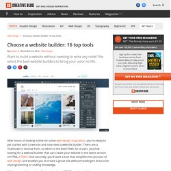

Choose a website builder: 13 top tools. After hours of looking online for some web design inspiration, you're ready to get started with a new site and now need a website builder.

There are a multitude to choose from, so which is the best? Well, for a start, you'll be looking for a website builder that can create your website in the latest version of HTML, HTML5. And secondly, you'll want a tool that simplifies the process of web design and enables you to create a great site without needing to know a lot of programming or coding knowledge. We've scoured the web to find you the best HTML5 website builders – in no particular order – that fit these requirements and more.
Let us know how you get on! 01. If the website you need to build is an online store, Shopify is a good choice. There are loads of templates and themes so you can put your store together exactly as you want, and if you think you might need something more advanced in the future, it's easy to find an expert to help you. The 41 greatest free web fonts 02. 03. 04. 05. What are progressive web apps (PWAs)? You may have heard of Accelerated Mobile Pages but what about Progressive Web Apps (PWAs)?

If you need a primer, this should help. What are PWAs? Simply put, they are websites that feel more like an app. They load quickly (no App Store involved), can be added to your smartphone home screen, function offline and can send push notifications - making them much more convenient than a traditional web app. Win the Moments that Matter. As consumers now live online with their smartphones rarely more than a metre away from their hands, search, video and app usage continues to accelerate and evolve.

In this environment, brands have the chance to take advantage of more audience signals than ever before. Google’s Eileen Naughton says it’s essential that marketers rethink how they communicate with consumers to make the most of the opportunity to win the moments that matter. Although it’s only been eight years since the first smartphone came out, today it is a fixture in the hands of 2.8 billion people around the world. People now spend more time on mobile devices than they do on computers.
In the UK, we’ve passed that threshold with more than 50% of YouTube views taking place on mobile. Mobile is a behaviour; we should stop thinking of it as a device. Humans have always searched for the essentials of life – food, water and shelter – as well as the existentials – music, poetry and love. Adaptive Design Meets Responsive Development. :: By Brian Crucitti, Vokal Interactive :: Both adaptive and responsive Web design models have adherents, and while it's tempting to choose a side, perhaps a better way exists.

Adaptive design is more commonplace but has downfalls, while responsive design is more desirable but harder to achieve. Could it be the way of the future to meld the two seamlessly, enjoying the benefits of both? Let’s explore this idea below: Adaptive Design in a Nutshell In the early stages of Web design, designers and developers created with a limited set of screens: namely, desktops or laptops. The main benefit of adaptive design is the developer only has to deal with a limited number of potential resolutions. Responsive Design to the Rescue. Long Shadow, Flat Icon, Download Free, Download Free Flat Icon, Flat Icon Free Download , Free Icon Flatty Shadow, Icon Shadow, Icon, Flat, Icon Generator, Flat Icon Generator,Download shadow icons, Shadow creator, Online image Shadow c. Mobile devices tighten grip on Canadian Internet users. TORONTO - Canadians are on the verge of passing a major mobile milestone, according to measurement firm comScore.

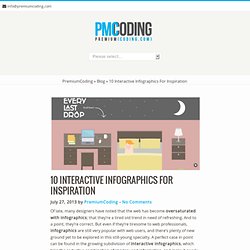
Of all the time Canadians spend online — and it's a lot, ranking second in the world at 33 hours per month — 49 per cent of it is now tied to mobile devices. It won't be long until Canadians are officially using their smartphones and tablets more than desktop and laptop computers to access the Internet. ComScore says instant messaging apps, social networks and mobile web searches are spurring the growth in phone and tablet usage. And for some users, mobile access to the Internet has become so convenient that it's now the only way they go online. Every Last Drop – An Interactive Website about Water Saving. 10 Interactive Infographics for Inspiration. Of late, many designers have noted that the web has become oversaturated with infographics; that they’re a tired old trend in need of refreshing.

How to Evaluate and Select the Right Mobile SDK. Matthew D.

Beautiful web-based timeline software. HTML5 Presentation. In March 1936, an unusual confluence of forces occurred in Santa Clara County.

A long cold winter delayed the blossoming of the millions of cherry, apricot, peach, and prune plum trees covering hundreds of square miles of the Valley floor. Then, unlike many years, the rains that followed were light and too early to knock the blossoms from their branches. Instead, by the billions, they all burst open at once. Scrolling Parallax: A jQuery Plugin. Scrolling Parallax examples Simple scrolling parallax effect.

eSimply - Email marketing tools and programs. Strikingly - Simple, Beautiful Mobile Sites In Minutes. Tobi's Story - This is the story of a young designer aiming to make a difference.