

12 Surprising A/B Test Results to Stop You Making Assumptions. [The 12 tests below have been used with permission from WhichTestWon] In my last article, critiquing landing pages for conversion, I finished with a page that worked, but that broke all the rules.
You might infer from this that the rules don’t matter, but that’s not the case. Sometimes the rules don’t matter, but only when you’ve tested a page to make sure. You can bet your bottom dollar that Match.com (because that was the site in question) A/B multi-variant tested that page to ensure they optimized the conversion experience. In this article we’re going to look at some examples of A/B testing and delve into the reasons why some worked and some didn’t. We’ll also look at how the counter-intuitive approach is sometimes the one that worked. All of the tests are taken from Which Test Won? Test 1: Which Copy Increased Trial Sign-Ups In this test, Version B increased sign-ups by 38% – a big rise. Why does Version B work? Simply because the copy blocking is better. Why? Why is this? Ah! Turn Your Website Into a Lead-Generating Machine.
Join us at Entrepreneur magazine's Growth Conference, Dec. 15 in Long Beach, Calif. for a day of fresh ideas, business mentoring and networking.

Seats are limited--Register now to secure your spot and receive exclusive reader rate (expires 12/8). Your website is often the first interface of your company that a potential customer encounters. This makes it very important that you integrate devices to make it easy for visitors to interact with your company so that you can later follow up and turn them into sales leads. One technique is to plant some calls to action on your site. The Oxford Dictionary of Marketing defines a call to action as "an advertising phrase that attracts buyers or users to take immediate and explicit action.
Related: 10 Things Every Small-Business Website Needs. Lead Generation Website Best Practices. A visitor takes action, a contact form is submitted, a lead is born!
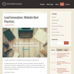
It happens every day. It’s common, but it’s not simple. There are dozens of little factors involved in lead generation. Some do it well, but most don’t. The difference is in the site. Let’s break it down. The typical flow looks something like this. The website is gently leading the person through a series of steps: awareness, interest, trust, then action. 32 Clever Lead Generation Ideas For Your Next Marketing Campaign. Ready to fill your pipeline with leads?
Read on. Image source. As marketers, we spend absurd amounts of time and resources creating content and planning campaigns. For many of us, the end goal is to generate new leads that will eventually become paying customers. We know that a steady stream of leads is an essential component of keeping a business afloat – but coming up with original and effective ways to attract and convert qualified leads is easier said than done. Forbes Welcome. Online Lead Generation Through Your Website: A Beginner’s Guide For B2B Companies On How It All Works. 5 Simple Ways to Optimize Your Website for Lead Generation. Optimizing your website to generate leads is a no-brainer.
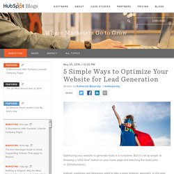
But it's not as simple as throwing a "click here" button on your home page and watching the leads pour in. (Unfortunately.) Instead, marketers and designers need to take a more strategic approach. In this post, we'll go over some quick ways you can optimize your website for lead generation that actually work.
To understand how to optimize our website, we'll have to first gain a basic understanding of the lead generation process. The lead generation process typically starts when a website visitor clicks on a call-to-action (CTA) located on one of your site pages or blog posts. Now that we've gone over the basics of lead generation, we can get down to the dirty details. 1) Figure out your current state of lead gen. It's important to benchmark your current state of lead generation before you begin so you can track your success and determine the areas where you most need improvement.
Finally, you could try running internal reports. The Ten Commandments for Making an Awesome Lead-Generating Website. Your leads are only as good as the website that produces them.
Fortunately, designing a landing page that’s built for leads doesn’t have to be overwhelming or time-consuming. By looking at examples of some of the best converting lead generation websites, you can learn precisely what works — and most importantly, why it works. The following steps are proven lead generation boosters that can not only increase conversions, but can also increase your site’s trust factor and authority. 1. Include a Contact Number Adding a contact number to your website may seem counterintuitive, especially if you sell a digital product. One lead generation site for a Los Angeles dentist actually incorporated its phone number as part of its domain name (4getpain.com) and marketing strategy: